Download all charts
Download the deck
Explore all 34 USAFacts charts that Ben and Scott reviewed in their debate, organized by debate question.
The data behind the debate
Ben Shapiro and Scott Galloway grounded their arguments about the American Dream in the same set of facts. Explore the featured charts below or download the full deck to examine all the data and draw your own conclusions.
Setting the stage
Average annual population growth peaked in the 2000s at 2.69 million and has since fallen to 1.89 million in the 2020s, the slowest of the five decades. The sources of that growth also shifted. Natural change held near 1.7 million a year from the 1980s through the 2000s, then fell to 1.29 million in the 2010s and 429,000 in the 2020s. Net migration rose over the same period, from 514,000 a year in the 1980s to 1.46 million in the 2020s.
Average annual population growth, by decade and component

Additional charts set up the debate: population by age group, households by type, and the share of people who reach the highest-earning 20% by childhood income. Download all charts for more information.
Question 1: Is government or capitalism better serving the American Dream?
Between 2000 and 2023, market income fell for the middle 20% (down 1%), the second 20% (10%), and the bottom 20% (50%), while rising for the fourth 20% (up 8%), the top 2–20% (22%), and the top 1% (9%). Taxes paid followed the same pattern, falling 1%, 6%, and 20% for the three lowest groups and rising 4%, 10%, and 3% for the three highest. Transfers rose for every group. Disposable income rose for all seven groups, from 12% for those 65 and over to 32% for the bottom 20% — though the dollar levels remain far apart, at $1.93 million for the top 1% and $28,822 for the bottom 20%.
Income, taxes, and transfers by income group and age
Percent change 2000–2023

Additional charts cover the first question: income group definitions, annual wages by percentile, and the share of total income and federal income tax paid. Download all charts for more information.
Question 2: Is government doing too little or too much?
Between 2013 and 2023, Medicare's reach grew the most, up 3.0 percentage points from 15.9% to 18.9% of the population, followed by Social Security, up 2.1 points from 17.4% to 19.5%. Free or reduced price school meals rose 1.2 points to 9.2%, and Medicaid/Children’s Health Insurance Program (CHIP) rose 0.7 points to 18.9%. Supplemental Security Income (SSI) was unchanged at 2.6%.
Six programs reached a smaller share of the population. Supplemental Nutrition Assistance Program (SNAP) fell the most, down 2.3 points from 13% to 10.7%, and unemployment compensation more than halved, from 2.1% to 1.0%. Special Supplemental Nutrition Program for Women, Infants, and Children (WIC) fell 0.5 points to 2.0% and Temporary Assistance for Needy Families (TANF) 0.3 points to 0.6%. Rental subsidies and energy aid, last measured in 2022, fell 0.5 and 0.4 points to 3.6% and 4.4%.
Share of the population receiving social safety net benefits

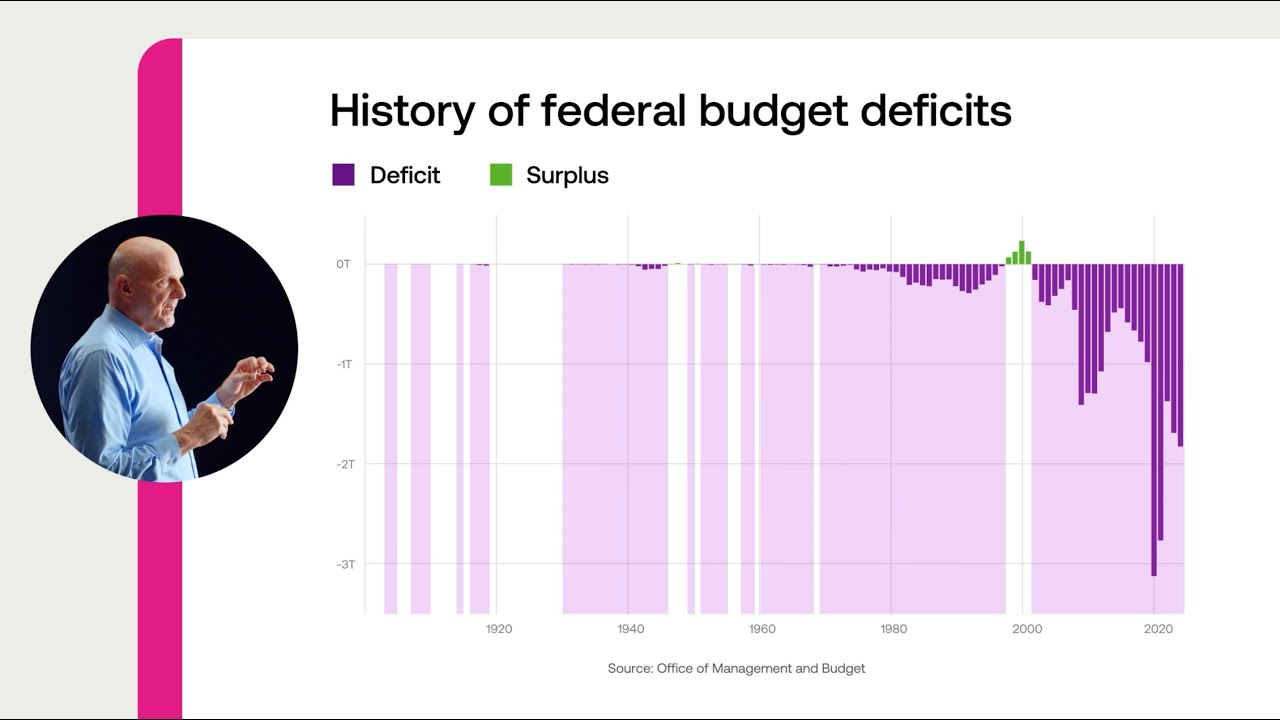
Additional charts cover the second question: share of families receiving transfers, spending for top five mandatory benefit program groups, and fiscal year budget surplus or deficit. Download all charts for more information.
Question 3: Is owning a home still part of the American dream and should government do more?
Since 1982, homeownership has risen for only one age group. Americans 65 and over went from 74.4% to 78.6%, while every younger group declined. The steepest drop was among 35- to 44-year-olds, who fell from 70% to 60.8%. Those under 35 went from 41.2% to 37%. The gap between the oldest and youngest households widened from 33.2 percentage points to 41.6.
Share of households that own their home
By age group, 1982–2025

Additional charts cover the third question: share of households that own their home, homeownership and renting rate, median monthly owner costs vs. median gross rent, median asking sales price by region, percent change in new residential construction costs from Q1 2005 vs. Consumer Price Index (CPI), and median monthly mortgage payment of US homeowners by recency of move. Download all charts for more information.
Watch Just the Facts videos













Our government is complex. Our data doesn’t have to be.
Subscribe for weekly, data-driven insights. No spin, just the facts.