In this section, we analyze by segment certain key metrics that measure progress towards our constitutional objectives of justice and domestic tranquility, common defense, general welfare, and security of the blessings of liberty to ourselves and our posterity. We chose metrics for which government data was available and that seemed representative of the status of these objectives. There are more metrics on our website at https://usafacts.org/, which you can access by selecting the “More detail” links next to the tables below.
As discussed in Part I, Item 1A. Risk Factors, in a free society, human behavior cannot be fully regulated or controlled. Government provides services, promulgates regulations, and enacts legislation intended to make progress towards our constitutional objectives; however, people are responsible for making their own choices. In addition, there are many other forces influencing these key metrics, including the natural world, governments and citizens of other countries, and businesses and philanthropic organizations worldwide. Therefore, one should not assume that the revenue and expenditures discussed above and the legislation discussed throughout this document caused the key metrics discussed in this section.
Justice and Domestic Tranquility (JDT)
The JDT segment works to establish justice and ensure domestic tranquility among the US population. Its reporting units are crime and disaster, safeguarding consumers and employees, and child safety and miscellaneous social services. Overall, the long-term trend for the past decade shows we:
- made meaningful progress on: numbers of overall crimes reported and related arrests; youth in jails and prisons, as well as overall numbers of those in prison for property and drug crimes; highway vehicle fires; median losses per fraud complaint; workplace violations, non-fatal workplace injuries, and back wages recovered; children adopted from foster care and the median time they spent in foster care; children ages four and older that are victims of maltreatment; and the number of children in poverty; and
- regressed notably in: people in prison for public order and other offenses; civilian deaths from fires that are vehicle and other non-structure fires; the numbers and estimated costs of billion-dollar natural disasters; acres and cost per acre burned in wildland fires; all types of consumer complaints and consumer product safety injuries; highway crashes; victimization of children ages birth to one year old; child fatalities as a result of maltreatment of children, primarily neglect and abuse and of children ages birth to one year old and ages eight to 11; children receiving free and reduced price lunch, and homeless children enrolled in school.
Shorter-term trends may differ.
Crime and disaster
The crime and disaster reporting unit seeks to reduce crime, administer justice, and mitigate and prevent disasters.
Crime
|
(In thousands, except percentages, rates, or otherwise noted) |
|
|
2018 |
|
|
|
2017 |
|
|
|
2013 |
|
|
|
2008 |
|
|
|
Change 2018 vs. 2017 |
|
|
|
Change 2018 vs. 2013 |
|
|
|
Change 2018 vs. 2008 |
|
Crimes reported 1 (fiscal year): |
|
|
|
|
|
|
|
|
|
|
|
|
|
|
|
|
|
|
|
|
|
|
|
|
|
|
|
|
Property crimes 2 |
|
|
7,219 |
|
|
|
7,683 |
|
|
|
8,652 |
|
|
|
9,774 |
|
|
|
(6)% |
|
|
|
(17)% |
|
|
|
(26)% |
|
Property crimes per 100,000 people |
|
|
2,210 |
|
|
|
2,363 |
|
|
|
2,734 |
|
|
|
3,215 |
|
|
|
(6)% |
|
|
|
(19)% |
|
|
|
(31)% |
|
Violent crimes 3 |
|
|
1,210 |
|
|
|
1,248 |
|
|
|
1,168 |
|
|
|
1,394 |
|
|
|
(3)% |
|
|
|
4% |
|
|
|
(13)% |
|
Violent crimes per 100,000 people |
|
|
370 |
|
|
|
384 |
|
|
|
369 |
|
|
|
459 |
|
|
|
(4)% |
|
|
|
—% |
|
|
|
(19)% |
|
Murder/non-negligent manslaughter (MNM) |
|
|
16 |
|
|
|
17 |
|
|
|
14 |
|
|
|
16 |
|
|
|
(6)% |
|
|
|
14% |
|
|
|
—% |
|
MNMs per 100,000 people |
|
|
5 |
|
|
|
5 |
|
|
|
5 |
|
|
|
5 |
|
|
|
—% |
|
|
|
—% |
|
|
|
—% |
|
Arrests by crime: |
|
|
10,311 |
|
|
|
10,555 |
|
|
|
11,303 |
|
|
|
14,007 |
|
|
|
(2)% |
|
|
|
(9)% |
|
|
|
(26)% |
|
Drug abuse violations |
|
|
1,654 |
|
|
|
1,633 |
|
|
|
1,501 |
|
|
|
1,703 |
|
|
|
1% |
|
|
|
10% |
|
|
|
(3)% |
|
Drug abuse violations arrests per 100,000 people |
|
|
506 |
|
|
|
502 |
|
|
|
475 |
|
|
|
560 |
|
|
|
1% |
|
|
|
7% |
|
|
|
(10)% |
|
Sale/manufacturing |
|
|
na |
|
|
|
238 |
|
|
|
269 |
|
|
|
305 |
|
|
|
na |
|
|
|
na |
|
|
|
na |
|
Possession |
|
|
na |
|
|
|
1,395 |
|
|
|
1,232 |
|
|
|
1,398 |
|
|
|
na |
|
|
|
na |
|
|
|
na |
|
Property crimes 2 |
|
|
1,167 |
|
|
|
1,250 |
|
|
|
1,559 |
|
|
|
1,687 |
|
|
|
(7)% |
|
|
|
(25)% |
|
|
|
(31)% |
|
Property crimes arrests rate (of property crimes reported) |
|
|
16% |
|
|
|
16% |
|
|
|
18% |
|
|
|
17% |
|
|
|
—ppt |
|
|
|
(2)ppt |
|
|
|
(1)ppt |
|
Driving under the influence (DUI) of alcohol or narcotics |
|
|
1,001 |
|
|
|
991 |
|
|
|
1,167 |
|
|
|
1,483 |
|
|
|
1% |
|
|
|
(14)% |
|
|
|
(33)% |
|
DUI arrests per 1,000 miles driven |
|
|
309 |
|
|
|
308 |
|
|
|
391 |
|
|
|
499 |
|
|
|
—% |
|
|
|
(21)% |
|
|
|
(38)% |
|
Violent crimes 3 |
|
|
521 |
|
|
|
519 |
|
|
|
480 |
|
|
|
595 |
|
|
|
—% |
|
|
|
9% |
|
|
|
(12)% |
|
Violent crimes arrests rate (of violent crimes reported) |
|
|
43% |
|
|
|
42% |
|
|
|
41% |
|
|
|
43% |
|
|
|
1ppt |
|
|
|
2ppt |
|
|
|
—ppt |
|
Other |
|
|
5,968 |
|
|
|
6,162 |
|
|
|
6,596 |
|
|
|
8,539 |
|
|
|
(3)% |
|
|
|
(10)% |
|
|
|
(30)% |
† We limited the key metrics data in this table to the years presented to be consistent with the previous sections of this MD&A. The most recent data in those sections is 2018, as that is the latest date for which comprehensive Government-wide financial data is available. Additional years of key metrics data may be found on our website. Click “More detail” to access it.
na An “na” reference in the table means the data is not available.
1 Crimes reported by local law enforcement to the Federal Bureau of Investigation
2 Property crimes are offenses of burglary, larceny-theft, motor vehicle theft, and arson.
3 Violent crimes are offenses of murder and nonnegligent manslaughter, rape, robbery, and aggravated assault.
Crimes reported
Property crimes and violent crimes reported had generally been declining at accelerating rates each year of the decade covered by this report, and at even higher rates if you adjust for population growth. Declines were seen across most crime sub-categories and major regions (Northeast, Midwest, South, West).
In 2016, this trend temporarily reversed for violent crimes, as reported crimes increased across all sub-categories and in every major region, with the exception of the Northeast. Rates dropped again for most sub-categories and regions in 2017 and 2018 but remained elevated when compared to recent history:
- By major region - the change in violent crimes from 2017 to 2018 ranged from a decrease of 5% in the Midwest (to a rate of 361 violent crimes reported per 100,000 people) to remaining flat in the West (to a rate of 423 violent crimes reported per 100,000 people).
- By state/territory - the change in violent crimes from 2017 to 2018 ranged from a decrease of 20% in West Virginia (to a rate of 290 violent crimes reported per 100,000 people) to an increase of 10% in New Mexico (to a rate of 857 violent crimes reported per 100,000 people).
- By type - Aggravated assaults accounted for 67% of violent crimes reported to law enforcement in 2018, with the number of aggravated assaults reported up 2% from 2017, while robbery offenses accounted for 23% (down 3%), rape accounted for 8% (same as 2017), and murder accounted for 1% (same as 2017).
Arrests
Arrests for property crimes and violent crimes followed similar trends as crimes reported, with property crime arrests decreasing in all periods and violent crime arrests decreasing over the past decade but increasing in 2017 and 2018. Arrests for drug abuse violations also decreased over the past decade but increased in 2017 and 2018. When comparing 2008 to 2017 (the latest available data), we see a shift in the distribution of drug abuse violation arrests towards those for possession (vs. sale/manufacturing) of heroin or cocaine and their derivatives and synthetic or manufactured drugs. Arrests for DUIs decreased for all periods before increasing slightly in 2018.
Underlying the overall arrests trends, there are demographical points to note:
- Youth (under age 18) are more often arrested for property crimes (18% of their arrests in 2018) than violent crimes (7% of their arrests in 2018) and are comprising a disproportionately smaller percentage of all arrests over time (an 8-percentage point decline overall between 2008 and 2018 – compared to a 2-percentage point decline in the percentage of the total population they represent); and
- Black people have been arrested at a rate (27% of total arrests in 2018) that is significantly higher than the rate they comprise of the US population (13% in 2018) throughout the periods discussed in this report. In 2018, Black people accounted for more than 50% of the population arrested for murder and nonnegligent manslaughter and robbery offenses.
Incarceration
|
December 31, except as otherwise noted (In thousands, except percentages or otherwise noted) |
2018 |
|
2017 |
|
2013 |
|
2008 |
|
Change 2018 vs. 2017 |
|
Change 2018 vs. 2013 |
|
Change 2018 vs. 2008 |
||||||||||||||
|
Incarcerated population: 1 |
|
|
2,123 |
|
|
|
2,154 |
|
|
|
2,223 |
|
|
|
2,310 |
|
|
|
(1)% |
|
|
|
(4)% |
|
|
|
(8)% |
|
Persons in jail (last weekday in June) 2 |
|
|
738 |
|
|
|
745 |
|
|
|
731 |
|
|
|
786 |
|
|
|
(1)% |
|
|
|
1% |
|
|
|
(6)% |
|
Persons in federal and state prison 3 |
|
|
1,465 |
|
|
|
1,489 |
|
|
|
1,577 |
|
|
|
1,608 |
|
|
|
(2)% |
|
|
|
(7)% |
|
|
|
(9)% |
|
Youth in jail (actuals, last weekday in June) |
|
|
3,400 |
|
|
|
3,600 |
|
|
|
4,600 |
|
|
|
7,700 |
|
|
|
(6)% |
|
|
|
(26)% |
|
|
|
(56)% |
|
Youth in state prisons (actuals) |
|
|
699 |
|
|
|
893 |
|
|
|
1,188 |
|
|
|
2,717 |
|
|
|
(22)% |
|
|
|
(41)% |
|
|
|
(74)% |
|
Sentenced prisoners by crime committed: |
|
|
|
|
|
|
|
|
|
|
|
|
|
|
|
|
|
|
|
|
|
|
|
|
|
|
|
|
Violent crimes |
|
|
706 |
|
|
|
723 |
|
|
|
718 |
|
|
|
730 |
|
|
|
(2)% |
|
|
|
(2)% |
|
|
|
(3)% |
|
Property crimes |
|
|
209 |
|
|
|
224 |
|
|
|
267 |
|
|
|
261 |
|
|
|
(7)% |
|
|
|
(22)% |
|
|
|
(20)% |
|
Drug crimes |
|
|
253 |
|
|
|
263 |
|
|
|
306 |
|
|
|
346 |
|
|
|
(4)% |
|
|
|
(17)% |
|
|
|
(27)% |
|
Public order and other 4 |
|
|
217 |
|
|
|
222 |
|
|
|
216 |
|
|
|
182 |
|
|
|
(2)% |
|
|
|
—% |
|
|
|
19% |
† We limited the key metrics data in this table to the years presented to be consistent with the previous sections of this MD&A. The most recent data in those sections is 2018, as that is the latest date for which comprehensive Government-wide financial data is available. Additional years of key metrics data may be found on our website. Click “More detail” to access it.
1 Prisoners held in local jails were excluded from the total to prevent double counting.
2 Jails are correctional facilities that confine persons before or after adjudication and are usually operated by local law enforcement authorities. Jail sentences are usually for 1 year or less.
3 State and federal prisoner populations differ from the jail inmate population in terms of conviction status, offense distribution, and average length of stay. Prison facilities also differ from local jail facilities in average size, treatment and programming resources, and crowding, among other characteristics.
4 Public order includes weapons, drunk driving, and court offenses; commercialized vice, morals, and decency offenses; and liquor law violations and other public-order offenses.
Our incarcerated populations decreased over the past decade. However, there are racial and other dynamics of note:
- Black (non-Hispanic) people are disproportionately jailed and imprisoned, comprising 33% of each those jailed and imprisoned in 2018 as compared to 13% of the US population. However, the percentages of the jailed and imprisoned populations they comprise are decreasing (declines of 6 and 5 percentage points between 2008 and 2018 of those jailed and imprisoned, respectively) despite remaining 13% of the US population during this period.
- The opposite is true for white (non-Hispanic) people, who represent a disproportionately small percentage of those incarcerated - 50% of those jailed and 30% of those imprisoned in 2018, while comprising 60% of the US population. The percentage of those jailed who are white increased 7 percentage points between 2008 and 2018, while the percentage of those imprisoned who are white decreased 2 percentage points. Meanwhile, white people decreased as a percentage of the US population (a 2-percentage point decrease between 2008 and 2018).
- Hispanic people comprised 15% of those jailed and 23% of those imprisoned in 2018 as compared to 18% of the US population. The percentage of those jailed who are Hispanic decreased 2 percentage points between 2008 and 2018, while the percentage of those imprisoned who are Hispanic increased 2 percentage points.
- The offenses for which people are imprisoned has changed, with violent crime, property crime, and drug offenses decreasing and public order offenses increasing.
- Numbers of incarcerated youth are decreasing.
Fire (non-natural disaster)
|
Calendar year |
2018 |
|
2017 |
|
2013 |
|
2008 |
|
Change 2018 vs. 2017 |
|
Change 2018 vs. 2013 |
|
Change 2018 vs. 2008 |
||||||||||||||
|
Fire incidents (in thousands, except rates): |
|
|
1,319 |
|
|
|
1,319 |
|
|
|
1,240 |
|
|
|
1,452 |
|
|
|
—% |
|
|
|
6% |
|
|
|
(9)% |
|
Home structure fires 1 |
|
|
363 |
|
|
|
357 |
|
|
|
370 |
|
|
|
387 |
|
|
|
2% |
|
|
|
(2)% |
|
|
|
(6)% |
|
Home structure fires per 100,000 housing units |
|
|
262 |
|
|
|
260 |
|
|
|
277 |
|
|
|
297 |
|
|
|
1% |
|
|
|
(5)% |
|
|
|
(12)% |
|
Other structure fires 2 |
|
|
136 |
|
|
|
142 |
|
|
|
118 |
|
|
|
129 |
|
|
|
(4)% |
|
|
|
15% |
|
|
|
6% |
|
Highway vehicle fires 3 |
|
|
182 |
|
|
|
168 |
|
|
|
164 |
|
|
|
207 |
|
|
|
8% |
|
|
|
11% |
|
|
|
(12)% |
|
Highway vehicle fires per 1 billion miles driven |
|
|
56 |
|
|
|
52 |
|
|
|
55 |
|
|
|
70 |
|
|
|
8% |
|
|
|
2% |
|
|
|
(20)% |
|
Other fires 4 |
|
|
638 |
|
|
|
653 |
|
|
|
589 |
|
|
|
730 |
|
|
|
(2)% |
|
|
8% |
|
|
|
(13)% |
|
|
Civilian deaths from fire incidents: |
|
|
3,655 |
|
|
|
3,400 |
|
|
|
3,240 |
|
|
|
3,320 |
|
|
|
8% |
|
|
|
13% |
|
|
|
10% |
|
Home structure fire civilian deaths 1 |
|
|
2,720 |
|
|
|
2,630 |
|
|
|
2,755 |
|
|
|
2,555 |
|
|
|
3% |
|
|
|
(1)% |
|
|
|
6% |
|
Rate of deaths per home structure fire |
|
|
0.7% |
|
|
|
0.7% |
|
|
|
0.7% |
|
|
|
0.7% |
|
|
|
—ppt |
|
|
|
—ppt |
|
|
|
—ppt |
|
Other structure fire civilian deaths 2 |
|
|
190 |
|
|
|
185 |
|
|
|
100 |
|
|
|
195 |
|
|
|
3% |
|
|
|
90% |
|
|
|
(3)% |
|
Rate of deaths per other structure fire |
|
|
0.1% |
|
|
|
0.1% |
|
|
|
0.1% |
|
|
|
0.2% |
|
|
|
—ppt |
|
|
|
—ppt |
|
|
|
(0.1)ppt |
|
Highway vehicle fire civilian deaths 3 |
|
|
490 |
|
|
|
400 |
|
|
|
300 |
|
|
|
350 |
|
|
|
23% |
|
|
|
63% |
|
|
|
40% |
|
Rate of deaths per highway vehicle fire |
|
|
0.3% |
|
|
|
0.2% |
|
|
|
0.2% |
|
|
|
0.2% |
|
|
|
0.1ppt |
|
|
|
0.1ppt |
|
|
|
0.1ppt |
|
Other fire civilian deaths 4 |
|
|
255 |
|
|
|
185 |
|
|
|
85 |
|
|
|
220 |
|
|
|
38% |
|
|
|
200% |
|
|
|
16% |
|
Rate of deaths per other fire |
|
|
0.0% |
|
|
|
0.0% |
|
|
|
0.0% |
|
|
|
0.0% |
|
|
|
—ppt |
|
|
|
—ppt |
|
|
|
—ppt |
† We limited the key metrics data in this table to the years presented to be consistent with the previous sections of this MD&A. The most recent data in those sections is 2018, as that is the latest date for which comprehensive Government-wide financial data is available. Additional years of key metrics data may be found on our website. Click “More detail” to access it.
1 Homes are dwellings, duplexes, manufactured homes (also called mobile homes), apartments, rowhouses, and townhouses.
2 Includes other residential properties, such as hotels and motels, dormitories, barracks, rooming and boarding homes, and the like.
3 Highway vehicles include any vehicle designed to operate normally on highways, such as automobiles, motorcycles, buses, trucks, and trailers, but not manufactured homes on foundations.
4 Other fires include fires in non-highway vehicles (i.e., trains, boats, ships, aircraft, farm, and construction vehicles), outside property fires, outside wilderness fires, and fires in rubbish, among others.
Fire incidents
The number of fire incidents have fluctuated but ultimately declined over the past decade, both on an absolute basis and per housing unit and mile driven. The overall decrease was led by a 92 thousand or 13% decrease in “other” fires. In 2018, the leading cause of fires was cooking for both residential and non-residential buildings, comprising 51% and 31% of those fires, respectively.
Civilian deaths from fire incidents
Civilian deaths from fire incidents have also fluctuated but increased overall in the past decade, led by a 165 or 6% increase in deaths from home structure fire incidents and a 140 or 40% increase in deaths from highway vehicle fire incidents. As a percentage of fire incidents, deaths for all types of fire incidents shown have remained less than 1% throughout the past decade.
Disasters
|
Calendar year (Dollars in billions, others actuals or as noted |
2018 |
|
2017 |
|
2013 |
|
2008 |
|
Change 2018 vs. 2017 |
|
Change 2018 vs. 2013 |
|
Change 2018 vs. 2008 |
||||||||||||||
|
Billion-dollar disaster incidents 1 |
|
|
14 |
|
|
|
16 |
|
|
|
9 |
|
|
|
12 |
|
|
|
(13)% |
|
|
|
56% |
|
|
|
17% |
|
Billion-dollar disaster cost estimate 1 |
|
$ |
91 |
|
|
$ |
306 |
|
|
$ |
23 |
|
|
$ |
64 |
|
|
|
(70)% |
|
|
|
296% |
|
|
|
42% |
|
Cost per billion-dollar disaster 1 |
|
$ |
6 |
|
|
$ |
19 |
|
|
$ |
3 |
|
|
$ |
5 |
|
|
|
(68)% |
|
|
|
100% |
|
|
|
20% |
|
Disaster deaths |
|
|
247 |
|
|
|
3,278 |
|
|
|
113 |
|
|
|
303 |
|
|
|
(92)% |
|
|
|
119% |
|
|
|
(18)% |
|
Billion-dollar disaster incidents |
|
|
|
|
|
|
|
|
|
|
|
|
|
|
|
|
|
|
|
|
|
|
|
|
|
|
|
|
Severe storm |
|
|
8 |
|
|
|
8 |
|
|
|
6 |
|
|
|
6 |
|
|
—% |
|
|
|
33% |
|
|
|
33% |
|
|
Severe storm cost |
|
$ |
12 |
|
|
$ |
17 |
|
|
$ |
10 |
|
|
$ |
9 |
|
|
|
(29)% |
|
|
|
20% |
|
|
|
33% |
|
Cost per severe storm |
|
$ |
2 |
|
|
$ |
2 |
|
|
$ |
2 |
|
|
$ |
2 |
|
|
|
—% |
|
|
|
—% |
|
|
|
—% |
|
Tropical cyclone |
|
|
2 |
|
|
|
3 |
|
|
|
— |
|
|
|
3 |
|
|
|
(33)% |
|
|
|
nm |
|
|
(33)% |
|
|
Tropical cyclone cost |
|
$ |
49 |
|
|
$ |
265 |
|
|
$ |
— |
|
|
$ |
37 |
|
|
|
(82)% |
|
|
|
nm |
|
|
32% |
|
|
Cost per tropical cyclone |
|
$ |
25 |
|
|
$ |
88 |
|
|
$ |
— |
|
|
$ |
12 |
|
|
|
(72)% |
|
|
|
nm |
|
|
108% |
|
|
Flood |
|
|
— |
|
|
|
2 |
|
|
|
2 |
|
|
|
1 |
|
|
|
(100)% |
|
|
|
(100)% |
|
|
|
(100)% |
|
Flood cost |
|
$ |
— |
|
|
$ |
3 |
|
|
$ |
3 |
|
|
$ |
10 |
|
|
|
(100)% |
|
|
|
(100)% |
|
|
|
(100)% |
|
Cost per flood |
|
$ |
— |
|
|
$ |
2 |
|
|
$ |
2 |
|
|
$ |
10 |
|
|
|
(100)% |
|
|
|
(100)% |
|
|
|
(100)% |
|
Drought |
|
|
1 |
|
|
|
1 |
|
|
|
1 |
|
|
|
1 |
|
|
|
—% |
|
|
|
—% |
|
|
|
—% |
|
Drought cost |
|
$ |
3 |
|
|
$ |
3 |
|
|
$ |
10 |
|
|
$ |
7 |
|
|
|
—% |
|
|
|
(70)% |
|
|
(57)% |
|
|
Cost per drought |
|
$ |
3 |
|
|
$ |
3 |
|
|
$ |
10 |
|
|
$ |
7 |
|
|
|
—% |
|
|
|
(70)% |
|
|
(57)% |
|
|
Wildfire |
|
|
1 |
|
|
|
1 |
|
|
|
— |
|
|
|
1 |
|
|
—% |
|
|
|
nm |
|
|
|
—% |
|
|
Wildfire cost |
|
$ |
24 |
|
|
$ |
18 |
|
|
$ |
— |
|
|
$ |
1 |
|
|
33% |
|
|
|
nm |
|
|
|
2,300% |
|
|
Cost per wildfire |
|
$ |
24 |
|
|
$ |
18 |
|
|
$ |
— |
|
|
$ |
1 |
|
|
33% |
|
|
nm |
|
|
2,300% |
|||
|
Other disaster |
|
|
2 |
|
|
|
1 |
|
|
|
— |
|
|
|
— |
|
|
|
100% |
|
|
|
nm |
|
|
|
nm |
|
Other disaster cost |
|
$ |
3 |
|
|
$ |
1 |
|
|
$ |
— |
|
|
$ |
— |
|
|
|
200% |
|
|
|
nm |
|
|
|
nm |
|
Cost per other disaster |
|
$ |
2 |
|
|
$ |
1 |
|
|
$ |
— |
|
|
$ |
— |
|
|
|
100% |
|
|
|
nm |
|
|
|
nm |
|
Wildland fires |
|
|
|
|
|
|
|
|
|
|
|
|
|
|
|
|
|
|
|
|
|
|
|
|
|
|
|
|
Acres burned in wildland fires (thousands) |
|
|
8,767 |
|
|
|
10,026 |
|
|
|
4,320 |
|
|
|
5,292 |
|
|
|
(13)% |
|
|
|
103% |
|
|
|
66% |
|
Acres burned per wildland fire |
|
|
151 |
|
|
|
140 |
|
|
|
91 |
|
|
|
67 |
|
|
|
8% |
|
|
|
66% |
|
|
|
125% |
† We limited the key metrics data in this table to the years presented to be consistent with the previous sections of this MD&A. The most recent data in those sections is 2018, as that is the latest date for which comprehensive Government-wide financial data is available. Additional years of key metrics data may be found on our website. Click “More detail” to access it.
nm An “nm” reference in the table means the figure is not meaningful.
1 Data is limited to billion-dollar disasters as provided by National Oceanic and Atmospheric Administration, as they account for roughly 80% of the total estimated US losses for all combined severe weather and climate events. These loss estimates reflect direct effects of weather and climate events (not including indirect effects) and constitute total estimated losses (both insured and uninsured). Because most of the data sources provide only insured losses, a “factor approach” (based on approximate average insurance participate rates) is used for conversion into the corresponding total estimated losses. For more detailed information regarding the cost estimates see https://www.ncdc.noaa.gov/monitoring-content/billions/docs/smith-and-katz-2013.pdf.
Disaster incidents
The numbers of billion-dollar disaster incidents have fluctuated, with peaks in 2008 and 2011, and a decline thereafter until 2015 when they began increasing again across most disaster types. The number of billion-dollar disaster incidents increased 17% in the past decade. The most frequent type of disaster is severe storm, followed by tropical cyclone and flood.
Disaster costs
Total estimated costs for billion-dollar disasters increased 42% in the past decade, with the most expensive disaster type per disaster being tropical cyclone, followed by wildfire. Per billion-dollar disaster, estimated costs increased 20% over the past decade. The increase in estimated total disaster costs in 2017 reflects $131 billion, $95 billion, and $53 billion related to hurricanes Harvey, Maria, and Irma, respectively.
Disaster deaths
Like billion-dollar disaster incidents, disaster deaths have fluctuated during the past decade, sharply rising in 2017. From 2017 to 2018, there was a decrease in deaths of 3,031 people, or 92%, primarily related to 2,981 deaths attributed to Hurricane Maria in 2017.
Acres burned
Acres burned in wildland fires (in all wildland fires, not just those declared disasters) increased over the past decade but decreased in 2018. Acres burned per wildland fire increased in all periods. Acres burned in wildland fires, categorized as either lightning-caused or human-caused, increased by 3.5 million acres or 66% over the past decade. Human-caused fires increased 2.2 million acres or 64%, and lightning-caused fires increased 1.3 million acres or 68%. The Great Basin region had the largest number and percent increase in total acres burned, at an increase of 1.9 million acres or 1,333%, while the Southern Area region had the largest acre decrease at 613 thousand acres, and the Northern Rockies region had the largest percent decrease at 36%.
Safeguarding consumers and employees
The safeguarding consumers and employees reporting unit seeks to keep people away from harm by regulating, primarily commercial interests.
Safeguarding consumers
Consumer complaints and product safety injuries
|
Calendar year (In thousands, except percentages, rates, or otherwise noted) |
2018 |
|
2017 |
|
2013 |
|
2008 |
|
Change 2018 vs. 2017 |
|
Change 2018 vs. 2013 |
|
Change 2018 vs. 2008 |
||||||||||||||
|
Consumer fraud complaints |
|
|
1,504 |
|
|
|
1,309 |
|
|
|
1,159 |
|
|
|
621 |
|
|
|
15% |
|
|
|
30% |
|
|
|
142% |
|
Consumer fraud complaints per 100,000 people |
|
|
460 |
|
|
|
403 |
|
|
|
367 |
|
|
|
204 |
|
|
|
14% |
|
|
|
25% |
|
|
|
125% |
|
Median loss per fraud complaint |
|
$ |
375 |
|
|
$ |
429 |
|
|
$ |
388 |
|
|
$ |
500 |
|
|
|
(13)% |
|
|
|
(3)% |
|
|
|
(25)% |
|
Identity theft complaints |
|
|
444 |
|
|
|
371 |
|
|
|
290 |
|
|
|
315 |
|
|
|
20% |
|
|
|
53% |
|
|
|
41% |
|
Identity theft complaints per 100,000 people |
|
|
136 |
|
|
|
114 |
|
|
|
92 |
|
|
|
104 |
|
|
|
19% |
|
|
|
48% |
|
|
|
31% |
|
Other consumer complaints 1 |
|
|
1,177 |
|
|
|
1,240 |
|
|
|
685 |
|
|
|
326 |
|
|
|
(5)% |
|
|
|
72% |
|
|
|
261% |
|
Other consumer complaints per 100,000 people |
|
|
360 |
|
|
|
381 |
|
|
|
217 |
|
|
|
107 |
|
|
|
(6)% |
|
|
|
66% |
|
|
|
236% |
|
Consumer financial protection (CFP) complaints 2 |
|
|
257 |
|
|
|
243 |
|
|
108 |
|
|
na |
|
|
|
6% |
|
|
138% |
|
|
na |
||||
|
CFP complaints per 100,000 people |
|
|
79 |
|
|
|
75 |
|
|
34 |
|
|
na |
|
|
|
5% |
|
|
132% |
|
|
na |
||||
|
Consumer product safety injuries 3 |
|
|
13,249 |
|
|
|
13,728 |
|
|
|
12,759 |
|
|
|
11,902 |
|
|
|
(3)% |
|
|
|
4% |
|
|
|
11% |
† We limited the key metrics data in this table to the years presented to be consistent with the previous sections of this MD&A. The most recent data in those sections is 2018, as that is the latest date for which comprehensive Government-wide financial data is available. Additional years of key metrics data may be found on our website. Click “More detail” to access it.
na An “na” reference in the table means the data is not available.
1 Other consumer complaints are complaints made to the FTC that are other than fraud or identity theft complaints, including: auto-related complaints; banks and lenders; computer equipment and software; credit bureaus, information furnishers, and report users; credit cards; debt collection; education; funeral services; home repair, improvement, and products; and television and electronic media.
2 These complaints were reported by the Consumer Financial Protection Bureau while all other complaints in this table were reported by the Federal Trade Commission.
3 These are calendar year national estimates of the number of persons treated in US hospital emergency departments with consumer product-related injuries and are derived by summing the statistical weights for the appropriate injury cases. The data system allows for reporting of up to two products for each person's injury, so a person's injury may be counted in two product groups.
Consumer complaints
Consumer complaints have grown throughout the period of this report, driven primarily by increased fraud and other consumer complaints, though all categories of complaints have increased.
- Fraud complaints are made by adults of all ages with no notable concentrations. Victims who report the method of initial contact primarily report that the fraud was initiated via phone, and those who report transferring funds most often report doing so through wire transfer.
- Identity theft complaints are also made by adults of all ages, with a plurality (26%) in the 30-39 year old age group, and most often comprise credit card fraud, followed by other identity theft.
- Other consumer complaints made to the Federal Trade Commission have increased due primarily to third-party debt collection complaints.
- Consumer financial protection complaints have grown, driven primarily by increases in credit-related complaints, including credit reporting and debt collection. These complaints are made to the Consumer Financial Protection Bureau, which originated in 2010 in response to the financial crisis and Great Recession.
Consumer fraud losses
The median loss per fraud complaint has fluctuated over the past decade but decreased in recent years. In 2018, 75% of the reports resulted in no loss, while the group with the largest number of reported losses (22% of the reports) was the group with losses between $1 and $100. Five percent of losses reported were more than $10,000, the top loss group. By type of fraud, the largest median amount paid per fraud in 2018 was for business and job opportunities at $1,304 per fraud.
Consumer product safety injuries
Consumer product safety injuries have fluctuated from year to year, peaking in 2017. The largest numbers of injuries relate to home structures and construction materials, sports and recreational equipment, and home furnishings and fixtures. Injuries related to home structures and construction materials increased 20% when comparing 2018 to 2008, while sports and recreational equipment injuries decreased 9%, and injuries related to home furnishings and fixtures increased 30%, over this same period.
Transportation safety
|
Calendar year (In thousands, except percentages, rates, or otherwise noted) |
|
2018 |
|
|
2017 |
|
|
2013 |
|
|
2008 |
Change |
|
Change |
Change |
||||||||||||
|
Transportation crashes |
|
|
6,760 |
|
|
|
6,479 |
|
|
|
5,713 |
|
|
|
5,839 |
|
|
|
4% |
|
|
|
18% |
|
|
|
16% |
|
Highway crashes |
|
|
6,735 |
|
|
|
6,453 |
|
|
|
5,687 |
|
|
|
5,811 |
|
|
|
4% |
|
|
|
18% |
|
|
|
16% |
|
Highway crashes per 100 million miles driven |
|
|
210 |
|
|
|
204 |
|
|
|
192 |
|
|
|
192 |
|
|
|
3% |
|
|
|
9% |
|
|
|
9% |
|
Transportation fatalities (actuals) |
|
|
38,501 |
|
|
|
39,368 |
|
|
|
34,691 |
|
|
|
39,562 |
|
|
|
(2)% |
|
|
|
11% |
|
|
|
(3)% |
|
Highway fatalities |
|
|
36,560 |
|
|
|
37,473 |
|
|
|
32,893 |
|
|
|
37,423 |
|
|
|
(2)% |
|
|
|
11% |
|
|
|
(2)% |
|
Highway fatalities per 100,000 highway crashes |
|
|
543 |
|
|
|
581 |
|
|
|
578 |
|
|
|
644 |
|
|
|
(7)% |
|
|
|
(6)% |
|
|
|
(16)% |
† We limited the key metrics data in this table to the years presented to be consistent with the previous sections of this MD&A. The most recent data in those sections is 2018, as that is the latest date for which comprehensive Government-wide financial data is available. Additional years of key metrics data may be found on our website. Click “More detail” to access it.
Nearly all transportation crashes (99% in 2018) and transportation fatalities (95% in 2018) are highway crashes and fatalities.
Highway crashes have increased, in absolute terms and per mile driven, over the past decade. Highway fatalities dropped 9% in each calendar year 2008 and 2009 and had remained at roughly 33,000 fatalities per year thereafter until 2015, when they jumped to over 35,000 and then jumped again to over 37,000 in 2016 before decreasing 1% in 2017 and 2% in 2018. Nearly a third of highway fatalities (29% or 10,710 in 2018) involved a driver with a Blood Alcohol Concentration of 0.08 (an illegal level in all 50 States, DC, and Puerto Rico) or higher. Since 2008, distraction-affected fatalities decreased 51%, to 2,841 in 2018.
Safeguarding employees
|
Calendar year, except as otherwise noted (In thousands, except percentages, rates, or otherwise noted) |
|
2018 |
|
|
2017 |
|
|
2013 |
|
|
2008 |
Change |
|
Change |
Change |
||||||||||||
|
Workplace violations (actual) 1 |
|
|
49,641 |
|
|
|
51,307 |
|
|
|
61,303 |
|
|
|
67,165 |
|
|
|
(3)% |
|
|
|
(19)% |
|
|
|
(26)% |
|
Workplace violations per 100,000 employees |
|
|
32 |
|
|
|
33 |
|
|
|
43 |
|
|
|
46 |
|
|
|
(3)% |
|
|
|
(26)% |
|
|
|
(30)% |
|
Non-fatal workplace injuries |
|
|
3,544 |
|
|
|
3,476 |
|
|
|
3,753 |
|
|
|
4,634 |
|
|
|
2% |
|
|
|
(6)% |
|
|
|
(24)% |
|
Non-fatal injuries per 100,000 employees |
|
|
2,275 |
|
|
|
2,267 |
|
|
|
2,608 |
|
|
|
3,188 |
|
|
|
—% |
|
|
|
(13)% |
|
|
|
(29)% |
|
Fatal workplace injuries (actual) |
|
|
5,250 |
|
|
|
5,147 |
|
|
|
4,585 |
|
|
|
5,214 |
|
|
|
2% |
|
|
|
15% |
|
|
|
1% |
|
Rate of fatality of workplace injuries |
|
|
0.1% |
|
|
|
0.1% |
|
|
|
0.1% |
|
|
|
0.1% |
|
|
|
—ppt |
|
|
|
—ppt |
|
|
|
—ppt |
|
Back wages recovered (fiscal year) |
|
$ |
304,914 |
|
|
$ |
270,404 |
|
|
$ |
249,954 |
|
|
$ |
185,288 |
|
|
|
13% |
|
|
|
22% |
|
|
|
65% |
|
Back wages recovered per injury |
|
$ |
86 |
|
|
$ |
78 |
|
|
$ |
67 |
|
|
$ |
40 |
|
|
|
10% |
|
|
|
28% |
|
|
|
115% |
† We limited the key metrics data in this table to the years presented to be consistent with the previous sections of this MD&A. The most recent data in those sections is 2018, as that is the latest date for which comprehensive Government-wide financial data is available. Additional years of key metrics data may be found on our website. Click “More detail” to access it.
1 Workplace violations are those reported by the Occupational Safety and Health Administration, including violations relating to fall protection, hazard communication, scaffolding, respiratory protection, control of hazardous energy, ladders, powered industrial trucks, machinery and machine guarding, and electrical wiring methods.
The work safety outcomes discussed here are all generally positive. Workplace violations and non-fatal workplace injuries are down roughly a quarter over the past decade, while fatal workplace injuries have increased 1%. As a rate per workplace injury, fatal injuries have been steady over the past decade. Back wages recovered, in total and per injury, have increased.
Fatal workplace injuries disproportionately take the lives of men (92% of the incidents in 2018). In 2018, 91% of fatal workplace injuries occurred in private industry, with the balance occurring in government. By private industry, in 2018, 43% of the incidents occurred in goods-producing industries, 49% of which were in construction, while the other 57% of the incidents occurred in service-providing industries, of which nearly a third were in transportation and warehousing.
Child safety and miscellaneous social services
The child safety and miscellaneous social services reporting unit works to maintain the welfare and safety of all children.
Child family situation
|
|
2018 |
|
2017 |
|
2013 |
|
2008 |
|
Change 2018 vs. 2017 |
|
Change 2018 vs. 2013 |
|
Change 2018 vs. 2008 |
||||||||||||||
|
Children in single parent households (in thousands, calendar year) |
|
19,646 |
|
|
|
19,973 |
|
|
|
20,531 |
|
|
|
19,501 |
|
|
|
(2)% |
|
|
(4)% |
|
|
|
1% |
||
|
Children in single parent households per 10,000 children |
|
|
2,680 |
|
|
|
2,714 |
|
|
|
2,791 |
|
|
|
2,632 |
|
|
|
(1)% |
|
|
(4)% |
|
|
|
2% |
|
|
Children in foster care (fiscal year) |
|
|
437,283 |
|
|
|
442,995 |
|
|
|
400,394 |
|
|
|
463,792 |
|
|
|
(1)% |
|
|
|
9% |
|
|
|
(6)% |
|
Children in foster care per 10,000 children |
|
|
60 |
|
|
|
60 |
|
|
|
54 |
|
|
|
63 |
|
|
|
—% |
|
|
|
11% |
|
|
|
(5)% |
|
Percentage of foster children fostered by relatives |
|
|
27% |
|
|
|
32% |
|
|
|
28% |
|
|
|
24% |
|
|
(5)ppt |
|
|
(1)ppt |
|
|
3ppt |
|||
|
Children entering foster care |
|
|
262,791 |
|
|
|
270,081 |
|
|
|
254,719 |
|
|
|
280,423 |
|
|
|
(3)% |
|
|
|
3% |
|
|
|
(6)% |
|
Children exiting foster care |
|
|
251,161 |
|
|
|
248,386 |
|
|
|
237,721 |
|
|
|
288,778 |
|
|
|
1% |
|
|
|
6% |
|
|
|
(13)% |
|
Median months in foster care |
|
|
13 |
|
|
|
13 |
|
|
|
13 |
|
|
|
16 |
|
|
—% |
|
|
|
—% |
|
|
|
(19)% |
|
|
Percentage of foster children reunited with parents |
|
|
49% |
|
|
|
49% |
|
|
|
51% |
|
|
|
52% |
|
|
—ppt |
|
|
(2)ppt |
|
|
(3)ppt |
|||
|
Percentage of foster children discharged to live with other relatives |
|
|
7% |
|
|
|
7% |
|
|
|
8% |
|
|
|
8% |
|
|
—ppt |
|
|
(1)ppt |
|
|
(1)ppt |
|||
|
Children adopted from foster care 1 |
|
|
62,997 |
|
|
|
59,469 |
|
|
|
50,800 |
|
|
|
55,236 |
|
|
|
6% |
|
|
24% |
|
|
|
14% |
|
|
Rate of children adopted from foster care (as a percentage of children in foster homes) 1 |
|
|
14% |
|
|
|
13% |
|
|
|
13% |
|
|
|
12% |
|
|
1ppt |
|
|
1ppt |
|
|
2ppt |
|||
† We limited the key metrics data in this table to the years presented to be consistent with the previous sections of this MD&A. The most recent data in those sections is 2018, as that is the latest date for which comprehensive Government-wide financial data is available. Additional years of key metrics data may be found on our website. Click “More detail” to access it.
1 Adoptions are those with Public Child Welfare Agency involvement.
Children in single parent households
The numbers of children in single parent households, including the rates thereof, have not changed materially during the periods presented here. In 2018, 83% of single-family households were headed by single mothers, while 17% were headed by single fathers.
Children in foster care
The numbers of children in foster care and their median stay have decreased over the past decade. In 2018, the primary cause of children being in foster care was neglect, at 62% of cases, followed by drug abuse by a parent, at 36%. The ratio of male and female children in foster care has been relatively consistent over the last decade, with 52% male and 48% female in 2018. However, there have been some other demographic shifts over this period including:
- the median age of children exiting foster care decreased from 9 to 8 years old;
- the percentage of children in foster care who are African-American decreased 9 percentage points, with all other races and ethnicities remaining flat or increasing over the same period; and
- the race with the most children in foster care is white, at 44% of foster children in 2018, having grown consistently over the past decade.
The percentages of foster children reunited with their parents or other relatives have declined over the past decade, while the numbers and rates of children adopted with welfare agency involvement have increased.
Crimes against children
|
Fiscal year |
2018 |
|
2017 |
|
2013 |
|
2008 |
|
Change 2018 vs. 2017 |
|
Change 2018 vs. 2013 |
|
Change 2018 vs. 2008 |
||||||||||||||
|
Child victims 1 (nearest thousand) |
|
|
677,000 |
|
|
|
674,000 |
|
|
|
656,000 |
|
|
|
716,000 |
|
|
|
—% |
|
|
|
3% |
|
|
|
(5)% |
|
Victimization rate by age (per 1,000 children): |
|
|
|
|
|
|
|
|
|
|
|
|
|
|
|
|
|
|
|
|
|
|
|
|
|
|
|
|
Birth-1 |
|
|
26.7 |
|
|
|
25.3 |
|
|
|
23.1 |
|
|
21.7 |
|
|
|
6% |
|
|
|
16% |
|
|
23% |
||
|
1-3 |
|
|
11.1 |
|
|
|
11.1 |
|
|
|
11.4 |
|
|
12.1 |
|
|
|
—% |
|
|
|
(3)% |
|
|
(8)% |
||
|
4-7 |
|
|
9.4 |
|
|
|
9.6 |
|
|
|
10.3 |
|
|
|
11.0 |
|
|
|
(2)% |
|
|
|
(9)% |
|
|
|
(15)% |
|
8-11 |
|
|
8.1 |
|
|
|
8.0 |
|
|
|
7.6 |
|
|
|
9.2 |
|
|
|
1% |
|
|
|
7% |
|
|
|
(12)% |
|
12-17 |
|
|
6.2 |
|
|
|
6.1 |
|
|
|
5.8 |
|
|
|
13.9 |
|
|
|
2% |
|
|
|
7% |
|
|
|
(55)% |
|
Boys 3 |
|
|
49% |
|
|
|
49% |
|
|
|
49% |
|
|
|
49% |
|
|
—ppt |
|
|
—ppt |
|
|
—ppt |
|||
|
Girls 3 |
|
|
51% |
|
|
|
51% |
|
|
|
51% |
|
|
|
51% |
|
|
—ppt |
|
|
—ppt |
|
|
—ppt |
|||
|
White (non-Hispanic) |
|
|
44% |
|
|
|
45% |
|
|
|
44% |
|
|
|
45% |
|
|
(1)ppt |
|
|
—ppt |
|
|
(1)ppt |
|||
|
African-American (non-Hispanic) |
|
|
21% |
|
|
|
21% |
|
|
|
21% |
|
|
|
22% |
|
|
—ppt |
|
|
—ppt |
|
|
(1)ppt |
|||
|
Hispanic |
|
|
22% |
|
|
|
22% |
|
|
|
22% |
|
|
|
21% |
|
|
—ppt |
|
|
—ppt |
|
|
1ppt |
|||
|
Neglect 2 |
|
|
61% |
|
|
|
64% |
|
|
|
62% |
|
|
|
62% |
|
|
(3)ppt |
|
|
(1)ppt |
|
|
(1)ppt |
|||
|
Physical abuse 2 |
|
|
11% |
|
|
|
16% |
|
|
|
14% |
|
|
|
14% |
|
|
(5)ppt |
|
|
(3)ppt |
|
|
(3)ppt |
|||
|
Sexual abuse 2 |
|
|
7% |
|
|
|
7% |
|
|
|
7% |
|
|
|
8% |
|
|
—ppt |
|
|
—ppt |
|
|
(1)ppt |
|||
|
Child fatalities as a result of maltreatment |
|
|
1,780 |
|
|
|
1,710 |
|
|
|
1,550 |
|
|
|
1,720 |
|
|
4% |
|
|
|
15% |
|
|
|
3% |
|
|
Fatality rate by age (per 100,000 children): |
|
|
|
|
|
|
|
|
|
|
|
|
|
|
|
|
|
|
|
|
|
|
|
|
|
|
|
|
Birth-1 |
|
|
22.8 |
|
|
|
21.9 |
|
|
|
18.1 |
|
|
|
17.2 |
|
|
|
4% |
|
|
|
26% |
|
|
|
33% |
|
1-3 |
|
|
5.2 |
|
|
|
4.5 |
|
|
|
5.0 |
|
|
|
5.1 |
|
|
16% |
|
|
|
4% |
|
|
|
2% |
|
|
4-7 |
|
|
1.3 |
|
|
|
1.3 |
|
|
|
1.5 |
|
|
|
1.4 |
|
|
—% |
|
|
|
(13)% |
|
|
|
(7)% |
|
|
8-11 |
|
|
0.6 |
|
|
|
0.6 |
|
|
|
0.3 |
|
|
|
0.5 |
|
|
—% |
|
|
|
100% |
|
|
|
20% |
|
|
12-17 |
|
|
0.5 |
|
|
|
0.4 |
|
|
|
0.2 |
|
|
|
0.9 |
|
|
|
25% |
|
|
150% |
|
|
|
(44)% |
|
|
Boys 3 |
|
|
58% |
|
|
|
58% |
|
|
|
58% |
|
|
|
57% |
|
|
—ppt |
|
|
—ppt |
|
|
1ppt |
|||
|
Girls 3 |
|
|
42% |
|
|
|
42% |
|
|
|
42% |
|
|
|
43% |
|
|
—ppt |
|
|
—ppt |
|
|
(1)ppt |
|||
|
White (non-Hispanic) |
|
|
40% |
|
|
|
42% |
|
|
|
39% |
|
|
|
39% |
|
|
(2)ppt |
|
|
1ppt |
|
|
1ppt |
|||
|
African-American (non-Hispanic) |
|
|
33% |
|
|
|
31% |
|
|
|
33% |
|
|
|
30% |
|
|
2ppt |
|
|
—ppt |
|
|
3ppt |
|||
|
Hispanic |
|
|
14% |
|
|
|
15% |
|
|
|
15% |
|
|
|
16% |
|
|
(1)ppt |
|
|
(1)ppt |
|
|
(2)ppt |
|||
|
Neglect 2 |
|
|
73% |
|
|
|
75% |
|
|
|
71% |
|
|
|
32% |
|
|
(2)ppt |
|
|
2ppt |
|
|
41ppt |
|||
|
Physical abuse 2 |
|
|
46% |
|
|
|
42% |
|
|
|
47% |
|
|
|
23% |
|
|
4ppt |
|
|
(1)ppt |
|
|
23ppt |
|||
|
Sexual abuse 2 |
|
|
1% |
|
|
|
1% |
|
|
|
1% |
|
|
—% |
|
|
—ppt |
|
|
—ppt |
|
|
1ppt |
||||
† We limited the key metrics data in this table to the years presented to be consistent with the previous sections of this MD&A. The most recent data in those sections is 2018, as that is the latest date for which comprehensive Government-wide financial data is available. Additional years of key metrics data may be found on our website. Click “More detail” to access it.
1 Victims of maltreatment are defined as children who experienced or who were at risk of experiencing abuse or neglect.
2 A child may have suffered from more than one type of maltreatment and therefore, the total number of reported maltreatments exceeds the number of fatalities and the total percentage of reported maltreatments exceeds 100%. The percentages are calculated against the number of child fatalities in the reporting states. Prior to 2009, “multiple maltreatment types” was a separate category. In 2009, the current method of reporting each of the multiple maltreatment types began, resulting in increases in each of the maltreatment categories in 2009 and later years when compared to prior years.
3 May not add to 100% due to unknown population.
Children victimized and who suffer fatalities as a result of reported maltreatment are most often victims of their parents, one year old or younger, neglected, and white. However, African-American children disproportionately suffer victimization and death from reported maltreatment, comprising 14% of the child population in 2018, while comprising 21% of child victims and 33% of child fatalities as a result of reported maltreatment.
Reported child victimization rates decreased over the past decade across most demographics, though victimization rates increased for:
- children ages birth to 1, increasing 23%; and
- Hispanic children, increasing 1 percentage point.
Child fatalities as a result of reported maltreatment increased over the past decade. Increased fatality rates were seen in children less than one year old, ages 1-3, ages 8-11, and for boys. By race and ethnicity, the percentage of child fatalities that were non-Hispanic white and African-American children increased, while those that were Hispanic children decreased.
In 2018, parents represented 92% of the perpetrators of reported child victimization, while 13% were nonparents, and 3% were unknown (figures don’t add to 100% due to multiple perpetrator situations). In 2008, parents represented 81% of the perpetrators, while 10% were nonparents, and 9% were unknown.
Child welfare
|
School year, except as otherwise noted |
|
2018 |
|
2017 |
|
2013 |
|
2008 |
|
Change 2018 vs. 2017 |
|
Change 2018 vs. 2013 |
|
Change 2018 vs. 2008 |
|
Children in poverty (in thousands, calendar year) |
|
11,869 |
|
12,759 |
|
15,801 |
|
14,068 |
|
(7)% |
|
(25)% |
|
(16)% |
|
Rate of children in poverty |
|
16% |
|
17% |
|
20% |
|
19% |
|
(1)ppt |
|
(4)ppt |
|
(3)ppt |
|
Percentage of children receiving free or reduced lunch at school |
|
74% |
|
73% |
|
70% |
|
60% |
|
1ppt |
|
4ppt |
|
14ppt |
|
Homeless children enrolled in school and known to our Government (in thousands) 1 |
|
1,505 |
|
1,354 |
|
1,203 |
|
774 |
|
11% |
|
25% |
|
94% |
|
Homeless children enrolled in school and known to our Government per 10,000 children |
|
205 |
|
184 |
|
164 |
|
104 |
|
11% |
|
25% |
|
97% |
† We limited the key metrics data in this table to the years presented to be consistent with the previous sections of this MD&A. The most recent data in those sections is 2018, as that is the latest date for which comprehensive Government-wide financial data is available. Additional years of key metrics data may be found on our website. Click “More detail” to access it.
1 Years represent the school year ending in the year noted. Includes the District of Columbia and Puerto Rico. Enrolled students include those aged 0 to 2, 3 through 5 not in Kindergarten, enrolled in Kindergarten through grade 12, and ungraded. Grade 13 is included for school year 2014. Data is inconsistently reported year over year by state and local educational agencies. Numbers reflect the number of homeless students known to the Government rather than the total number of homeless students in the country. The 2010-2011 school year and earlier contains duplicate counts.
Child poverty
Children in poverty represent roughly a third of the overall US population in poverty. The number of children in poverty and child poverty rates decreased when compared to a decade ago.
The race and ethnicity with the highest rates of child poverty are the non-Hispanic Black population, ranging from 30% to 35% of children, and the Hispanic population, ranging from 24% to 33% of children, for the periods presented in this report. White and Asian populations have lower rates of child poverty, ranging from 9% to 13% for non-Hispanic white children and 10% to 15% for Asian children, during the periods presented. Child poverty rates for all populations decreased when comparing 2018 to 2008.
Free and reduced lunch
The percentage of children receiving free or reduced lunch at school is growing consistently, including in recent years despite reduced numbers of children in poverty in those years. Any child at a participating school may purchase a meal through the National School Lunch Program. Children from families with incomes at or below 130% of the federal poverty level are eligible for free meals. Those with incomes between 130% and 185% of the federal poverty level are eligible for reduced‐price lunch, for which students can be charged no more than 40 cents. These eligibility requirements have not changed in the past decade. The increased percentage of children receiving free or reduced lunch at school may be due to the 2010 Healthy Hunger-Free Kids Act, which allows qualifying schools in high-poverty areas to provide free meals to all students without requiring students to demonstrate eligibility.
Homeless children
Homeless children enrolled in school and known to our Government increased over the past decade. Most (74% in 2018) homeless children are “doubled up,” or living with others due to loss of housing, economic hardship, or a similar reason. The next largest source of primary nighttime residence for homeless children, at 12% of the homeless in 2018, was shelters, transitional housing, or awaiting foster care. The fastest growing forms of nighttime residence were doubling up and unsheltered, growing 84% and 158%, respectively, from 2008 to 2018.
Common Defense (CD)
CD works to provide for the common defense of the US population. Its reporting units are national defense and support for veterans, immigration and border security, and foreign affairs and foreign aid. Overall, the long-term trend for the past decade shows we:
- made meaningful progress on bringing home our active duty military personnel who were stationed abroad, visas granted, border apprehensions and numbers of people removed or returned, and passports in circulation; and
- regressed notably in naturalizations, numbers of VA patients, unauthorized persons with a prior criminal conviction who are removed, intellectual property seizures, and airport firearm discoveries.
Shorter-term trends may differ.
National defense and support for veterans
The national defense and support for veterans reporting unit provides for our common defense by maintaining and managing the military and providing benefits for veterans, as well as by keeping Americans safe abroad.
National defense
|
Calendar year, except as otherwise noted |
|
2018 |
|
2017 |
|
2013 |
|
2008 |
|
Change 2018 vs. 2017 |
|
Change 2018 vs. 2013 |
|
Change 2018 vs. 2008 |
|
Total armed forces, excluding reserves (in thousands, fiscal year) |
|
2,057 |
|
2,035 |
|
2,111 |
|
2,087 |
|
1% |
|
(3)% |
|
(1)% |
|
Number of active duty military stationed in (in thousands): 1 |
|
1,304 |
|
1,295 |
|
1,370 |
|
1,402 |
|
1% |
|
(5)% |
|
(7)% |
|
US |
|
1,139 |
|
1,133 |
|
1,209 |
|
1,113 |
|
1% |
|
(6)% |
|
2% |
|
Abroad |
|
165 |
|
161 |
|
161 |
|
289 |
|
2% |
|
2% |
|
(43)% |
|
Number of active duty military deaths from: |
|
na |
|
na |
|
na |
|
1,440 |
|
na |
|
na |
|
na |
|
Hostile/terrorist |
|
na |
|
na |
|
na |
|
353 |
|
na |
|
na |
|
na |
|
Accidents |
|
na |
|
na |
|
na |
|
506 |
|
na |
|
na |
|
na |
|
Self-inflicted |
|
na |
|
na |
|
na |
|
259 |
|
na |
|
na |
|
na |
|
Illness |
|
na |
|
na |
|
na |
|
244 |
|
na |
|
na |
|
na |
|
Homicide |
|
na |
|
na |
|
na |
|
47 |
|
na |
|
na |
|
na |
|
Undetermined or pending |
|
na |
|
na |
|
na |
|
31 |
|
na |
|
na |
|
na |
|
Number of US civilian deaths overseas by cause: |
|
724 |
|
822 |
|
858 |
|
727 |
|
(12)% |
|
(16)% |
|
—% |
|
Vehicle accident |
|
167 |
|
264 |
|
229 |
|
217 |
|
(37)% |
|
(27)% |
|
(23)% |
|
Homicide |
|
132 |
|
159 |
|
176 |
|
125 |
|
(17)% |
|
(25)% |
|
6% |
|
Suicide |
|
112 |
|
106 |
|
145 |
|
111 |
|
6% |
|
(23)% |
|
1% |
|
Drowning |
|
136 |
|
122 |
|
115 |
|
98 |
|
11% |
|
18% |
|
39% |
|
Disaster |
|
— |
|
2 |
|
— |
|
1 |
|
(100)% |
|
—% |
|
(100)% |
|
Terrorist, hostage, and execution |
|
6 |
|
8 |
|
16 |
|
35 |
|
(25)% |
|
(63)% |
|
(83)% |
|
Other accident |
|
107 |
|
125 |
|
153 |
|
118 |
|
(14)% |
|
(30)% |
|
(9)% |
|
Other |
|
64 |
|
36 |
|
24 |
|
22 |
|
78% |
|
167% |
|
191% |
† We limited the key metrics data in this table to the years presented to be consistent with the previous sections of this MD&A. The most recent data in those sections is 2018, as that is the latest date for which comprehensive Government-wide financial data is available. Additional years of key metrics data may be found on our website. Click “More detail” to access it.
na An “na” reference in the table means the data is not available.
1 Details may not add to total. Totals and by location were taken from two separate data sources. In addition, numbers have been rounded.
Armed forces
Overall numbers of armed forces (excluding reserve forces) remain at roughly the same level they were a decade ago, however, the number of active duty military personnel have decreased, despite participating in one additional major conflict. The mix of station location changed when comparing 2018 to 2008; there was a decline in those stationed abroad, primarily in the “undistributed” geography, mostly in the Navy followed by the Marines. This decline was offset in part by increased numbers of active duty military personnel stationed in the US, particularly with the Navy, offset in part by decreases in the Army.
Active duty military deaths
We do not have recent (post-2010) data for active duty military deaths, so we are unable to analyze trends.
US civilian deaths overseas
The numbers of deaths of US civilians overseas fluctuates from year to year but were flat compared to a decade ago, reflecting an increase in drownings and uncategorized deaths, offset by decreases in nearly all other categories of death. Compared to a decade ago, drownings increased by 38 instances or 39%, primarily reflecting an increase of 44 drownings in Baja.
Support for veterans
|
Calendar year, except as otherwise noted (In thousands, except percentages or otherwise noted) |
|
2018 |
|
2017 |
|
2013 |
|
2008 |
|
Change 2018 vs. 2017 |
|
Change 2018 vs. 2013 |
|
Change 2018 vs. 2008 |
|
Number of veterans |
|
17,964 |
|
18,205 |
|
19,589 |
|
22,425 |
|
(1)% |
|
(8)% |
|
(20)% |
|
Rates of veteran: |
|
|
|
|
|
|
|
|
|
|
|
|
|
|
|
Unemployment |
|
4% |
|
4% |
|
7% |
|
5% |
|
—ppt |
|
(3)ppt |
|
(1)ppt |
|
Poverty |
|
7% |
|
7% |
|
7% |
|
6% |
|
—ppt |
|
—ppt |
|
1ppt |
|
Disability |
|
29% |
|
30% |
|
29% |
|
25% |
|
(1)ppt |
|
—ppt |
|
4ppt |
|
Number of unique VA patients (fiscal year) |
|
6,116 |
|
6,056 |
|
5,690 |
|
5,298 |
|
1% |
|
7% |
|
15% |
† We limited the key metrics data in this table to the years presented to be consistent with the previous sections of this MD&A. The most recent data in those sections is 2018, as that is the latest date for which comprehensive Government-wide financial data is available. Additional years of key metrics data may be found on our website. Click “More detail” to access it.
The number of veterans has decreased consistently over the past decade, while indicators of veteran well-being were mixed.
Veteran unemployment
The veteran unemployment rate has fluctuated year to year, but is down approximately one percentage point compared to a decade ago, while overall unemployment has trended downward since 2011. As of 2018, the veteran unemployment rate was generally consistent with the overall unemployment rate. See discussion of overall unemployment at General Welfare, Economy and Infrastructure, Employment Profile (calendar year 2018) below.
Veteran poverty
The veteran poverty rate has not changed materially in the last decade, but overall it is trending higher, despite veteran unemployment being flat and veteran compensation and pension payments increasing. In 2018, the veteran poverty rate was less than the poverty rate of all persons of 11.8%. In 2017 (except as otherwise noted, the latest available date):
- female veterans had higher poverty rates than male veterans (9% for females and 6% for males), including much higher rates for those in the service industry (11% for females and 4% for males);
- disabled female veterans had higher poverty rates than disabled male veterans (16% for females and 9% for males), primarily for those ages 35-53 years old (19% for females and 13% for males);
- female veterans had lower median household income than male veterans, at $60,223 for females and $61,986 for males;
- Black/African American veterans had the highest poverty rate among female veterans at 13%, while female veterans of Some Other Race (a race other than white, Black/African American, American Indian/Alaska Native, Asian, or Native Hawaiian/Other Pacific Islander) had the lowest rate at 3%;
- American Indian/Alaska Native veterans had the highest poverty rate among male veterans at 13%, while white male veterans had the lowest rate at 6%;
- post-9/11, World War II, and peacetime veterans had higher poverty rates than veterans of other conflicts;
- the lowest poverty rates for male and female veterans were in the Northeast; and
- in 2018, the rate of veterans in poverty by state/district/territory ranged from 4% in each Hawaii, Maryland, New Hampshire, and Wyoming to 17% in Puerto Rico. The highest rates of veteran poverty were in:
- Puerto Rico, at 17%, while the overall unemployment rate for the territory was 11%;
- Washington DC, at 10%, while the overall unemployment rate for the district was 6% (the 2nd highest in the country);
- West Virginia at 10%, while the overall unemployment rate for the state was 5.2% (the 3rd highest in the country); and
- Louisiana at 10%, while the overall unemployment rate for the state was 4.8% (the 6th highest in the country).
Veteran disability
The veteran disability rate has fluctuated year to year and increased in the past decade but is currently roughly four percentage points higher than it was a decade ago. The most prevalent service-connected disabilities are Tinnitus (the perception of noise or ringing in the ears), hearing loss, post-traumatic stress disorder (PTSD), general scars, limitation of knee flexion, and lumbosacral or cervical strain, which comprised 8%, 5%, 4%, 4%, 4%, and 4%, respectively, of the disabilities of veterans receiving disability compensation at the end of fiscal year 2018.
VA patients
While the overall veteran population declines, the number of unique patients being treated at VA medical centers is increasing. According to the GAO, this is due in part to servicemembers returning from US military operations in Afghanistan and Iraq and the growing needs of an aging veteran population. The proportion of living veterans who served in World War II and the Korean War decreased 9 and 6 percentage points, respectively, while the proportion of living veterans who served in Vietnam and the Gulf War increased 1 and 19 percentage points, respectively, over the past decade.
Immigration and border security
The immigration and border security reporting unit manages the US immigration process, including borders and customs responsibilities.
Authorized entry to the US
|
Fiscal year (In thousands, except percentages or otherwise noted) |
|
2018 |
|
2017 |
|
2013 |
|
2008 |
|
Change 2018 vs. 2017 |
|
Change 2018 vs. 2013 |
|
Change 2018 vs. 2008 |
|
Naturalizations (citizenship) 1 |
|
762 |
|
707 |
|
780 |
|
1,047 |
|
8% |
|
(2)% |
|
(27)% |
|
Naturalizations as a percentage of attempts (total naturalizations and denials) |
|
89% |
|
90% |
|
90% |
|
90% |
|
(1)ppt |
|
(1)ppt |
|
(1)ppt |
|
Green Cards (permanent residence) granted 2 |
|
1,097 |
|
1,127 |
|
991 |
|
1,107 |
|
(1)% |
|
11% |
|
(3)% |
|
Visas granted |
|
9,028 |
|
9,682 |
|
9,164 |
|
6,603 |
|
(7)% |
|
(1)% |
|
37% |
† We limited the key metrics data in this table to the years presented to be consistent with the previous sections of this MD&A. The most recent data in those sections is 2018, as that is the latest date for which comprehensive Government-wide financial data is available. Additional years of key metrics data may be found on our website. Click “More detail” to access it.
1 Naturalization is the process by which US citizenship is granted to a foreign citizen or national after he or she fulfills the requirements established by Congress in the Immigration and Nationality Act.
2 Foreign nationals granted lawful permanent residence
The number of employees working in citizenship and immigration services within the Department of Homeland Security increased 70% over the past decade.
Naturalizations (citizenship)
Naturalization is the way a person not born in the US voluntarily becomes a US citizen. General requirements for naturalization require the applicant to be at least 18 years old at the time of filing, be a permanent resident (have a “Green Card”) for at least five years, demonstrate continuous residence in the US for at least five years immediately preceding the date of filing, and be able to read, write, and speak basic English, amongst some of the requirements.
Naturalizations decreased in the last decade, as did naturalizations as a percentage of attempted naturalizations. Throughout the periods presented in this report, most people who naturalized were:
- females, including 55% of those who naturalized in 2018;
- 21 years of age or older, including 98% in 2018;
- married, including 65% in 2018;
- working in an unknown occupation, working in management, professional, and related occupations, not working, or working in service occupations, including 34%, 19%, 17%, and 10%, respectively, in 2018; and
- born in Asia or North America, including 36% each in 2018.
Green Cards (permanent residence)
A Green Card allows a person to live and work permanently in the US. There are a few eligibility categories that allow an individual to apply for a Green Card: through family, through employment, as a Special Immigrant, for victims of abuse, through registry, and through other categories. Most people who apply for a Green Card will need to complete two forms – an immigrant petition and a Green Card application. Someone else usually must file the petition on behalf of the applicant (e.g. family, spouse, employer).
Green Cards granted followed similar demographic trends as naturalizations. Throughout the periods presented in this report, most people who were granted Green Cards were:
- females, including 53% of those granted Green Cards in 2018;
- 21 years of age or older, including 76% in 2018;
- married, including 57% in 2018;
- either immediate family members (44% in 2018) or otherwise related (20% in 2018) to US citizens; and
- born in Asia or North America, including 36% and 38%, respectively, in 2018.
The categories of Green Card recipients with the largest numerical and percentage growth, respectively, between 2008 and 2018 were refugees, with growth of 65,704 people or 73%, and “certain Iraqis and Afghans employed by the U.S. Government and their spouses and children,” at 4,517% growth or 10,074 people. The categories with the largest numerical and percentage declines between 2008 and 2018 were asylees, declining 46,187 people or 60%, and parolees, declining nearly 99% or 1,155 people.
Visas
The numbers of visas granted increased over the past decade but decreased in 2018. Most visas are granted to temporary visitors for business or pleasure, including 75% of visas granted in 2018. The next largest category of visa recipients are temporary workers and their families, at 9% in 2018, followed by students and their families and exchange visitors and their families, at 4% each in 2018. The category of visa recipients with the largest numerical growth between 2008 and 2018 was temporary visitors for business or pleasure, with growth of 2.1 million people or 45%.
Unauthorized entry to the US
|
Fiscal year (In thousands, except percentages, rates, or otherwise noted) |
|
2018 |
|
2017 |
|
2013 |
|
2008 |
|
Change 2018 vs. 2017 |
|
Change 2018 vs. 2013 |
|
Change 2018 vs. 2008 |
|
Border apprehensions of illegal aliens |
|
404 |
|
311 |
|
421 |
|
724 |
|
30% |
|
(4)% |
|
(44)% |
|
Rate of apprehensions per attempted crossing (apprehensions plus estimated undocumented population) |
|
na |
|
na |
|
4% |
|
6% |
|
na |
|
na |
|
na |
|
Persons removed or returned 1 |
|
489 |
|
388 |
|
611 |
|
1,171 |
|
26% |
|
(20)% |
|
(58)% |
|
Rate of those removed or returned per estimated undocumented person in the population |
|
na |
|
na |
|
6% |
|
10% |
|
na |
|
na |
|
na |
|
Persons removed with a prior criminal conviction |
|
148 |
|
110 |
|
198 |
|
105 |
|
35% |
|
(25)% |
|
41% |
|
Rate of those removed that had a prior criminal conviction |
|
45% |
|
38% |
|
46% |
|
29% |
|
7ppt |
|
(1)ppt |
|
16ppt |
† We limited the key metrics data in this table to the years presented to be consistent with the previous sections of this MD&A. The most recent data in those sections is 2018, as that is the latest date for which comprehensive Government-wide financial data is available. Additional years of key metrics data may be found on our website. Click “More detail” to access it.
na An “na” reference in the table means the data is not available.
1 Removals are the compulsory and confirmed movement of an inadmissible or deportable alien out of the US based on an order of removal. An alien who is removed has administrative or criminal consequences placed on subsequent reentry owing to the fact of the removal. Returns are the confirmed movement of an inadmissible or deportable alien out of the US not based on an order of removal.
The number of employees working in immigration and customs enforcement and in customs and border protection, within the Department of Homeland Security, increased 11% and 15%, respectively, over the past decade. The number of border agents increased 12% nationwide and 8% at the southwest US border over the past decade.
Border apprehensions
Border apprehensions have decreased over the past decade. Nearly all (98% in 2018) border apprehensions occur at the southwest border of the US, and a plurality (38% in 2018) of all illegal aliens apprehended are from Mexico. However, over the last decade, the number of illegal aliens apprehended from Mexico decreased 77%, while the number of illegal aliens apprehended from other locations increased 301%.
Persons removed or returned
The number of persons removed or returned decreased 58% over the past decade. Of those removed in 2018: 64% were Mexican nationals, of whom 43% had a prior criminal conviction; 15% were Guatemalan nationals, of whom 40% had a prior criminal conviction; and 9% were Honduran nationals, of whom 45% had a prior criminal conviction. Of those returned in 2018: 42% were from North America, including 26% from Mexico and 11% from Canada, and 40% were from Asia, including 18% from the Philippines and 10% from China.
Estimated unauthorized immigrant population in the US
|
January 1 |
|
2000 |
|
2005 |
|
2010 |
|
|
|
2010 1 |
|
2015 2 |
|
|
|
2015 3 |
|
2016 3 |
|
2017 3 |
|
2018 3 |
|
Unauthorized immigrants † |
|
|
|
|
|
|
|
|
|
|
|
|
|
|
|
|
|
|
|
|
|
|
|
Estimated population (in thousands) |
|
8,460 |
|
10,490 |
|
10,790 |
|
|
|
11,590 |
|
11,960 |
|
|
|
11,440 |
|
11,750 |
|
11,410 |
|
11,390 |
|
Period of entry |
|
|
|
|
|
|
|
|
|
|
|
|
|
|
|
|
|
|
|
|
|
|
|
1980 to 1989 |
|
na |
|
21.1% |
|
18.7% |
|
|
|
na |
|
na |
|
|
|
15.0% |
|
14.0% |
|
13.5% |
|
13.7% |
|
1990 to 1999 |
|
na |
|
49.7% |
|
42.6% |
|
|
|
na |
|
na |
|
|
|
36.5% |
|
34.8% |
|
33.5% |
|
33.5% |
|
2000 to 2009 |
|
na |
|
29.2% |
|
38.8% |
|
|
|
na |
|
na |
|
|
|
41.2% |
|
40.1% |
|
39.4% |
|
37.2% |
|
2010 or later |
|
na |
|
—% |
|
—% |
|
|
|
na |
|
na |
|
|
|
7.3% |
|
11.1% |
|
12.4% |
|
15.6% |
|
Gender and age |
|
|
|
|
|
|
|
|
|
|
|
|
|
|
|
|
|
|
|
|
|
|
|
Male |
|
na |
|
na |
|
57.0% |
|
|
|
na |
|
52.6% |
|
|
|
52.6% |
|
52.3% |
|
52.0% |
|
51.4% |
|
Female |
|
na |
|
na |
|
43.0% |
|
|
|
na |
|
47.4% |
|
|
|
47.4% |
|
47.7% |
|
48.0% |
|
48.6% |
|
Under 18 years |
|
na |
|
na |
|
11.4% |
|
|
|
na |
|
8.7% |
|
|
|
9.9% |
|
8.9% |
|
9.5% |
|
9.8% |
|
18 to 24 years |
|
na |
|
na |
|
12.0% |
|
|
|
na |
|
9.5% |
|
|
|
10.3% |
|
9.2% |
|
8.4% |
|
7.4% |
|
25 to 34 years |
|
na |
|
na |
|
35.1% |
|
|
|
na |
|
29.5% |
|
|
|
30.6% |
|
28.9% |
|
27.4% |
|
25.8% |
|
35 to 44 years |
|
na |
|
na |
|
27.7% |
|
|
|
na |
|
30.2% |
|
|
|
30.1% |
|
31.2% |
|
31.5% |
|
31.9% |
|
45 to 54 years |
|
na |
|
na |
|
10.2% |
|
|
|
na |
|
15.1% |
|
|
|
14.2% |
|
15.3% |
|
16.6% |
|
17.5% |
|
55+years |
|
na |
|
na |
|
3.6% |
|
|
|
na |
|
7.0% |
|
|
|
4.9% |
|
6.5% |
|
6.6% |
|
7.6% |
|
Country of birth |
|
|
|
|
|
|
|
|
|
|
|
|
|
|
|
|
|
|
|
|
|
|
|
Mexico |
|
55.3% |
|
56.9% |
|
61.5% |
|
|
|
58.9% |
|
55.0% |
|
|
|
54.2% |
|
50.8% |
|
51.4% |
|
47.6% |
|
El Salvador |
|
5.1% |
|
4.5% |
|
5.7% |
|
|
|
5.8% |
|
6.3% |
|
|
|
6.3% |
|
6.4% |
|
6.6% |
|
6.4% |
|
Guatemala |
|
3.4% |
|
3.5% |
|
4.8% |
|
|
|
4.5% |
|
5.2% |
|
|
|
5.2% |
|
5.2% |
|
5.3% |
|
5.4% |
|
Honduras |
|
1.9% |
|
1.7% |
|
3.1% |
|
|
|
3.3% |
|
3.7% |
|
|
|
3.7% |
|
3.7% |
|
4.4% |
|
4.0% |
|
Philippines |
|
2.4% |
|
2.0% |
|
2.6% |
|
|
|
2.5% |
|
3.1% |
|
|
|
3.1% |
|
3.5% |
|
2.6% |
|
3.2% |
|
India |
|
1.4% |
|
2.7% |
|
1.9% |
|
|
|
2.3% |
|
3.9% |
|
|
|
3.9% |
|
4.8% |
|
4.3% |
|
4.7% |
|
Columbia |
|
1.2% |
|
1.0% |
|
1.0% |
|
|
|
1.0% |
|
1.2% |
|
|
|
1.1% |
|
1.2% |
|
1.1% |
|
1.8% |
|
China |
|
2.2% |
|
2.2% |
|
1.2% |
|
|
|
2.6% |
|
2.7% |
|
|
|
2.8% |
|
3.6% |
|
3.6% |
|
3.6% |
|
Other countries |
|
27.1% |
|
25.5% |
|
18.2% |
|
|
|
19.1% |
|
18.3% |
|
|
|
19.7% |
|
20.8% |
|
20.7% |
|
23.3% |
† The most recent data available from our Government is shown in this table. Additional years of key metrics data not shown in this table may be found on our website. Click “More detail” to access it.
†† The unauthorized resident immigrant population is defined as all foreign-born non-citizens who are not legal residents and calculated as: the legally resident population (includes all persons who were granted lawful permanent residence; granted asylum; admitted as refugees; or admitted as nonimmigrants for a temporary stay in the US and not required to leave by January of the respective year) on January 1 of the respective year less the total foreign-born population living in the US on the same date. Under section 249 of the Immigration and Nationality Act (INA), the registry provision, qualified persons who have resided continuously in the US since prior to January 1, 1972 may apply for legal permanent resident (LPR) status. Additionally, persons who had resided continuously in the US since prior to January 1, 1982 as unauthorized residents were eligible to adjust for LPR status under the Immigration Reform and Control Act (IRCA) of 1986.
na An “na” reference in the table means the data is not available.
1 Revised by DHS to be consistent with estimates derived from the 2010 Census.
2 2015 estimates should not be compared with DHS estimates previously released for 2000-2010 due to the use of the 2010 Census population estimates versus the 2000 Census population estimates. A revision for 2010 to be consistent with the 2010 Census has been provided by DHS.
3 2015-2018 incorporate minor updates to improve upon the methodology employed in previous years. A revision for 2015 to be consistent with the new methodology has been provided by DHS.
Due to a change in methodology, we are not able to compare the estimated undocumented population consistently across all periods presented in this report. However, the estimated undocumented population has increased, with a shift in the mix of immigrants towards older people and countries of birth other than Mexico.
Other border security
|
Fiscal year, except as otherwise noted (In thousands, except percentages, rates, or otherwise noted) |
|
2018 |
|
2017 |
|
2013 |
|
2008 |
|
Change 2018 vs. 2017 |
|
Change 2018 vs. 2013 |
|
Change 2018 vs. 2008 |
|
Intellectual property seizures 1 |
|
34 |
|
34 |
|
24 |
|
15 |
|
(1)% |
|
39% |
|
126% |
|
Intellectual property seizures per 100 border agents |
|
174 |
|
175 |
|
112 |
|
86 |
|
(1)% |
|
55% |
|
102% |
|
Drugs seized at the border coming into the US (kgs) |
|
414 |
|
618 |
|
1,348 |
|
na |
|
(33)% |
|
(69)% |
|
na |
|
Airport firearm discoveries (actual, calendar year) |
|
4,244 |
|
3,957 |
|
1,813 |
|
926 |
|
7% |
|
134% |
|
358% |
† We limited the key metrics data in this table to the years presented to be consistent with the previous sections of this MD&A. The most recent data in those sections is 2018, as that is the latest date for which comprehensive Government-wide financial data is available. Additional years of key metrics data may be found on our website. Click “More detail” to access it.
na An “na” reference in the table means the data is not available.
1 Products that are seized because they infringe on US trademarks, copyrights, and patents.
Intellectual property seizures
Intellectual property seizures have more than doubled over the last decade, and the average border agent is seizing more goods. There have been changes in the sources and nature of the goods seized:
- Country of origin – China, Hong Kong, and India were consistently the top three sources of goods seized during the periods of this report, while many of the other originators have changed; three of the top 10 originators in 2008 were not among the top 10 in 2018. In 2018, most seized goods originated in China or Hong Kong, including 54% and 31%, respectively, of the value of goods seized. In 2008, 81% of the value of goods seized originated in China, while the second highest originator was India at 6% of the value seized, followed by Hong Kong at 5%.
- Commodities seized – In 2018, the aggregate Manufacturer’s Suggested Retail Price (MSRP) of intellectual property seizures was $1.4 billion, compared to $0.3 billion in 2008. The top (those 7% or more of aggregate MSRP) commodities seized in 2018 were watches/jewelry (44% of aggregate MSRP), handbags/wallets (16%), pharmaceuticals/personal care (9%), and wearing apparel/accessories (8%). In 2008, the top commodities seized were footwear (38% of aggregate MSRP), handbags/wallets/backpacks (11%), pharmaceuticals (10%), wearing apparel (9%), and consumer electronics/electronic articles (8%).
The increase in the MSRP of seizures of the top commodities over the past decade was six-fold the increase in paid consumption of these goods. Paid consumption of luggage and similar personal items; clothing and footwear; and audio-video, photographic, and information processing equipment and media increased 28%, 24%, and 19%, respectively, in the past decade. We were unable to find data on paid consumption of jewelry and watches in 2008.
Drug seizures
We do not have border drug seizures data for periods prior to 2012. However, for the periods for which do have data, total kilograms of drugs seized at the border have declined, reflecting decreased seizures of marijuana, offset in part by increased seizures of methamphetamine. The decline in marijuana seizures began in 2014, when kilograms seized decreased 23% from the prior year. Recreational use of marijuana was legalized in Colorado and Washington states in 2012. Eight additional states, and the District of Columbia, legalized recreational use of marijuana from 2012-2018.
Airport firearm discoveries
Firearm discoveries at Transportation Security Administration airport checkpoints have consistently increased each year. In 2018, discoveries were made at 249 airports, with the greatest numbers discovered at Hartsfield-Jackson Atlanta International Airport and Dallas/Fort Worth International Airport at 298 and 219 discoveries, respectively. Of the overall number of firearms discovered in 2018, 86% were loaded.
Foreign affairs and foreign aid
The foreign affairs and foreign aid reporting unit aims to support American interests and values around the world through diplomacy.
|
Fiscal year |
|
2018 |
|
|
2017 |
|
|
2013 |
|
|
2008 |
|
|
Change 2018 vs. 2017 |
|
|
Change 2018 vs. 2013 |
|
|
Change 2018 vs. 2008 |
|||||||
|
Number of valid passports in circulation (in thousands) |
|
|
137,589 |
|
|
|
136,114 |
|
|
|
117,444 |
|
|
|
92,039 |
|
|
|
1% |
|
|
|
17% |
|
|
|
49% |
|
Foreign aid obligations by type (in millions): |
|
|
|
|
|
|
|
|
|
|
|
|
|
|
|
|
|
|
|
|
|
|
|
|
|
|
|
|
Governance |
|
$ |
20,991 |
|
|
$ |
18,002 |
|
|
$ |
18,743 |
|
|
$ |
22,036 |
|
|
|
17% |
|
|
|
12% |
|
|
|
(5)% |
|
Health and population |
|
$ |
8,916 |
|
|
$ |
9,930 |
|
|
$ |
9,087 |
|
|
$ |
7,331 |
|
|
|
(10)% |
|
|
|
(2)% |
|
|
|
22% |
|
Humanitarian |
|
$ |
8,200 |
|
|
$ |
8,502 |
|
|
$ |
4,904 |
|
|
$ |
4,517 |
|
|
|
(4)% |
|
|
|
67% |
|
|
|
82% |
|
Infrastructure |
|
$ |
153 |
|
|
$ |
806 |
|
|
$ |
2,078 |
|
|
$ |
4,428 |
|
|
|
(81)% |
|
|
|
(93)% |
|
|
|
(97)% |
|
Other |
|
$ |
6,878 |
|
|
$ |
7,881 |
|
|
$ |
8,415 |
|
|
$ |
6,680 |
|
|
|
(26)% |
|
|
|
(38)% |
|
|
|
8% |
† We limited the key metrics data in this table to the years presented to be consistent with the previous sections of this MD&A. The most recent data in those sections is 2018, as that is the latest date for which comprehensive Government-wide financial data is available. Additional years of key metrics data may be found on our website. Click “More detail” to access it.
The number of passports in circulation has increased consistently, outpacing the rate of population growth. We are not aware of a government source for data on where Americans are traveling with their passports.
Aid by category
Foreign aid has fluctuated over the past decade, with a shift towards humanitarian aid and away from infrastructure aid. Growth in health and population aid and humanitarian aid outpaced inflation. According to the Congressional Research Service (CRS), “Adjusted for inflation, annual foreign assistance funding over the past decade was the highest it has been since the Marshall Plan in the years immediately following World War II. Key foreign assistance trends in the past decade include growth in development aid, particularly global health programs; increased security assistance directed toward U.S. allies in the antiterrorism effort; and high levels of humanitarian assistance to address a range of crises.”49
Infrastructure aid has been significantly reduced. According to CRS, “The [infrastructure] aid programs in Iraq and Afghanistan supported the building of schools, health clinics, roads, power plants, and irrigation systems…. The Afghanistan Infrastructure Fund… wound down as the U.S. military presence in that country declined… In Iraq alone, more than $10 billion went to economic infrastructure. Economic infrastructure is now also supported by U.S. assistance in a wider range of developing countries through the Millennium Challenge Corporation. In this case, recipient countries design their own assistance programs, most of which, to date, include an infrastructure component.”
Aid by country
According to CRS, “More than 170 countries and territories received some form of U.S. assistance in FY2018, reflecting the broad use of aid as a diplomatic tool. Top U.S. bilateral aid recipients are typically countries that are strategic allies in the Middle East, important partners in counterterrorism efforts, or global health focus countries. Top recipients also often include countries that face humanitarian crises brought on by natural disaster or conflict. In FY2018, the top 10 recipient countries accounted for approximately 37% of aide obligations.”
Afghanistan received the most aid in FY2018 of $6 billion, followed by Israel of $3 billion, Jordan of $2 billion, Iraq of $1 billion, Ethiopia of $900 million, and Syria, Kenya, Nigeria and South Sudan all receiving $800 million. Aid to Afghanistan increased significantly (453%) in 2002, generally grew annually from there, peaked at $13.4 billion in 2011 and has generally declined since with some annual fluctuations.
Aid to Israel has been relatively steady over the past 30 years, exceeding $2 billion in 1981 and remaining between $2 billion and $4 billion annually since. Through 2020, according to the Congressional Research Service, “Israel is the largest cumulative recipient of U.S. foreign assistance since World War II… To date, the United States has provided Israel $146 billion (current, or noninflation-adjusted, dollars) in bilateral assistance and missile defense funding. Almost all U.S. bilateral aid to Israel is in the form of military assistance, although from 1971 to 2007 Israel also received significant economic assistance… In 2016, the U.S. and Israeli governments signed their third 10-year Memorandum of Understanding (MOU) on military aid, covering FY2019 to FY2028. Under the terms of the MOU, the United States pledges to provide – subject to congressional appropriation - $38 billion in military aid…to Israel. This MOU replaced a previous $30 billion 10-year agreement, which ran through FY2018… The United States and Israel have maintained strong bilateral relations based on a number of factors, including robust domestic U.S. support for Israel and its security; shared strategic goals in the Middle East; a mutual commitment to democratic values; and historical ties dating from U.S. support for the creation of Israel in 1948. U.S. foreign aid has been a major component in cementing and reinforcing these ties."50
General Welfare (GW)
This segment works to promote the general welfare of the US population. Its reporting units are economy and infrastructure, standard of living and aid to the disadvantaged, and health. Overall, the long-term trend for the past decade shows we:
- made meaningful progress on growing our economy as measured by increases in: GDP; the S&P 500 index; private fixed investment; numbers of businesses, including those less than one year old; and new home sales, and by decreases in workers at or below minimum wage, our overall net trade deficit, bankruptcy filings, and bank failures; and we made meaningful progress in reducing the percentage of Americans who are uninsured; and
- regressed notably in: increasing rates of senior employment; increasing median housing prices – both new homes and rent; deterioration of the condition of our roads; and in multiple health-related factors, including rates of obesity, out-of-pocket costs for healthcare, and deaths from all leading and select other causes.
Shorter-term trends may differ.
Economy and infrastructure
The economy and infrastructure reporting unit seeks to encourage economic growth and development, and to limit economic volatility. It also works to ensure there are jobs for those who can work and to maintain minimum wages.
Economy
Investment, Gross Domestic Product (GDP), and trade
|
Calendar year, except as otherwise noted (In thousands, except percentages, rates, or otherwise noted) |
|
2018 |
|
2017 |
|
2013 |
|
2008 |
|
Change 2018 vs. 2017 |
|
Change 2018 vs. 2013 |
|
Change 2018 vs. 2008 |
||||||||||||||
|
Investment and GDP |
|
|
|
|
|
|
|
|
|
|
|
|
|
|
|
|
|
|
|
|
|
|
|
|
|
|
|
|
|
S&P 500 (end of December) (actual) |
|
|
2,507 |
|
|
|
2,674 |
|
|
|
1,848 |
|
|
|
903 |
|
|
|
(6)% |
|
|
|
36% |
|
|
|
178% |
|
|
S&P 500 adjusted for inflation (2018 base) |
|
|
2,507 |
|
|
|
2,739 |
|
|
|
1,992 |
|
|
|
1,053 |
|
|
|
(8)% |
|
|
|
26% |
|
|
|
138% |
|
|
Private fixed investment (in billions) 1 |
|
$ |
3,596 |
|
|
$ |
3,343 |
|
|
$ |
2,721 |
|
|
$ |
2,507 |
|
|
|
8% |
|
|
|
32% |
|
|
|
43% |
|
|
Residential |
|
$ |
795 |
|
|
$ |
755 |
|
|
$ |
510 |
|
|
$ |
516 |
|
|
|
5% |
|
|
|
56% |
|
|
|
54% |
|
|
Nonresidential |
|
$ |
2,755 |
|
|
$ |
2,588 |
|
|
$ |
2,211 |
|
|
$ |
1,991 |
|
|
|
6% |
|
|
|
25% |
|
|
|
38% |
|
|
Private fixed investment per capita |
|
$ |
11,002 |
|
|
$ |
10,282 |
|
|
$ |
8,609 |
|
|
$ |
8,244 |
|
|
|
7% |
|
|
|
28% |
|
|
|
33% |
|
|
Private fixed investment adjusted for inflation (2018 base) |
|
$ |
3,596 |
|
|
$ |
3,425 |
|
|
$ |
2,933 |
|
|
$ |
2,924 |
|
|
|
5% |
|
|
|
23% |
|
|
|
23% |
|
|
GDP (in billions) |
|
$ |
20,612 |
|
|
$ |
19,543 |
|
|
$ |
16,785 |
|
|
$ |
14,713 |
|
|
|
5% |
|
|
|
23% |
|
|
|
40% |
|
|
GDP (in billions) adjusted for inflation (2018 base, using GDP deflator) |
|
$ |
20,612 |
|
|
$ |
20,019 |
|
|
$ |
18,214 |
|
|
$ |
17,229 |
|
|
|
3% |
|
|
|
13% |
|
|
|
20% |
|
|
GDP per capita |
|
$ |
63,065 |
|
|
$ |
60,110 |
|
|
$ |
53,107 |
|
|
$ |
48,383 |
|
|
|
5% |
|
|
|
19% |
|
|
|
30% |
|
|
Trade |
|
|
|
|
|
|
|
|
|
|
|
|
|
|
|
|
|
|
|
|
|
|
|
|
|
|
|
|
|
Annual goods, services, and income trade by largest surplus (deficit) between the US and other countries (in millions): |
|
$ |
(449,693) |
|
|
$ |
(365,269) |
|
|
$ |
(336,854) |
|
|
$ |
(696,523) |
|
|
|
23% |
|
|
|
33% |
|
|
|
(35)% |
|
|
China |
|
$ |
(408,943) |
|
|
$ |
(361,839) |
|
|
$ |
(328,734) |
|
|
$ |
(308,264) |
|
|
|
13% |
|
|
|
24% |
|
|
|
33% |
|
|
Netherlands |
|
$ |
92,142 |
|
|
$ |
105,576 |
|
|
$ |
88,749 |
|
|
$ |
64,632 |
|
|
|
(13)% |
|
|
|
4% |
|
|
|
43% |
|
|
Mexico |
|
$ |
(96,033) |
|
|
$ |
(85,493) |
|
|
$ |
(64,553) |
|
|
$ |
(81,003) |
|
|
|
12% |
|
|
|
49% |
|
|
|
19% |
|
|
Germany |
|
$ |
(79,692) |
|
|
$ |
(71,885) |
|
|
$ |
(76,611) |
|
|
$ |
(58,432) |
|
|
|
11% |
|
|
|
4% |
|
|
|
36% |
|
|
United Kingdom |
|
$ |
79,244 |
|
|
$ |
58,727 |
|
|
$ |
19,728 |
|
|
$ |
8,241 |
|
|
|
35% |
|
|
|
302% |
|
|
|
862% |
|
|
Singapore |
|
$ |
58,037 |
|
|
$ |
48,864 |
|
|
$ |
39,261 |
|
|
$ |
29,959 |
|
|
|
19% |
|
|
|
48% |
|
|
|
94% |
|
|
Japan |
|
$ |
(78,681) |
|
|
$ |
(82,422) |
|
|
$ |
(89,269) |
|
|
$ |
(93,422) |
|
|
|
(5)% |
|
|
|
(12)% |
|
|
|
(16)% |
|
|
Other |
|
$ |
(15,767) |
|
|
$ |
23,203 |
|
|
$ |
74,575 |
|
|
$ |
(258,234) |
|
|
|
(168)% |
|
|
|
(121)% |
|
|
|
(94)% |
|
† We limited the key metrics data in this table to the years presented to be consistent with the previous sections of this MD&A. The most recent data in those sections is 2018, as that is the latest date for which comprehensive Government-wide financial data is available. Additional years of key metrics data may be found on our website. Click “More detail on Investment and GDP” or "More detail on Trade" to access it.
1 Private fixed investment (PFI) measures spending by private businesses, nonprofit institutions, and households on fixed assets in the US economy. Fixed assets consist of structures, equipment, and software that are used in the production of goods and services. PFI encompasses the creation of new productive assets, the improvement of existing assets, and the replacement of worn out or obsolete assets.
S&P 500
The S&P 500 peaked in 2007, dropped and bottomed out in 2009 in connection with the Great Recession, and began climbing again, surpassing its pre-recession value in 2013, and increasing for the rest of the decade until 2018 when it declined.
Private fixed investment
Private fixed investment followed the same trend. Over the past decade, private fixed investment in nonresidential investments increased 38%, while residential investments increased 54%. Within nonresidential, the largest increases were in intellectual property, which increased $332 billion or 58%, followed by equipment, which increased $279 billion or 54%, over the past decade. Within residential, the largest dollar and percentage increase was in non-permanent structures, which increased $161 billion or 58%, followed by single family residential structures, which increased $99 billion or 53%.
GDP
Gross domestic product (GDP) has grown over the past decade, even when adjusted for inflation and population. By industry, the largest increases were in: finance, insurance, real estate, rental, and leasing (up $1.6 trillion or 58%); professional and business services (up $796 billion or 45%); educational services, healthcare, and social assistance (up $597 billion or 50%); and government (up $568 billion or 29%). The lowest growth was in agriculture, forestry, fishing, and hunting (up $31 billion or 21%). Mining declined $61 billion or 16%, the only decline in the major industry categories.
Trade
The US has an overall net trade deficit with other countries, comprising largely a deficit with China. China accounted for 91% of our overall net trade deficit in 2018, made up mostly of a deficit in the trading of goods. The country with whom we had the largest trade surplus in 2018 was the Netherlands. The majority of that surplus comprised a surplus of income, meaning Americans earned more income in the Netherlands than the Dutch earned in the US. The country with the second largest trade surplus in 2018 and the largest surplus growth over the past decade was the United Kingdom, where the majority of the surplus in 2018 was also a surplus of income, having shifted from a surplus of services in 2008.
Businesses
|
(In thousands, except percentages, rates, or otherwise noted) |
|
2018 |
|
2017 |
|
2013 |
|
2008 |
|
Change 2018 vs. 2017 |
|
Change 2018 vs. 2013 |
|
Change 2018 vs. 2008 |
|||||||
|
Businesses (end of March) |
|
|
|
|
|
|
|
|
|
|
|
|
|
|
|
|
|
|
|
|
|
|
Establishments less than one year old |
|
|
734 |
|
|
733 |
|
|
629 |
|
|
678 |
|
|
—% |
|
|
17% |
|
|
8% |
|
Net change in establishments (number of openings less closings) |
|
|
90 |
|
|
106 |
|
|
95 |
|
|
22 |
|
|
(15)% |
|
|
(5)% |
|
|
309% |
|
Bankruptcy filings |
|
|
773 |
|
|
791 |
|
|
1,108 |
|
|
1,043 |
|
|
(2)% |
|
|
(30)% |
|
|
(26)% |
|
Business bankruptcy filings (fiscal year) |
|
|
22 |
|
|
23 |
|
|
35 |
|
|
39 |
|
|
(4)% |
|
|
(37)% |
|
|
(44)% |
|
Business bankruptcy filings per 10,000 businesses |
|
|
na |
|
|
39 |
|
|
60 |
|
|
65 |
|
|
na |
|
|
na |
|
|
na |
|
Non-business bankruptcy filings (fiscal year) |
|
|
751 |
|
|
768 |
|
|
1,073 |
|
|
1,004 |
|
|
(2)% |
|
|
(30)% |
|
|
(25)% |
|
Non-business bankruptcy filings per 100,000 adults |
|
|
296 |
|
|
305 |
|
|
442 |
|
|
437 |
|
|
(3)% |
|
|
(33)% |
|
|
(32)% |
|
Bank failures (calendar year) |
|
|
— |
|
|
8 |
|
|
24 |
|
|
25 |
|
|
(100)% |
|
|
(100)% |
|
|
(100)% |
|
Bank failures per 100,000 banks |
|
|
— |
|
|
164 |
|
|
413 |
|
|
356 |
|
|
(100)% |
|
|
(100)% |
|
|
(100)% |
† We limited the key metrics data in this table to the years presented to be consistent with the previous sections of this MD&A. The most recent data in those sections is 2018, as that is the latest date for which comprehensive Government-wide financial data is available. Additional years of key metrics data may be found on our website. Click “More detail” to access it.
na An “na” reference in the table means the data is not available.
Businesses
Establishments less than one year old and net changes in establishments vary from year to year and decreased in and around the Great Recession. Between 2006 and 2014, the latest year for which the data is available, the service industry had the largest increase in the number of firms, at 286 thousand or 13%, and the agricultural services, forestry, and fishing industry had the largest rate of increase in the number of firms, at 25% or 27 thousand, while the construction industry had the largest decrease and rate of decrease in the number of firms, at 127 thousand or 24%.
Bankruptcy filings
Bankruptcy filings have decreased over the past decade, both business and non-business. Bank failures increased from 2008 to 2010 when they peaked in frequency and declined until they reached zero in 2018.
Housing
|
Calendar year (In thousands, except percentages, rates, or otherwise noted) |
|
2018 |
|
2017 |
|
2013 |
|
2008 |
|
Change 2018 vs. 2017 |
|
Change 2018 vs. 2013 |
|
Change 2018 vs. 2008 |
|||||||
|
Homeownership rate (inverse is rental rate) |
|
|
64% |
|
|
64% |
|
|
65% |
|
|
68% |
|
|
—ppt |
|
|
(1)ppt |
|
|
(4)ppt |
|
Homeowners |
|
|
|
|
|
|
|
|
|
|
|
|
|
|
|
|
|
|
|
|
|
|
New home sales |
|
|
617 |
|
|
613 |
|
|
429 |
|
|
485 |
|
|
1% |
|
|
44% |
|
|
27% |
|
New home sales per 100,000 adults |
|
|
243 |
|
|
244 |
|
|
177 |
|
|
211 |
|
|
—% |
|
|
37% |
|
|
15% |
|
Median new home price |
|
$ |
326 |
|
$ |
323 |
|
$ |
269 |
|
$ |
232 |
|
|
1% |
|
|
21% |
|
|
41% |
|
Median home price adjusted for inflation (2018 base) |
|
$ |
326 |
|
$ |
331 |
|
$ |
290 |
|
$ |
271 |
|
|
(2)% |
|
|
12% |
|
|
20% |
|
Median new home size (sq ft) |
|
|
2,435 |
|
|
2,457 |
|
|
2,478 |
|
|
2,234 |
|
|
(1)% |
|
|
(2)% |
|
|
9% |
|
Median new home lot size (sq ft) |
|
|
8,511 |
|
|
8,431 |
|
|
8,596 |
|
|
8,854 |
|
|
1% |
|
|
(1)% |
|
|
(4)% |
|
Vacancy rates 1 |
|
|
3% |
|
|
3% |
|
|
4% |
|
|
6% |
|
|
—ppt |
|
|
(1)ppt |
|
|
(3)ppt |
|
Renters |
|
|
|
|
|
|
|
|
|
|
|
|
|
|
|
|
|
|
|
|
|
|
Median gross rent (actual) |
|
$ |
1,058 |
|
$ |
1,012 |
|
$ |
905 |
|
$ |
824 |
|
|
5% |
|
|
17% |
|
|
28% |
|
Median gross rent adjusted for inflation (2018 base) |
|
$ |
1,058 |
|
$ |
1,037 |
|
$ |
976 |
|
$ |
961 |
|
|
2% |
|
|
8% |
|
|
10% |
|
Vacancy rates 1 |
|
|
7% |
|
|
7% |
|
|
8% |
|
|
10% |
|
|
—ppt |
|
|
(1)ppt |
|
|
(3)ppt |
† We limited the key metrics data in this table to the years presented to be consistent with the previous sections of this MD&A. The most recent data in those sections is 2018, as that is the latest date for which comprehensive Government-wide financial data is available. Additional years of key metrics data may be found on our website. Click “More detail” to access it.
1 Vacancy rates are from the Current Population Survey/Housing Vacancy Survey and represent the unweighted average of vacancy rates for housing with 1 unit, 2 or more units, and 5 or more units.
Rates of homeownership had decreased over the past decade while rates of renting a home had increased, until 2018, when this trend reversed. This is generally true across all major regions of the US.
Homeowners
New home sales peaked in 2005, bottomed out in 2011 after a 76% decline from the peak amidst the Great Recession, and have been increasing annually since, yet have not reached pre-recession levels. In the past decade, unit sales of new homes increased, with a decline in units sold in the Northeast (3 thousand homes or 9%) offset by increases in all other regions. The South saw the largest increase in unit sales (82 thousand or 31%), while the West saw the largest rate increase (40% or 46 thousand).
The median price of a new home followed a similar pattern as new home sales, decreasing during the Great Recession and increasing since, surpassing pre-recession highs in 2013. In the past decade, the largest dollar increase in median sales price was in the Northeast ($141,000 or 41% increase), while the largest rate increase was in the Midwest (46% or $92,000 increase).
The median size of new homes sold increased 9% over the past decade, with increases in all major regions of the US, while the median lot size of new homes sold decreased 4%, with decreases in all major regions. Vacancy rates for homeowner units decreased 3 percentage points over the past decade. In 2018, homeowner vacancy rates for 1 unit was 1%, 2 or more units was 4%, and 5 or more units was 4%.
Renters
Median gross rents increased for each of the periods presented. Median gross rent was $1,058 in 2018, up 10% from a decade ago after adjusting for inflation. In the past decade, the largest dollar and rate increase in median gross rents was in the West (up $328 or 33%). By State or territory, the District of Columbia had the largest dollar increase at $505 and Colorado had the largest rate increase at 52%, while Nevada had the lowest dollar and rate increase (up $97 and 10%). Vacancy rates for rental units decreased 3 percentage points over the past decade. Among the groupings reported, rentals with 5 or more units had the highest vacancy rates, higher than both those with 1 unit and with 2 or more units.
Jobs and wages
|
Calendar year (In thousands, except percentages, rates, or otherwise noted) |
2018 |
|
2017 |
|
2013 |
|
2008 |
|
Change 2018 vs. 2017 |
|
Change 2018 vs. 2013 |
|
Change 2018 vs. 2008 |
||||||||
|
Total working age employment 1 |
|
|
146,056 |
|
|
144,103 |
|
|
136,248 |
|
|
139,383 |
|
|
1% |
|
|
7% |
|
|
5% |
|
Jobs per person in working age population (ages 16-64) 2 |
|
|
0.70 |
|
|
0.69 |
|
|
0.66 |
|
|
0.70 |
|
|
1% |
|
|
6% |
|
|
—% |
|
Total senior employment 1 |
|
|
9,706 |
|
|
9,234 |
|
|
7,681 |
|
|
5,979 |
|
|
5% |
|
|
26% |
|
|
62% |
|
Jobs per person in senior population (ages 65+) 2 |
|
|
0.20 |
|
|
0.19 |
|
|
0.19 |
|
|
0.16 |
|
|
6% |
|
|
12% |
|
|
27% |
|
Median annual wage (actual) |
|
$ |
38,640 |
|
$ |
37,690 |
|
$ |
35,080 |
|
$ |
32,390 |
|
|
3% |
|
|
10% |
|
|
19% |
|
Median annual wage adjusted for inflation (2018 base) |
|
$ |
38,640 |
|
$ |
38,611 |
|
$ |
37,813 |
|
$ |
37,776 |
|
|
—% |
|
|
2% |
|
|
2% |
|
Workers at or below minimum wage |
|
|
1,711 |
|
|
1,824 |
|
|
3,300 |
|
|
2,226 |
|
|
(6)% |
|
|
(48)% |
|
|
(23)% |
|
Workers at or below minimum wage per 1,000 hourly employees |
|
|
21 |
|
|
23 |
|
|
43 |
|
|
30 |
|
|
(9)% |
|
|
(51)% |
|
|
(30)% |
|
Federal minimum wage per hour |
|
$ |
7.25 |
|
$ |
7.25 |
|
$ |
7.25 |
|
$ |
5.85 |
|
—% |
|
—% |
|
|
24% |
||
|
Federal minimum wage per hour adjusted for inflation (2018 base) |
|
$ |
7.25 |
|
$ |
7.43 |
|
$ |
7.81 |
|
$ |
6.82 |
|
|
(2)% |
|
|
(7)% |
|
|
6% |
† We limited the key metrics data in this table to the years presented to be consistent with the previous sections of this MD&A. The most recent data in those sections is 2018, as that is the latest date for which comprehensive Government-wide financial data is available. Additional years of key metrics data may be found on our website. Click “More detail” to access it.
1 Total working age employment is from the current population survey (CPS) and represents average annual national non-farm employment.
2 Total working age employment divided by the working age population of the US.
Jobs
Total working age employment increased during the periods presented in this report but has not kept pace with growth in the working age population; over the past decade, total working age employment increased 5% while the working age population increased 5%, resulting in no change in jobs per person of working age. Over this same time period, however, total senior employment increased 62% while the senior population increased 35%, resulting in an increase of 27% in jobs per senior.
Demographically:
- Gender - The number of employed women increased more over the past decade (up 8% to 73 million workers) than did the number of employed men (up 7% to 83 million workers).
- Race and ethnicity - The number of employed Asian people increased at the greatest rate (up 42% to 10 million workers) followed closely by Hispanic people (up 33% to 27 million workers), while the number of employed white people increased by 2% (to 121 million workers).
- Type of job - The number of jobs that increased the most were in food preparation and serving related; personal care and service; healthcare practitioners; technical, business and financial operations; management; and computer and mathematical fields (each adding more than 1 million jobs in a decade), while the number of jobs that decreased the most were in office and administrative support and in production (each losing around 1 million jobs). Production jobs include but are not limited to: assemblers and fabricators; food processing workers; metal workers and plastic workers; printing, textile, apparel, and furnishings workers; and woodworkers.
Wages
The median annual wage increased across all job categories over the past decade and outpaced inflation by 2%. By job (not adjusted for inflation):
- The largest dollar increase in median annual wages was in management jobs, increasing $16,570 or 19% to $104,240.
- The largest percentage increase was in farming, fishing, and forestry, increasing 31% or $5,960 to $25,380.
- The smallest dollar increase was in sales and related, increasing $3,870 or 16% to $28,180.
- The smallest percentage increase was in education, training, and library, increasing 12% or $5,470 to $49,700.
The job category with the highest median annual wage is management, at $104,240 in 2018. The job category with the lowest median annual wage is food preparation and serving related, at $23,070 in 2018.
The number of workers paid at or below minimum wage decreased 23% over the past decade, as opposed to growth in total employment (7%) and the working age population (5%). The federal minimum wage per hour increased at a rate (24%) greater than that of median annual wages (19%), pre- and post-inflation. As of January 1, 2018, the District of Columbia, Guam, and 30 states had higher minimum wages than the federal minimum wage, up to $11.50 per hour in the District of Columbia. Five states had no state level minimum wage.
Employment Profile (calendar year 2018)
We also analyze employment by family and individual units (FIUs) and income cohort. See Part I, Item 1. Purpose and Function of Our Government, Customers, Cohorts of our population of this report for a discussion of FIUs and income cohorts. An important thing to note when viewing the table below is that the income cohorts are based on average total Market Income, which equals the sum of average: wages and salaries, supplements to wages and salaries, self-employment income, interest income, rental income, S-Corporation income, dividend income, capital gains income, net retirement income, and other market income. Therefore, an FIU can be counted as unemployed in the table below but still have income.
|
Family and Individual Unit Sub Group /Income % |
|
|
16 + Population (in K) |
|
Employed (in K) |
|
Not Participating (in K) |
|
Unemployed (in K) |
|
|
Employment- Population Ratio |
|
Labor Force Participation Rate |
|
Unemployment Rate |
|
|
Avg.
Number of |
|
|
% of Units with # |
||||||
|
|
Primary Earners |
|
All Earners |
|
|
0 Earners |
|
1 Earner |
|
2 Earners |
||||||||||||||||||
|
All Family and Individual Units |
|
|
262,660 |
|
156,663 |
|
99,659 |
|
6,338 |
|
|
59.6% |
|
62.1% |
|
3.9% |
|
|
35.9 |
|
39.7 |
|
|
28% |
|
49% |
|
23% |
|
Bottom 5% ($0) |
|
|
5,979 |
|
439 |
|
5,319 |
|
221 |
|
|
7.3% |
|
11.0% |
|
33.5% |
|
|
— |
|
— |
|
|
100% |
|
—% |
|
—% |
|
Bottom 5%-20% ($0-$10K) |
|
|
29,567 |
|
7,057 |
|
21,364 |
|
1,146 |
|
|
23.9% |
|
27.7% |
|
14.0% |
|
|
7.7 |
|
8.2 |
|
|
69% |
|
29% |
|
1% |
|
Second 20% ($10K-$36K) |
|
|
44,212 |
|
22,031 |
|
20,827 |
|
1,354 |
|
|
49.8% |
|
52.9% |
|
5.8% |
|
|
23.2 |
|
25.5 |
|
|
33% |
|
62% |
|
4% |
|
Middle 20% ($36K-$69K) |
|
|
49,397 |
|
30,536 |
|
17,610 |
|
1,251 |
|
|
61.8% |
|
64.4% |
|
3.9% |
|
|
35.6 |
|
39.1 |
|
|
17% |
|
71% |
|
11% |
|
Fourth 20% ($69K-$128K) |
|
|
59,707 |
|
42,471 |
|
16,004 |
|
1,232 |
|
|
71.1% |
|
73.2% |
|
2.8% |
|
|
50.0 |
|
55.5 |
|
|
9% |
|
55% |
|
36% |
|
Top 2%-20% ($128K-$785K) |
|
|
66,227 |
|
50,455 |
|
14,771 |
|
1,001 |
|
|
76.2% |
|
77.7% |
|
1.9% |
|
|
64.0 |
|
71.2 |
|
|
5% |
|
34% |
|
62% |
|
Top 1% ($785K+) |
|
|
3,629 |
|
2,609 |
|
976 |
|
44 |
|
|
71.9% |
|
73.1% |
|
1.7% |
|
|
64.5 |
|
71.5 |
|
|
4% |
|
39% |
|
57% |
|
Married No Kids |
|
|
58,074 |
|
41,607 |
|
15,249 |
|
1,218 |
|
|
71.6% |
|
73.7% |
|
2.8% |
|
|
61.0 |
|
67.4 |
|
|
8% |
|
28% |
|
64% |
|
Bottom 5% |
|
|
391 |
|
39 |
|
332 |
|
20 |
|
|
10.0% |
|
15.1% |
|
33.8% |
|
|
— |
|
— |
|
|
100% |
|
—% |
|
—% |
|
Bottom 5%-20% |
|
|
2,424 |
|
691 |
|
1,679 |
|
54 |
|
|
28.5% |
|
30.7% |
|
7.2% |
|
|
17.1 |
|
17.8 |
|
|
54% |
|
34% |
|
11% |
|
Second 20% |
|
|
3,952 |
|
1,925 |
|
1,916 |
|
111 |
|
|
48.7% |
|
51.5% |
|
5.4% |
|
|
33.9 |
|
37.0 |
|
|
23% |
|
47% |
|
30% |
|
Middle 20% |
|
|
7,244 |
|
4,193 |
|
2,839 |
|
212 |
|
|
57.9% |
|
60.8% |
|
4.8% |
|
|
46.4 |
|
49.4 |
|
|
12% |
|
48% |
|
41% |
|
Fourth 20% |
|
|
16,816 |
|
12,674 |
|
3,769 |
|
373 |
|
|
75.4% |
|
77.6% |
|
2.9% |
|
|
64.5 |
|
70.1 |
|
|
3% |
|
29% |
|
69% |
|
Top 2%-20% |
|
|
25,390 |
|
20,891 |
|
4,076 |
|
423 |
|
|
82.3% |
|
83.9% |
|
2.0% |
|
|
74.2 |
|
83.4 |
|
|
1% |
|
18% |
|
81% |
|
Top 1% |
|
|
1,298 |
|
1,013 |
|
272 |
|
13 |
|
|
78.1% |
|
79.0% |
|
1.2% |
|
|
74.1 |
|
84.4 |
|
|
1% |
|
27% |
|
72% |
|
Married Parents |
|
|
63,729 |
|
43,536 |
|
18,971 |
|
1,222 |
|
|
68.3% |
|
70.2% |
|
2.7% |
|
|
65.0 |
|
68.5 |
|
|
2% |
|
31% |
|
67% |
|
Bottom 5% |
|
|
198 |
|
30 |
|
158 |
|
10 |
|
|
15.0% |
|
20.1% |
|
25.3% |
|
|
— |
|
— |
|
|
100% |
|
—% |
|
—% |
|
Bottom 5%-20% |
|
|
1,585 |
|
578 |
|
946 |
|
61 |
|
|
36.5% |
|
40.3% |
|
9.6% |
|
|
25.5 |
|
26.2 |
|
|
31% |
|
54% |
|
15% |
|
Second 20% |
|
|
4,712 |
|
2,461 |
|
2,097 |
|
154 |
|
|
52.2% |
|
55.5% |
|
5.9% |
|
|
44.7 |
|
46.9 |
|
|
3% |
|
65% |
|
32% |
|
Middle 20% |
|
|
9,851 |
|
5,814 |
|
3,762 |
|
275 |
|
|
59.0% |
|
61.8% |
|
4.5% |
|
|
54.3 |
|
57.3 |
|
|
1% |
|
51% |
|
48% |
|
Fourth 20% |
|
|
19,379 |
|
13,715 |
|
5,322 |
|
342 |
|
|
70.8% |
|
72.5% |
|
2.4% |
|
|
66.2 |
|
69.9 |
|
|
—% |
|
29% |
|
71% |
|
Top 2%-20% |
|
|
26,204 |
|
19,758 |
|
6,089 |
|
357 |
|
|
75.4% |
|
76.8% |
|
1.8% |
|
|
74.7 |
|
78.8 |
|
|
—% |
|
17% |
|
83% |
|
Top 1% |
|
|
1,430 |
|
984 |
|
433 |
|
13 |
|
|
68.8% |
|
69.7% |
|
1.3% |
|
|
73.8 |
|
78.2 |
|
|
—% |
|
27% |
|
73% |
|
Single No Kids |
|
|
61,114 |
|
44,206 |
|
14,783 |
|
2,125 |
|
|
72.3% |
|
75.8% |
|
4.6% |
|
|
29.8 |
|
32.9 |
|
|
21% |
|
79% |
|
—% |
|
Bottom 5% |
|
|
2,605 |
|
264 |
|
2,218 |
|
123 |
|
|
10.1% |
|
14.8% |
|
31.8% |
|
|
— |
|
— |
|
|
100% |
|
—% |
|
—% |
|
Bottom 5%-20% |
|
|
10,740 |
|
4,005 |
|
6,147 |
|
588 |
|
|
37.3% |
|
42.8% |
|
12.8% |
|
|
10.3 |
|
10.7 |
|
|
58% |
|
42% |
|
—% |
|
Second 20% |
|
|
14,673 |
|
11,077 |
|
3,032 |
|
564 |
|
|
75.5% |
|
79.3% |
|
4.8% |
|
|
29.6 |
|
31.6 |
|
|
14% |
|
86% |
|
—% |
|
Middle 20% |
|
|
15,746 |
|
13,770 |
|
1,544 |
|
432 |
|
|
87.4% |
|
90.2% |
|
3.0% |
|
|
39.3 |
|
42.5 |
|
|
3% |
|
97% |
|
—% |
|
Fourth 20% |
|
|
11,161 |
|
10,107 |
|
775 |
|
279 |
|
|
90.6% |
|
93.1% |
|
2.7% |
|
|
42.0 |
|
48.0 |
|
|
1% |
|
99% |
|
—% |
|
Top 2%-20% |
|
|
4,935 |
|
4,478 |
|
358 |
|
99 |
|
|
90.7% |
|
92.8% |
|
2.2% |
|
|
43.6 |
|
53.4 |
|
|
2% |
|
98% |
|
—% |
|
Top 1% |
|
|
191 |
|
172 |
|
15 |
|
4 |
|
|
90.1% |
|
92.3% |
|
2.3% |
|
|
47.1 |
|
54.1 |
|
|
1% |
|
99% |
|
—% |
|
Single Parents |
|
|
21,080 |
|
12,333 |
|
7,680 |
|
1,067 |
|
|
58.5% |
|
63.6% |
|
8.0% |
|
|
27.4 |
|
31.4 |
|
|
24% |
|
76% |
|
—% |
|
Bottom 5% |
|
|
909 |
|
75 |
|
773 |
|
61 |
|
|
8.2% |
|
14.9% |
|
44.9% |
|
|
— |
|
— |
|
|
100% |
|
—% |
|
—% |
|
Bottom 5%-20% |
|
|
3,483 |
|
928 |
|
2,228 |
|
327 |
|
|
26.7% |
|
36.0% |
|
26.0% |
|
|
6.8 |
|
7.6 |
|
|
66% |
|
34% |
|
—% |
|
Second 20% |
|
|
6,450 |
|
4,197 |
|
1,894 |
|
359 |
|
|
65.1% |
|
70.6% |
|
7.9% |
|
|
30.8 |
|
33.5 |
|
|
6% |
|
94% |
|
—% |
|
Middle 20% |
|
|
5,465 |
|
3,840 |
|
1,451 |
|
174 |
|
|
70.3% |
|
73.4% |
|
4.3% |
|
|
38.6 |
|
43.4 |
|
|
3% |
|
97% |
|
—% |
|
Fourth 20% |
|
|
3,231 |
|
2,362 |
|
754 |
|
115 |
|
|
73.1% |
|
76.7% |
|
4.7% |
|
|
41.5 |
|
50.3 |
|
|
1% |
|
99% |
|
—% |
|
Top 2%-20% |
|
|
1,147 |
|
825 |
|
304 |
|
18 |
|
|
71.9% |
|
73.4% |
|
2.1% |
|
|
43.4 |
|
57.2 |
|
|
1% |
|
99% |
|
—% |
|
Top 1% |
|
|
33 |
|
20 |
|
12 |
|
1 |
|
|
61.0% |
|
63.4% |
|
3.9% |
|
|
44.0 |
|
53.6 |
|
|
1% |
|
99% |
|
—% |
|
Elderly (age 65+) |
|
|
58,662 |
|
14,981 |
|
42,975 |
|
706 |
|
|
25.5% |
|
26.7% |
|
4.5% |
|
|
11.1 |
|
14.1 |
|
|
70% |
|
24% |
|
7% |
|
Bottom 5% |
|
|
1,876 |
|
32 |
|
1,837 |
|
7 |
|
|
1.7% |
|
2.1% |
|
18.2% |
|
|
— |
|
— |
|
|
100% |
|
—% |
|
—% |
|
Bottom 5%-20% |
|
|
11,334 |
|
855 |
|
10,363 |
|
116 |
|
|
7.5% |
|
8.6% |
|
12.0% |
|
|
2.3 |
|
2.6 |
|
|
89% |
|
10% |
|
—% |
|
Second 20% |
|
|
14,426 |
|
2,371 |
|
11,888 |
|
167 |
|
|
16.4% |
|
17.6% |
|
6.6% |
|
|
4.7 |
|
7.0 |
|
|
81% |
|
17% |
|
2% |
|
Middle 20% |
|
|
11,091 |
|
2,919 |
|
8,013 |
|
159 |
|
|
26.3% |
|
27.8% |
|
5.2% |
|
|
10.1 |
|
14.2 |
|
|
68% |
|
28% |
|
4% |
|
Fourth 20% |
|
|
9,119 |
|
3,612 |
|
5,384 |
|
123 |
|
|
39.6% |
|
41.0% |
|
3.3% |
|
|
21.1 |
|
27.1 |
|
|
48% |
|
39% |
|
13% |
|
Top 2%-20% |
|
|
8,551 |
|
4,504 |
|
3,942 |
|
105 |
|
|
52.7% |
|
53.9% |
|
2.3% |
|
|
34.4 |
|
40.9 |
|
|
28% |
|
46% |
|
26% |
|
Top 1% |
|
|
677 |
|
419 |
|
244 |
|
14 |
|
|
61.9% |
|
64.0% |
|
3.2% |
|
|
43.2 |
|
49.4 |
|
|
19% |
|
46% |
|
35% |
† We limited the key metrics data in this table to the years presented to be consistent with the previous sections of this MD&A. The most recent data in those sections is 2018, as that is the latest date for which comprehensive Government-wide financial data is available. Additional years of key metrics data may be found on our website. Click “More detail” to access it.
In 2018, of the 262.7 million FIUs age 16 and older:
- 156.7 million FIUs or 59.6% of FIUs were employed (including the self-employed);
- 99.7 million FIUS or 37.9% were not participating in the workforce (neither employed nor actively looking for work); and
- 6.3 million FIUs or 2.4% were unemployed (not employed and had been actively looking for a job for the prior four weeks). The 3.9% unemployment rate shown in the cohort table above is different from this rate, as the rate in the table above represents the unemployed divided by the labor force (those employed and unemployed, excluding those not participating) rather than being divided by all FIUs age 16 and older.
Employed
By family type
Of the 156.7 million FIUs that were employed in 2018, the families without children had the highest employment rates. By family type:
- 41.6 million FIUs or 72% of the married without kids FIUs were employed;
- 43.5 million FIUs or 68% of the married parent FIUs were employed;
- 44.2 million FIUs or 72% of the single without kids FIUs were employed;
- 12.3 million FIUs or 59% of the single parent FIUs were employed; and
- 15.0 million FIUs or 26% of the elderly FIUs were employed.
By income cohort and disability status
Generally, the percentage of FIUs employed increase as we move up the income cohorts; the employment rate climbs from 7.3% in the lowest 5% income cohort to 76.2% in the second highest cohort, and then declines to 71.9% for the top 1% cohort. Of the working age population that was employed in 2018, 4% had a disability.
Not participating (not working, not looking)
By family type
Of the 99.7 million FIUs that were not participating in the workforce in 2018, a plurality (43.0 million FIUs or 43%) were elderly (age 65 and older). The remainder was, by family type:
- 15.2 million married without kids FIUs (26% of their family type) or 15% of the FIUs aged 16 and older that were not participating;
- 19.0 million married parent FIUs (30% of their family type) or 19% of those not participating;
- 14.8 million single without kids FIUs (24% of their family type) or 15% of those not participating; and
- 7.7 million single parent FIUs (36% of their family type) or 8% of those not participating.
By income cohort and disability status
Generally, the rates of FIUs not participating in the labor force decrease as we move up the income cohorts; the rate of those not participating decreases from 89.0% in the lowest 5% income cohort until it reaches 22.3% in the second highest income cohort, and then increases to 26.9% for the top 1% cohort. Of the working age population that was not participating in 2018, 25% had a disability.
Unemployed (not working, actively looking)
By family type
A third of the 6.3 million FIUs who were unemployed were single without kids, while the elderly comprised the fewest number of FIUs unemployed. By family type:
- 1.2 million FIUs or 19% of the FIUs aged 16 and older that were unemployed were married without kids;
- 1.2 million or 19% were married parents;
- 2.1 million or 34% were single without kids;
- 1.1 million or 17% were single parents; and
- 0.7 million or 11% were elderly.
By income cohort and disability status
Generally, the rate of FIUs unemployed decreases as we move up the income cohorts; the unemployment rate (the percentage of the FIUs age 16 and older that are unemployed) increases from 3.7% for the lowest 5% income cohort to 3.9% for the second lowest income cohort, and then decreases for each cohort through the top 1% cohort where the unemployment rate is 1.2%. Of the working age population that was unemployed in 2018, 8% had a disability.
Workweek
In 2018, the workweek averaged 39.7 hours for all FIUs. The number of hours in a workweek generally rises with incomes, ranging from zero for the bottom 5% income cohort to 71.5 hours among the top 1% income cohort. There may be multiple people in an FIU who work, so this is not the number of hours worked by each individual.
Transportation infrastructure
|
Fiscal year, except as otherwise noted (In thousands, except percentages and otherwise noted) |
|
2018 |
|
2017 |
|
2013 |
|
2008 |
|
Change 2018 vs. 2017 |
|
Change 2018 vs. 2013 |
|
Change 2018 vs. 2008 |
||||
|
Percentage of roads in unsatisfactory condition by type (calendar year): |
|
|
|
|
|
|
|
|
|
|
|
|
|
|
|
|
|
|
|
Interstates 1 |
|
|
3% |
|
|
3% |
|
3% |
|
|
3% |
|
—ppt |
|
—ppt |
|
—ppt |
|
|
Other freeways and expressways |
|
|
7% |
|
|
8% |
|
8% |
|
|
7% |
|
(1)ppt |
|
(1)ppt |
|
—ppt |
|
|
Other principal arterials |
|
|
14% |
|
|
14% |
|
13% |
|
|
12% |
|
—ppt |
|
1ppt |
|
2ppt |
|
|
Minor arterials |
|
|
19% |
|
|
20% |
|
18% |
|
|
14% |
|
(1)ppt |
|
1ppt |
|
5ppt |
|
|
Major collectors |
|
|
20% |
|
|
22% |
|
20% |
|
|
16% |
|
(2)ppt |
|
—ppt |
|
4ppt |
|
|
Collectors |
|
|
48% |
|
|
50% |
|
53% |
|
|
45% |
|
(2)ppt |
|
(5)ppt |
|
3ppt |
|
|
Percentage of bridges in poor condition 2 |
|
|
8% |
|
|
8% |
|
|
9% |
|
|
na |
|
—ppt |
|
(1)ppt |
|
na |
|
Hours of delay per commuter per year per urban highway commuter 3 |
|
na |
|
|
54 |
|
|
48 |
|
|
42 |
|
na |
|
na |
|
na |
|
|
Fuel wasted due to urban commuter delays (million gallons) 3 |
|
na |
|
|
6.8 |
|
|
6.7 |
|
|
6.4 |
|
na |
|
na |
|
na |
|
|
Passenger trains |
|
|
|
|
|
|
|
|
|
|
|
|
|
|
|
|
|
|
|
Number of Amtrak passengers (in millions) |
|
31.7 |
|
|
31.7 |
|
|
30.9 |
|
|
28.7 |
|
—% |
|
3% |
|
10% |
|
|
Amtrak hours of delay, due to: |
|
96 |
|
|
95 |
|
|
79 |
|
|
95 |
|
1% |
|
22% |
|
1% |
|
|
Host railroad issue (e.g. freight train interference) |
|
55 |
|
|
53 |
|
|
45 |
|
|
65 |
|
4% |
|
22% |
|
(15)% |
|
|
Amtrak issue (e.g. equipment failure, passenger handling, holding) |
|
27 |
|
|
28 |
|
|
22 |
|
|
23 |
|
(4)% |
|
23% |
|
17% |
|
|
Other (e.g. weather, customs and immigration, law enforcement) |
|
14 |
|
|
14 |
|
|
12 |
|
|
7 |
|
—% |
|
17% |
|
100% |
|
|
Average age of Amtrak locomotive and car fleets (years): |
|
|
|
|
|
|
|
|
|
|
|
|
|
|
|
|
|
|
|
Locomotives (diesel and electric) |
|
19.9 |
|
|
19.3 |
|
|
21.9 |
|
|
19.6 |
|
3% |
|
9% |
|
2% |
|
|
Car fleets (railcar and trainset fleets) |
|
31.3 |
|
|
30.6 |
|
|
28.6 |
|
|
24.5 |
|
2% |
|
9% |
|
28% |
|
† We limited the key metrics data in this table to the years presented to be consistent with the previous sections of this MD&A. The most recent data in those sections is 2018, as that is the latest date for which comprehensive Government-wide financial data is available. Additional years of key metrics data may be found on our website. Click “More detail” to access it.
na An “na” reference in the table means the data is not available.
1 Unsatisfactory condition means an International Roughness Index (IRI) value greater than 170, as used by the National Cooperative Highway Research Program (NHCRP). These percentages were derived from https://www.bts.gov/topics/national-transportation-statistics.
2 Poor condition means a bridge that has a condition rating of 4 or less for the deck, superstructures, substructures, or culvert, as defined by the Federal Highway Administration (https://www.fhwa.dot.gov/bridge/britab.cfm).
3 Data is based on an analysis by Texas A&M Transportation Institute, Mobility Division and reported by the Bureau of Transportation Statistics (a 494 urban area average).
Roads
All types of roads except interstates and other freeways and expressways became more unsatisfactory in condition over the past decade, while bridges improved in condition. As of 2018, the roads in the worst condition, at 48% unsatisfactory, are the collectors. Collectors are, for rural areas, routes that serve intra-county rather than statewide travel, and in urban areas, streets that provide direct access to neighborhoods and arterials. As of 2018, 8% of bridges were in poor condition.
Road congestion in urban areas is one of the major causes for commuter delays. Hours of delay per year per urban highway commuter increased 12 hours when comparing 2008 to 2017, the latest date for which data are available. The city that reported the greatest increase in hours of delay was Los Angeles at an increase of 26 hours, while only one city reported a decline – Cape Coral, Florida with a decline of one hour. Fuel wasted due to urban commuter delays increased 6% from 2008 to 2017, the latest date for which data are available.
Passenger trains
The number of Amtrak passengers has increased, and they are experiencing more delays in their travels. During the past decade, host railroad-caused delays decreased, whereas Amtrak and other causes increased. Amtrak owns its trains, however, over 70% of the miles traveled by Amtrak trains are on tracks owned by other railroads known as “host railroads.” Host railroads range from large, publicly traded companies based in the US or Canada, to state and local government agencies and small businesses. The leading cause of delay to Amtrak trains on host railroads is freight train interference, which is typically caused by a freight railroad requiring an Amtrak train to wait so that its freight trains can operate first.
The average age of Amtrak trains has increased over the past decade. Amtrak operates a fleet of predominantly custom-built equipment, a significant portion of which is at or nearing the end of its useful service life. Amtrak’s railcar fleet is averaging nearly 33 years of age, and its diesel locomotives nearly 21 years of age, both at or beyond Amtrak’s estimated useful commercial life of 30 years for railcars and 20-25 years for locomotives before key factors affecting a locomotive or car fleet become significant. With a long lead-time to procure any replacement units, Amtrak is focused on the continued modernization of its passenger car, locomotive, and trainset fleets.
Standard of living and aid to the disadvantaged
The standard of living and aid to the disadvantaged reporting unit seeks to maintain a minimum standard of living for all Americans and reduce levels of poverty among the US population, including children, by providing for their basic needs including welfare, free and subsidized school lunches, and child healthcare.
Poverty
|
|
|
2018 |
|
|
2017 |
|
|
2013 |
|
|
2008 |
|
|
Change |
|
|
Change |
|
|
Change |
||||||||
|
Rate of poverty of all persons - Official Poverty Measure 1 |
|
|
12% |
|
|
12% |
|
|
15% |
|
|
13% |
|
|
|
—ppt |
|
(3)ppt |
|
|
(1)ppt |
|||||||
|
Rate of poverty of all persons - Supplemental Poverty Measure 1 |
|
|
13% |
|
|
13% |
|
|
|
16% |
|
|
|
na |
|
|
|
|
—ppt |
|
|
(3)ppt |
|
|
na |
|||
† We limited the key metrics data in this table to the years presented to be consistent with the previous sections of this MD&A. The most recent data in those sections is 2018, as that is the latest date for which comprehensive Government-wide financial data is available. Additional years of key metrics data may be found on our website. Click “More detail” to access it.
na An “na” reference in the table means the data is not available.
1 The poverty rate is calculated by the Census based on income for the calendar year shown, for the population as of March of the following year. For example, the 2018 poverty rate is for the population living in March of 2019 that would be considered in poverty based on calendar year 2018 income.
There are two primary government poverty measures, the Official Poverty Measure (OPM) and the Supplemental Poverty Measure (SPM), which began in 2010. The key differences are that the SPM uses a different definition of income and a different poverty threshold. The OPM income or resource measure is pre-tax cash income, while the SPM income or resource measure is cash income plus in-kind government benefits (such as food stamps and housing subsidies) minus nondiscretionary expenditures (e.g. taxes and work expenses). The OPM poverty thresholds are based on the cost of food multiplied by 3 to allow for expenditures on other goods and services, adjusted for changes in prices, while the SPM thresholds are based on a broad measure of necessary expenditures (food, clothing, shelter, and utilities) and are based on recent, annually updated expenditure data, adjusted for geographic differences in the cost of living. The two measures (OPM and SPM) may produce different pictures of who is counted as poor.
We discuss and show the details of both poverty measures below. Note that the rates in the table above are per individual, while the tables below are per family and individual unit (FIU), consistent with our other cohort tables.
Poverty profile using Official Poverty Measure (calendar year 2018)
|
|
|
|
|
|
|
Average Per Unit |
|
|
Top Earner Gender |
|
|
Race, Ethnicity of Unit Head |
|
|
|
|
|
|
|
|
|
|
|
|||||||
|
Family and Individual Unit Sub Group/% of Poverty Threshold % |
|
|
# of Units (in K) |
|
|
Persons |
Children (Under 18) |
Age of Unit Head |
|
|
% Male |
% Female |
|
|
% White (all ethnicities) |
% Black (all ethnicities) |
% Asian (all ethnicities) |
% Other Race (all ethnicities) |
% Hispanic (all races) |
% US-Born |
|
|
% Urban |
% Rural |
|
|
% Northeast |
% Midwest |
% South |
% West |
|
All Families |
|
|
149,989 |
|
|
2.2 |
0.5 |
50.1 |
|
|
56% |
44% |
|
|
78% |
14% |
6% |
2% |
15% |
84% |
|
|
83% |
17% |
|
|
17% |
21% |
38% |
24% |
|
<100% of poverty threshold |
|
|
20,504 |
|
|
1.9 |
0.6 |
47.1 |
|
|
40% |
60% |
|
|
69% |
22% |
6% |
3% |
21% |
80% |
|
|
79% |
21% |
|
|
16% |
19% |
43% |
22% |
|
100%-200% |
|
|
26,700 |
|
|
2.1 |
0.6 |
50.3 |
|
|
48% |
52% |
|
|
76% |
17% |
4% |
3% |
22% |
79% |
|
|
79% |
21% |
|
|
15% |
20% |
41% |
23% |
|
200%-300% |
|
|
23,533 |
|
|
2.2 |
0.5 |
49.9 |
|
|
56% |
44% |
|
|
78% |
15% |
5% |
2% |
18% |
83% |
|
|
80% |
20% |
|
|
16% |
22% |
40% |
22% |
|
300%-400% |
|
|
20,045 |
|
|
2.2 |
0.5 |
49.4 |
|
|
60% |
40% |
|
|
79% |
14% |
5% |
2% |
15% |
85% |
|
|
82% |
18% |
|
|
16% |
23% |
38% |
23% |
|
400%+ |
|
|
59,206 |
|
|
2.3 |
0.4 |
51.1 |
|
|
64% |
36% |
|
|
83% |
9% |
7% |
1% |
9% |
87% |
|
|
87% |
13% |
|
|
19% |
22% |
35% |
25% |
|
Single No Kids |
|
|
51,586 |
|
|
1.2 |
— |
40.5 |
|
|
52% |
48% |
|
|
74% |
18% |
6% |
2% |
16% |
86% |
|
|
85% |
15% |
|
|
17% |
21% |
37% |
24% |
|
<100% of poverty threshold |
|
|
10,091 |
|
|
1.1 |
— |
40.4 |
|
|
46% |
54% |
|
|
68% |
22% |
7% |
3% |
17% |
85% |
|
|
80% |
20% |
|
|
16% |
20% |
40% |
23% |
|
100%-200% |
|
|
9,353 |
|
|
1.2 |
— |
40.1 |
|
|
48% |
52% |
|
|
73% |
20% |
4% |
3% |
21% |
83% |
|
|
80% |
20% |
|
|
14% |
22% |
41% |
23% |
|
200%-300% |
|
|
8,530 |
|
|
1.2 |
— |
39.4 |
|
|
52% |
48% |
|
|
73% |
20% |
4% |
3% |
17% |
86% |
|
|
83% |
17% |
|
|
16% |
23% |
40% |
21% |
|
300%-400% |
|
|
7,654 |
|
|
1.2 |
— |
39.4 |
|
|
54% |
46% |
|
|
75% |
18% |
6% |
2% |
16% |
87% |
|
|
86% |
14% |
|
|
18% |
23% |
36% |
24% |
|
400%+ |
|
|
15,957 |
|
|
1.2 |
— |
41.8 |
|
|
58% |
42% |
|
|
78% |
13% |
8% |
2% |
11% |
87% |
|
|
90% |
10% |
|
|
21% |
19% |
33% |
27% |
|
Single Parents |
|
|
14,060 |
|
|
2.9 |
1.7 |
35.8 |
|
|
25% |
75% |
|
|
67% |
26% |
3% |
3% |
26% |
83% |
|
|
81% |
19% |
|
|
15% |
21% |
41% |
23% |
|
<100% of poverty threshold |
|
|
4,011 |
|
|
3.1 |
2.0 |
34.3 |
|
|
16% |
84% |
|
|
62% |
31% |
3% |
3% |
29% |
79% |
|
|
78% |
22% |
|
|
14% |
19% |
46% |
20% |
|
100%-200% |
|
|
3,948 |
|
|
3.0 |
1.8 |
35.6 |
|
|
24% |
76% |
|
|
66% |
27% |
2% |
4% |
32% |
79% |
|
|
80% |
20% |
|
|
15% |
22% |
41% |
22% |
|
200%-300% |
|
|
2,488 |
|
|
2.7 |
1.5 |
36.1 |
|
|
29% |
71% |
|
|
71% |
23% |
3% |
2% |
24% |
87% |
|
|
81% |
19% |
|
|
15% |
22% |
39% |
23% |
|
300%-400% |
|
|
1,481 |
|
|
2.7 |
1.5 |
36.6 |
|
|
32% |
68% |
|
|
71% |
22% |
4% |
3% |
20% |
88% |
|
|
85% |
15% |
|
|
15% |
20% |
42% |
23% |
|
400%+ |
|
|
2,133 |
|
|
2.5 |
1.4 |
37.9 |
|
|
37% |
63% |
|
|
73% |
19% |
6% |
3% |
16% |
88% |
|
|
88% |
12% |
|
|
18% |
20% |
35% |
27% |
|
Married No Kids |
|
|
24,069 |
|
|
2.4 |
— |
50.5 |
|
|
70% |
30% |
|
|
84% |
8% |
7% |
1% |
13% |
83% |
|
|
82% |
18% |
|
|
17% |
21% |
39% |
23% |
|
<100% of poverty threshold |
|
|
823 |
|
|
2.2 |
— |
52.4 |
|
|
59% |
41% |
|
|
78% |
12% |
8% |
2% |
16% |
77% |
|
|
71% |
29% |
|
|
14% |
13% |
55% |
18% |
|
100%-200% |
|
|
1,758 |
|
|
2.4 |
— |
50.8 |
|
|
68% |
32% |
|
|
79% |
10% |
8% |
3% |
26% |
71% |
|
|
77% |
23% |
|
|
15% |
15% |
46% |
24% |
|
200%-300% |
|
|
2,462 |
|
|
2.5 |
— |
51.1 |
|
|
68% |
32% |
|
|
81% |
11% |
6% |
2% |
24% |
73% |
|
|
76% |
24% |
|
|
14% |
19% |
45% |
22% |
|
300%-400% |
|
|
2,758 |
|
|
2.5 |
— |
50.5 |
|
|
71% |
29% |
|
|
82% |
10% |
6% |
2% |
19% |
78% |
|
|
79% |
21% |
|
|
14% |
20% |
42% |
23% |
|
400%+ |
|
|
16,269 |
|
|
2.4 |
— |
50.4 |
|
|
71% |
29% |
|
|
86% |
7% |
7% |
1% |
9% |
87% |
|
|
85% |
15% |
|
|
19% |
23% |
36% |
23% |
|
Married Parents |
|
|
24,654 |
|
|
4.3 |
2.0 |
40.6 |
|
|
76% |
24% |
|
|
81% |
8% |
9% |
2% |
20% |
75% |
|
|
84% |
16% |
|
|
16% |
22% |
37% |
25% |
|
<100% of poverty threshold |
|
|
1,435 |
|
|
4.8 |
2.6 |
39.0 |
|
|
75% |
25% |
|
|
76% |
11% |
10% |
3% |
44% |
50% |
|
|
82% |
18% |
|
|
14% |
15% |
43% |
28% |
|
100%-200% |
|
|
3,659 |
|
|
4.7 |
2.4 |
38.6 |
|
|
81% |
19% |
|
|
79% |
11% |
7% |
3% |
38% |
59% |
|
|
80% |
20% |
|
|
14% |
17% |
42% |
28% |
|
200%-300% |
|
|
3,995 |
|
|
4.4 |
2.1 |
39.3 |
|
|
78% |
22% |
|
|
81% |
10% |
7% |
3% |
27% |
71% |
|
|
80% |
20% |
|
|
15% |
21% |
40% |
25% |
|
300%-400% |
|
|
3,664 |
|
|
4.3 |
2.0 |
40.2 |
|
|
77% |
23% |
|
|
80% |
10% |
8% |
2% |
18% |
80% |
|
|
81% |
19% |
|
|
14% |
24% |
39% |
23% |
|
400%+ |
|
|
11,900 |
|
|
4.0 |
1.8 |
41.9 |
|
|
73% |
27% |
|
|
82% |
6% |
11% |
1% |
10% |
82% |
|
|
88% |
12% |
|
|
19% |
23% |
34% |
24% |
|
Elderly (65+) |
|
|
35,620 |
|
|
1.7 |
— |
72.6 |
|
|
52% |
48% |
|
|
84% |
11% |
4% |
1% |
8% |
88% |
|
|
79% |
21% |
|
|
18% |
21% |
38% |
22% |
|
<100% of poverty threshold |
|
|
4,143 |
|
|
1.4 |
0.1 |
73.9 |
|
|
35% |
65% |
|
|
73% |
20% |
5% |
2% |
17% |
80% |
|
|
78% |
22% |
|
|
17% |
20% |
43% |
21% |
|
100%-200% |
|
|
7,982 |
|
|
1.5 |
— |
74.3 |
|
|
41% |
59% |
|
|
81% |
14% |
4% |
2% |
11% |
86% |
|
|
75% |
25% |
|
|
17% |
20% |
41% |
22% |
|
200%-300% |
|
|
6,058 |
|
|
1.7 |
— |
73.5 |
|
|
51% |
49% |
|
|
85% |
10% |
3% |
1% |
7% |
90% |
|
|
78% |
22% |
|
|
18% |
22% |
38% |
22% |
|
300%-400% |
|
|
4,488 |
|
|
1.8 |
— |
72.7 |
|
|
57% |
43% |
|
|
86% |
9% |
3% |
1% |
6% |
90% |
|
|
79% |
21% |
|
|
17% |
24% |
36% |
23% |
|
400%+ |
|
|
12,948 |
|
|
1.9 |
— |
71.1 |
|
|
61% |
39% |
|
|
89% |
6% |
4% |
1% |
4% |
91% |
|
|
83% |
17% |
|
|
19% |
22% |
36% |
23% |
† We limited the key metrics data in this table to the years presented to be consistent with the previous sections of this MD&A. The most recent data in those sections is 2018, as that is the latest date for which comprehensive Government-wide financial data is available. Additional years of key metrics data may be found on our website. Click “More detail” to access it.
†† Poverty as defined by the Official Poverty Measure (OPM), officially used by the Census Bureau since 1963. Varies by family size, composition, and age of householder. Poverty line set as equal to three times the cost of a minimum diet in 1963 (adjusted for inflation). Uses gross income before tax as resource measure.
Over the past decade, the average poverty rate of our population increased until 2013 when it started to decline. Demographically, in 2018:
- Geographic region -The region with the highest poverty rate remained the South, at 43% of all FIUs in poverty.
- Race and ethnicity -
- White people accounted for the largest portion of FIUs in poverty, at 69% of heads of FIUs below the poverty line in 2018, while they represented an even greater portion of heads of all FIUs (78%).
- Black people were disproportionately represented among the poor, comprising 14% of heads of all FIUs, while representing 22% of heads of FIUs below the poverty line in 2018.
- Hispanic people (included within each applicable race as well) were also disproportionately represented among the poor, comprising 15% of the heads of all FIUs, while representing 21% of heads of FIUs below the poverty line in 2018.
- Gender - Families where women were the primary earners accounted for 44% of all FIUs in 2018 but 60% of the poor. In particular, women disproportionately supported elderly poor families, where they were head-of-household for 48% of all elderly FIUs but 65% of the elderly poor FIUs. The same was true for families who were married with no kids, where women were head-of-household for 30% of this population but 41% of the subset that was below the poverty line.
- Family type - In 2018, by family type, the largest number of people in poverty were single people without kids. Single parents had the highest poverty rate, 29%, and were disproportionally represented among the poor (20% of the poor while 9% of all FIUs). Single people without kids had a 20% poverty rate and were also disproportionally represented among the poor, representing 49% of the poor and 34% of all FIUs. All other family types were under-represented among the poor (i.e. they comprised a smaller portion of the poor than they did of all FIUs).
Poverty profile using Supplemental Poverty Measure (calendar year 2018)
|
|
|
|
|
|
|
Average Per Unit |
|
|
Top Earner Gender |
|
|
Race, Ethnicity of Unit Head |
|
|
|
|
|
|
|
|
|
|
|
|
|
|||||||
|
Family and Individual Unit SubGroup/% of Poverty Threshold 1 |
|
|
# of Units (in K) |
|
|
Persons |
Children (Under 18) |
Age of Unit Head |
|
|
% Male |
% Female |
|
|
% White |
% Black |
% Asian |
% Other Race |
% Hispanic |
|
|
% US-Born |
|
|
% Urban |
% Rural |
|
|
% Northeast |
% Midwest |
% South |
% West |
|
All Families |
|
|
149,989 |
|
|
2.2 |
0.5 |
50.1 |
|
|
56% |
44% |
|
|
78% |
14% |
6% |
2% |
15% |
|
|
84% |
|
|
83% |
17% |
|
|
17% |
21% |
38% |
24% |
|
<100% of poverty threshold |
|
|
21,648 |
|
|
1.9 |
0.5 |
49.5 |
|
|
45% |
55% |
|
|
70% |
20% |
7% |
2% |
23% |
|
|
75% |
|
|
83% |
17% |
|
|
17% |
16% |
41% |
26% |
|
100%-200% |
|
|
41,452 |
|
|
2.2 |
0.6 |
49.2 |
|
|
51% |
49% |
|
|
74% |
18% |
5% |
2% |
22% |
|
|
79% |
|
|
82% |
18% |
|
|
17% |
20% |
39% |
24% |
|
200%-300% |
|
|
31,403 |
|
|
2.3 |
0.5 |
49.0 |
|
|
58% |
42% |
|
|
79% |
13% |
5% |
2% |
14% |
|
|
86% |
|
|
82% |
18% |
|
|
16% |
23% |
38% |
23% |
|
300%-400% |
|
|
21,236 |
|
|
2.2 |
0.4 |
49.8 |
|
|
60% |
40% |
|
|
82% |
10% |
6% |
1% |
10% |
|
|
89% |
|
|
82% |
18% |
|
|
17% |
24% |
36% |
22% |
|
400%+ |
|
|
34,250 |
|
|
2.1 |
0.3 |
52.5 |
|
|
65% |
35% |
|
|
86% |
7% |
6% |
1% |
6% |
|
|
89% |
|
|
84% |
16% |
|
|
19% |
23% |
37% |
22% |
|
Single No Kids |
|
|
51,586 |
|
|
1.2 |
— |
40.5 |
|
|
52% |
48% |
|
|
74% |
18% |
6% |
2% |
16% |
|
|
86% |
|
|
85% |
15% |
|
|
17% |
21% |
37% |
24% |
|
<100% of poverty threshold |
|
|
9,699 |
|
|
1.2 |
— |
39.7 |
|
|
50% |
50% |
|
|
68% |
21% |
8% |
3% |
21% |
|
|
79% |
|
|
84% |
16% |
|
|
16% |
17% |
40% |
27% |
|
100%-200% |
|
|
14,103 |
|
|
1.2 |
— |
40.6 |
|
|
50% |
50% |
|
|
70% |
22% |
5% |
3% |
19% |
|
|
84% |
|
|
83% |
17% |
|
|
17% |
21% |
38% |
24% |
|
200%-300% |
|
|
10,932 |
|
|
1.2 |
— |
39.5 |
|
|
52% |
48% |
|
|
74% |
18% |
5% |
3% |
15% |
|
|
88% |
|
|
84% |
16% |
|
|
17% |
23% |
36% |
24% |
|
300%-400% |
|
|
7,194 |
|
|
1.2 |
— |
40.3 |
|
|
53% |
47% |
|
|
78% |
14% |
6% |
2% |
12% |
|
|
89% |
|
|
85% |
15% |
|
|
18% |
23% |
36% |
23% |
|
400%+ |
|
|
9,658 |
|
|
1.1 |
— |
42.2 |
|
|
57% |
43% |
|
|
81% |
10% |
7% |
1% |
8% |
|
|
90% |
|
|
87% |
13% |
|
|
20% |
21% |
35% |
24% |
|
Single Parents |
|
|
14,060 |
|
|
2.9 |
1.7 |
35.8 |
|
|
25% |
75% |
|
|
67% |
26% |
3% |
3% |
26% |
|
|
83% |
|
|
81% |
19% |
|
|
15% |
21% |
41% |
23% |
|
<100% of poverty threshold |
|
|
3,313 |
|
|
3.0 |
1.8 |
35.0 |
|
|
19% |
81% |
|
|
61% |
32% |
4% |
3% |
34% |
|
|
73% |
|
|
83% |
17% |
|
|
16% |
16% |
45% |
23% |
|
100%-200% |
|
|
6,075 |
|
|
2.9 |
1.7 |
35.2 |
|
|
23% |
77% |
|
|
66% |
28% |
3% |
3% |
29% |
|
|
82% |
|
|
82% |
18% |
|
|
16% |
21% |
41% |
22% |
|
200%-300% |
|
|
2,816 |
|
|
2.8 |
1.6 |
36.3 |
|
|
30% |
70% |
|
|
72% |
20% |
3% |
4% |
18% |
|
|
89% |
|
|
79% |
21% |
|
|
13% |
23% |
41% |
23% |
|
300%-400% |
|
|
1,030 |
|
|
2.6 |
1.4 |
37.0 |
|
|
36% |
64% |
|
|
76% |
16% |
5% |
4% |
15% |
|
|
92% |
|
|
79% |
21% |
|
|
16% |
23% |
39% |
23% |
|
400%+ |
|
|
827 |
|
|
2.6 |
1.4 |
40.1 |
|
|
39% |
61% |
|
|
79% |
15% |
4% |
2% |
15% |
|
|
91% |
|
|
85% |
15% |
|
|
17% |
24% |
36% |
23% |
|
Married No Kids |
|
|
24,069 |
|
|
2.4 |
— |
50.5 |
|
|
70% |
30% |
|
|
84% |
8% |
7% |
1% |
13% |
|
|
83% |
|
|
82% |
18% |
|
|
17% |
21% |
39% |
23% |
|
<100% of poverty threshold |
|
|
1,609 |
|
|
2.4 |
— |
51.6 |
|
|
62% |
38% |
|
|
78% |
10% |
10% |
2% |
23% |
|
|
69% |
|
|
79% |
21% |
|
|
16% |
14% |
45% |
26% |
|
100%-200% |
|
|
3,808 |
|
|
2.6 |
— |
51.0 |
|
|
69% |
31% |
|
|
79% |
11% |
8% |
2% |
26% |
|
|
69% |
|
|
82% |
18% |
|
|
16% |
15% |
41% |
27% |
|
200%-300% |
|
|
4,519 |
|
|
2.6 |
— |
50.0 |
|
|
71% |
29% |
|
|
83% |
9% |
6% |
2% |
17% |
|
|
81% |
|
|
82% |
18% |
|
|
16% |
21% |
39% |
24% |
|
300%-400% |
|
|
4,215 |
|
|
2.5 |
— |
49.5 |
|
|
69% |
31% |
|
|
84% |
9% |
5% |
2% |
10% |
|
|
88% |
|
|
82% |
18% |
|
|
17% |
23% |
37% |
23% |
|
400%+ |
|
|
9,918 |
|
|
2.3 |
— |
50.9 |
|
|
71% |
29% |
|
|
87% |
5% |
6% |
1% |
6% |
|
|
89% |
|
|
84% |
16% |
|
|
18% |
24% |
37% |
20% |
|
Married Parents |
|
|
24,654 |
|
|
4.3 |
2.0 |
40.6 |
|
|
76% |
24% |
|
|
81% |
8% |
9% |
2% |
20% |
|
|
75% |
|
|
84% |
16% |
|
|
16% |
22% |
37% |
25% |
|
<100% of poverty threshold |
|
|
1,692 |
|
|
4.6 |
2.2 |
40.4 |
|
|
74% |
26% |
|
|
75% |
11% |
11% |
3% |
44% |
|
|
48% |
|
|
90% |
10% |
|
|
17% |
11% |
40% |
33% |
|
100%-200% |
|
|
7,056 |
|
|
4.5 |
2.1 |
38.9 |
|
|
79% |
21% |
|
|
78% |
11% |
8% |
3% |
34% |
|
|
63% |
|
|
83% |
17% |
|
|
15% |
18% |
39% |
28% |
|
200%-300% |
|
|
6,171 |
|
|
4.3 |
2.0 |
40.0 |
|
|
76% |
24% |
|
|
81% |
8% |
8% |
2% |
16% |
|
|
80% |
|
|
82% |
18% |
|
|
16% |
23% |
38% |
24% |
|
300%-400% |
|
|
4,127 |
|
|
4.1 |
1.9 |
41.1 |
|
|
74% |
26% |
|
|
83% |
7% |
9% |
1% |
10% |
|
|
85% |
|
|
83% |
17% |
|
|
16% |
27% |
36% |
22% |
|
400%+ |
|
|
5,608 |
|
|
4.0 |
1.8 |
42.9 |
|
|
73% |
27% |
|
|
84% |
5% |
11% |
1% |
7% |
|
|
84% |
|
|
88% |
12% |
|
|
18% |
25% |
35% |
23% |
|
Elderly (65+) |
|
|
35,620 |
|
|
1.7 |
— |
72.6 |
|
|
52% |
48% |
|
|
84% |
11% |
4% |
1% |
8% |
|
|
88% |
|
|
79% |
21% |
|
|
18% |
21% |
38% |
22% |
|
<100% of poverty threshold |
|
|
5,335 |
|
|
1.6 |
0.1 |
73.6 |
|
|
39% |
61% |
|
|
76% |
17% |
6% |
2% |
15% |
|
|
80% |
|
|
81% |
19% |
|
|
18% |
18% |
40% |
25% |
|
100%-200% |
|
|
10,410 |
|
|
1.6 |
— |
73.8 |
|
|
45% |
55% |
|
|
80% |
14% |
4% |
2% |
11% |
|
|
85% |
|
|
78% |
22% |
|
|
18% |
19% |
39% |
23% |
|
200%-300% |
|
|
6,965 |
|
|
1.7 |
— |
72.7 |
|
|
53% |
47% |
|
|
86% |
10% |
3% |
1% |
6% |
|
|
91% |
|
|
79% |
21% |
|
|
17% |
24% |
37% |
22% |
|
300%-400% |
|
|
4,670 |
|
|
1.8 |
— |
71.8 |
|
|
57% |
43% |
|
|
88% |
7% |
4% |
1% |
4% |
|
|
92% |
|
|
79% |
21% |
|
|
18% |
24% |
37% |
21% |
|
400%+ |
|
|
8,240 |
|
|
1.8 |
— |
71.2 |
|
|
64% |
36% |
|
|
92% |
4% |
3% |
1% |
3% |
|
|
93% |
|
|
80% |
20% |
|
|
18% |
23% |
39% |
20% |
† We limited the key metrics data in this table to the years presented to be consistent with the previous sections of this MD&A. The most recent data in those sections is 2018, as that is the latest date for which comprehensive Government-wide financial data is available. Additional years of key metrics data may be found on our website. Click “More detail” to access it.
†† Poverty threshold as defined by the Supplemental Poverty Measure (SPM) for 2013 from the Census Bureau. The SPM extends the official poverty measure by taking account of many of our Government programs designed to assist low-income families and individuals that are not included in the current official poverty measure. It uses different methodologies for household size and adjusts for cost of living differences across geographies.
The Supplemental Poverty Measure shows us, in 2018, demographically:
- Geographic region- The region with the highest poverty rate remained the South, at 41% of all FIUs in poverty.
- Race and ethnicity - White people accounted for the largest portion of FIUs in poverty, at 70% of heads of FIUs below the poverty line in 2018, while they represented an even greater portion of heads of all FIUs (78%). Black and Hispanic people were disproportionately represented among the poor, comprising 14% and 15% of heads of all FIUs, respectively, while representing 20% and 23%, respectively, of heads of FIUs below the poverty line in 2018.
- Gender - Families where women were the primary earners accounted for 44% of all FIUs in 2018 but 55% of the poor. In particular, women disproportionately supported elderly poor families, where they were head-of-household for 48% of all elderly FIUs but 61% of the elderly poor FIUs. The same was true for families who were married with no kids, where women were head-of-household for 30% of this population but 38% of the subset that was below the poverty line.
- Family type - In 2018, by family type, the largest number of people in poverty were single people without kids. Single parents had the highest poverty rate, 24%, and were disproportionally represented among the poor (15% of the poor while 9% of all FIUs). Single people without kids had a 19% poverty rate and were also disproportionally represented among the poor, representing 45% of the poor and 34% of all FIUs. The elderly had a 15% poverty rate and were also disproportionally represented among the poor, representing 25% of the poor and 24% of all FIUs. Married families were under-represented among the poor (i.e. they comprised a smaller portion of the poor than they did of all FIUs).
Subsidized housing
|
Calendar year |
|
2018 |
|
|
2017 |
|
|
2013 |
|
|
2008 |
|
|
Change |
|
|
Change |
|
|
Change |
|||||||
|
People in subsidized housing (in thousands) |
|
|
9,535 |
|
|
|
9,653 |
|
|
|
10,077 |
|
|
|
9,635 |
|
|
|
(1)% |
|
|
|
(5)% |
|
|
|
(1)% |
|
People in subsidized housing per 100,000 people |
|
|
2,917 |
|
|
|
2,969 |
|
|
|
3,188 |
|
|
|
3,168 |
|
|
|
(2)% |
|
|
|
(9)% |
|
|
|
(8)% |
† We limited the key metrics data in this table to the years presented to be consistent with the previous sections of this MD&A. The most recent data in those sections is 2018, as that is the latest date for which comprehensive Government-wide financial data is available. Additional years of key metrics data may be found on our website. Click “More detail” to access it.
The number of people in subsidized housing has fluctuated but decreased over the past decade. Demographically:
- Gender - Over the past decade, 75% to 78% of HUD subsidized households were headed by a woman, and 33% to 38% were headed by a woman with a child in the household.
- Family type - Over the past decade, 30% to 37% of HUD subsidized households had only one adult with children, while the number of households with two or more adults with children decreased 8 percentage points to only 4% in 2018.
- Race - Households where the head-of-household is Black comprised 42% of the subsidized households in 2018 while households headed by a white person followed at 35%. Over the past decade, the Black head-of-household percentage increased 3 percentage points, while the white head-of household percentage decreased 6 percentage points.
- Age - Households where the head-of-household is age 25 to 50 comprised 40% of the subsidized households in 2018, down from 44% in 2008, while households headed by a person over 62 years old followed at 36% in 2018, up from 31% in 2008.
Consumption
|
Calendar year |
|
2018 |
|
|
2017 |
|
|
2013 |
|
|
2008 |
|
|
Change |
|
|
Change |
|
|
Change |
|||||||
|
Total household cash expenditures (consumption) (in billions) |
|
$ |
12,955 |
|
|
$ |
12,353 |
|
|
$ |
10,500 |
|
|
$ |
9,587 |
|
|
|
5% |
|
|
|
23% |
|
|
|
35% |
|
Cash expenditures per household |
|
$ |
101,539 |
|
|
$ |
97,866 |
|
|
$ |
85,743 |
|
|
$ |
82,092 |
|
|
|
4% |
|
|
|
18% |
|
|
|
24% |
|
Cash expenditures per household adjusted for inflation (2018 base) |
|
$ |
101,539 |
|
|
$ |
100,256 |
|
|
$ |
92,423 |
|
|
$ |
95,744 |
|
|
|
1% |
|
|
|
10% |
|
|
|
6% |
† We limited the key metrics data in this table to the years presented to be consistent with the previous sections of this MD&A. The most recent data in those sections is 2018, as that is the latest date for which comprehensive Government-wide financial data is available. Additional years of key metrics data may be found on our website. Click “More detail” to access it.
One measure of standard of living may be household consumption. Total household cash expenditures have outpaced inflation by 6% over the past decade. In 2018, our largest household cash expenditures were for healthcare (24% of our expenditures), housing (17%), food (12%), and transportation (11%). The largest dollar increases in aggregate household expenditures over the last decade were in healthcare (growth of $1.1 trillion or 55%), food both in and out of the home ($424 billion or 39%), housing ($369 billion or 20%), transportation ($257 billion or 22%), recreation and entertainment ($212 billion or 35%), and technology ($146 billion or 30%).
As a comparison, medical care inflation was 33%, food inflation was 20%, overall inflation was 16%, population growth was 7%, and the median annual wage grew 19% over the past decade.
Health
The health reporting unit seeks to maintain good public health in America, by incentivizing healthy behavior and managing the public healthcare delivery system.
Health conditions
|
Calendar year |
|
2018 |
|
|
2017 |
|
|
2013 |
|
|
2008 |
|
|
Change |
|
|
Change |
|
|
Change |
|||||||
|
Percent of adults with: 1 |
|
|
|
|
|
|
|
|
|
|
|
|
|
|
|
|
|
|
|
|
|
|
|
|
|
|
|
|
Asthma 2 |
|
|
15% |
|
|
|
14% |
|
|
|
14% |
|
|
|
13% |
|
|
|
1ppt |
|
|
|
1ppt |
|
|
|
2ppt |
|
Diabetes 3 |
|
|
11% |
|
|
|
11% |
|
|
|
10% |
|
|
|
9% |
|
|
|
—ppt |
|
|
|
1ppt |
|
|
|
2ppt |
|
Heavy drinker 4 |
|
|
6% |
|
|
|
6% |
|
|
|
6% |
|
|
|
5% |
|
|
|
—ppt |
|
|
|
—ppt |
|
|
|
1ppt |
|
Smoker 5 |
|
|
16% |
|
|
|
17% |
|
|
|
19% |
|
|
|
18% |
|
|
|
(1)ppt |
|
|
|
(3)ppt |
|
|
|
(2)ppt |
|
Exercise 1x/mo + 6 |
|
|
76% |
|
|
|
74% |
|
|
|
75% |
|
|
|
74% |
|
|
|
2ppt |
|
|
|
1ppt |
|
|
|
2ppt |
|
Obese 7 |
|
|
31% |
|
|
|
31% |
|
|
|
29% |
|
|
|
26% |
|
|
|
—ppt |
|
|
|
2ppt |
|
|
|
5ppt |
|
Overweight 8 |
|
|
36% |
|
|
|
35% |
|
|
|
35% |
|
|
|
36% |
|
|
|
1ppt |
|
|
|
1ppt |
|
|
|
—ppt |
|
Low sleep 9 |
|
|
36% |
|
|
|
na |
|
|
|
36% |
|
|
|
na |
|
|
|
na |
|
|
|
—ppt |
|
|
|
na |
† We limited the key metrics data in this table to the years presented to be consistent with the previous sections of this MD&A. The most recent data in those sections is 2018, as that is the latest date for which comprehensive Government-wide financial data is available. Additional years of key metrics data may be found on our website. Click “More detail” to access it.
na An “na” reference in the table means the data is not available.
1 Data represents the median crude prevalence of conditions across all states and the District of Columbia.
2 Individuals who have ever been told that they have asthma.
3 Individuals who have ever been told by a medical professional that they have diabetes.
4 Males having 14+ drinks per week, females having 7+ drinks per week.
5 Individuals who smoke cigarettes every day or some days.
6 Individuals who in the past month have participated in any physical activities or exercises such as running, calisthenics, golf, gardening, or walking for exercise outside of regular job.
7 Individuals with a body mass index (BMI) greater than 29.9.
8 Individuals with a body mass index (BMI) between 25.0 and 29.9.
9 Individuals who sleep on average less than 7 hours during a 24-hour period.
Americans report experiencing higher rates of asthma, diabetes, heavy drinking, and obesity than they were a decade ago. They also report exercising more frequently. We look at these factors and others by family and individual unit (FIU) and income cohort in the table below.
Health profile (calendar year 2018)
|
|
|
Percent of adults who have health condition |
|||||||||||||||||||||||||||||
|
Family and Individual Unit Sub Group/Income % |
|
|
% Asthma 1 |
|
|
|
% Diabetes 2 |
|
|
|
% Heavy Drinker 3 |
|
|
|
% Smoker 4 |
|
|
|
% Exercise |
|
|
|
% Obese 6 |
|
|
|
% Overweight 7 |
|
|
|
% Low Sleep 8 |
|
All Families |
|
|
14.0% |
|
|
|
10.7% |
|
|
|
6.5% |
|
|
|
13.1% |
|
|
|
78.0% |
|
|
|
29.8% |
|
|
|
35.2% |
|
|
|
33.6% |
|
Bottom 20% ($0-$10K) |
|
|
17.2% |
|
|
|
18.3% |
|
|
|
5.4% |
|
|
|
19.3% |
|
|
|
65.3% |
|
|
|
32.0% |
|
|
|
31.9% |
|
|
|
34.5% |
|
Second 20% ($10K-$36K) |
|
|
15.1% |
|
|
|
13.2% |
|
|
|
6.0% |
|
|
|
16.9% |
|
|
|
71.5% |
|
|
|
31.6% |
|
|
|
34.0% |
|
|
|
34.8% |
|
Middle 20% ($36K-$69K) |
|
|
13.8% |
|
|
|
10.5% |
|
|
|
6.7% |
|
|
|
15.1% |
|
|
|
77.2% |
|
|
|
31.5% |
|
|
|
34.8% |
|
|
|
34.9% |
|
Fourth 20% ($69K-$128K) |
|
|
13.0% |
|
|
|
8.1% |
|
|
|
6.5% |
|
|
|
10.7% |
|
|
|
82.7% |
|
|
|
29.4% |
|
|
|
35.9% |
|
|
|
33.4% |
|
Top 20% ($128K+) |
|
|
12.5% |
|
|
|
7.1% |
|
|
|
7.2% |
|
|
|
8.1% |
|
|
|
85.7% |
|
|
|
26.4% |
|
|
|
37.4% |
|
|
|
31.5% |
|
Married No Kids |
|
|
12.9% |
|
|
|
9.6% |
|
|
|
7.4% |
|
|
|
11.7% |
|
|
|
81.3% |
|
|
|
29.5% |
|
|
|
35.5% |
|
|
|
32.8% |
|
Bottom 20% |
|
|
15.8% |
|
|
|
19.6% |
|
|
|
4.8% |
|
|
|
20.4% |
|
|
|
66.3% |
|
|
|
34.1% |
|
|
|
34.5% |
|
|
|
36.5% |
|
Second 20% |
|
|
13.7% |
|
|
|
13.4% |
|
|
|
7.4% |
|
|
|
15.3% |
|
|
|
71.5% |
|
|
|
34.0% |
|
|
|
35.0% |
|
|
|
34.1% |
|
Middle 20% |
|
|
13.0% |
|
|
|
12.6% |
|
|
|
5.8% |
|
|
|
16.2% |
|
|
|
76.0% |
|
|
|
33.8% |
|
|
|
35.3% |
|
|
|
33.3% |
|
Fourth 20% |
|
|
12.9% |
|
|
|
9.1% |
|
|
|
7.0% |
|
|
|
11.3% |
|
|
|
82.4% |
|
|
|
30.5% |
|
|
|
34.5% |
|
|
|
33.4% |
|
Top 20% |
|
|
12.4% |
|
|
|
7.3% |
|
|
|
8.4% |
|
|
|
9.2% |
|
|
|
85.3% |
|
|
|
26.5% |
|
|
|
36.4% |
|
|
|
31.8% |
|
Married Parents |
|
|
12.8% |
|
|
|
5.5% |
|
|
|
5.3% |
|
|
|
10.0% |
|
|
|
82.5% |
|
|
|
30.2% |
|
|
|
36.9% |
|
|
|
34.6% |
|
Bottom 20% |
|
|
18.3% |
|
|
|
11.4% |
|
|
|
3.9% |
|
|
|
19.5% |
|
|
|
66.0% |
|
|
|
35.6% |
|
|
|
35.9% |
|
|
|
38.8% |
|
Second 20% |
|
|
14.2% |
|
|
|
8.0% |
|
|
|
4.7% |
|
|
|
15.4% |
|
|
|
74.2% |
|
|
|
35.4% |
|
|
|
34.6% |
|
|
|
35.9% |
|
Middle 20% |
|
|
13.8% |
|
|
|
6.6% |
|
|
|
4.4% |
|
|
|
13.5% |
|
|
|
76.0% |
|
|
|
34.3% |
|
|
|
36.1% |
|
|
|
38.0% |
|
Fourth 20% |
|
|
12.4% |
|
|
|
5.1% |
|
|
|
5.3% |
|
|
|
9.9% |
|
|
|
83.6% |
|
|
|
30.5% |
|
|
|
36.9% |
|
|
|
34.5% |
|
Top 20% |
|
|
12.1% |
|
|
|
4.5% |
|
|
|
5.9% |
|
|
|
7.3% |
|
|
|
86.7% |
|
|
|
27.1% |
|
|
|
37.7% |
|
|
|
33.0% |
|
Single No Kids |
|
|
16.1% |
|
|
|
7.6% |
|
|
|
8.4% |
|
|
|
19.2% |
|
|
|
78.7% |
|
|
|
29.6% |
|
|
|
32.4% |
|
|
|
37.2% |
|
Bottom 20% |
|
|
18.7% |
|
|
|
11.7% |
|
|
|
7.1% |
|
|
|
24.3% |
|
|
|
70.8% |
|
|
|
31.6% |
|
|
|
29.1% |
|
|
|
38.2% |
|
Second 20% |
|
|
16.8% |
|
|
|
8.0% |
|
|
|
7.9% |
|
|
|
21.5% |
|
|
|
76.5% |
|
|
|
30.7% |
|
|
|
32.1% |
|
|
|
38.7% |
|
Middle 20% |
|
|
14.6% |
|
|
|
6.4% |
|
|
|
9.3% |
|
|
|
18.7% |
|
|
|
80.3% |
|
|
|
30.1% |
|
|
|
32.8% |
|
|
|
37.7% |
|
Fourth 20% |
|
|
14.6% |
|
|
|
5.0% |
|
|
|
9.0% |
|
|
|
14.1% |
|
|
|
84.8% |
|
|
|
26.8% |
|
|
|
34.6% |
|
|
|
35.4% |
|
Top 20% |
|
|
14.3% |
|
|
|
4.6% |
|
|
|
9.1% |
|
|
|
10.7% |
|
|
|
88.9% |
|
|
|
24.3% |
|
|
|
36.5% |
|
|
|
32.4% |
|
Single Parents |
|
|
17.7% |
|
|
|
6.7% |
|
|
|
6.3% |
|
|
|
20.4% |
|
|
|
74.1% |
|
|
|
35.3% |
|
|
|
30.4% |
|
|
|
42.7% |
|
Bottom 20% |
|
|
20.7% |
|
|
|
9.1% |
|
|
|
5.4% |
|
|
|
26.3% |
|
|
|
67.9% |
|
|
|
36.7% |
|
|
|
27.1% |
|
|
|
42.7% |
|
Second 20% |
|
|
19.0% |
|
|
|
6.0% |
|
|
|
5.8% |
|
|
|
22.0% |
|
|
|
70.0% |
|
|
|
35.4% |
|
|
|
30.8% |
|
|
|
44.5% |
|
Middle 20% |
|
|
15.8% |
|
|
|
5.5% |
|
|
|
7.5% |
|
|
|
19.9% |
|
|
|
77.1% |
|
|
|
35.4% |
|
|
|
30.1% |
|
|
|
41.9% |
|
Fourth 20% |
|
|
15.2% |
|
|
|
6.2% |
|
|
|
6.7% |
|
|
|
13.0% |
|
|
|
83.0% |
|
|
|
34.8% |
|
|
|
32.3% |
|
|
|
41.5% |
|
Top 20% |
|
|
15.9% |
|
|
|
6.8% |
|
|
|
7.1% |
|
|
|
11.6% |
|
|
|
84.8% |
|
|
|
27.8% |
|
|
|
38.7% |
|
|
|
36.7% |
|
Elderly (65+) |
|
|
12.9% |
|
|
|
21.1% |
|
|
|
4.7% |
|
|
|
9.1% |
|
|
|
70.7% |
|
|
|
28.5% |
|
|
|
37.4% |
|
|
|
26.9% |
|
Bottom 20% |
|
|
14.9% |
|
|
|
27.9% |
|
|
|
3.9% |
|
|
|
12.1% |
|
|
|
58.7% |
|
|
|
30.3% |
|
|
|
35.0% |
|
|
|
27.8% |
|
Second 20% |
|
|
12.5% |
|
|
|
22.6% |
|
|
|
4.2% |
|
|
|
11.2% |
|
|
|
66.3% |
|
|
|
29.4% |
|
|
|
36.6% |
|
|
|
27.1% |
|
Middle 20% |
|
|
12.5% |
|
|
|
19.8% |
|
|
|
5.3% |
|
|
|
8.4% |
|
|
|
74.4% |
|
|
|
28.4% |
|
|
|
38.2% |
|
|
|
26.6% |
|
Fourth 20% |
|
|
11.7% |
|
|
|
16.3% |
|
|
|
4.7% |
|
|
|
6.3% |
|
|
|
79.3% |
|
|
|
27.1% |
|
|
|
39.4% |
|
|
|
26.7% |
|
Top 20% |
|
|
12.5% |
|
|
|
14.9% |
|
|
|
5.8% |
|
|
|
5.4% |
|
|
|
82.5% |
|
|
|
25.3% |
|
|
|
39.4% |
|
|
|
25.6% |
1 Individuals who have ever been told that they have asthma.
2 Individuals who have ever been told by a medical professional that they have diabetes.
3 Males having 14+ drinks per week, females having 7+ drinks per week.
4 Individuals who smoke cigarettes every day or some days.
5 Individuals who in the past month have participated in any physical activities or exercises such as running, calisthenics, golf, gardening, or walking for exercise outside of regular job.
6 Individuals with a body mass index (BMI) greater than 29.9.
7 Individuals with a body mass index (BMI) between 25.0 and 29.9.
8 Individuals who sleep on average less than 7 hours during a 24-hour period.
By income cohort, the higher the income, the lower the rates of asthma, diabetes, smoking, obesity, and low sleep, and the higher the rates of heavy drinking, exercise, and being overweight. In 2018, the conditions where the gap between the lowest and highest income cohorts were greatest (greater than a 10-percentage point delta) were diabetes, smoking, and exercise:
- Higher income earners report lower instances of diabetes, at 7.1% of top earners compared to 18.3% of those who earn the least.
- Smokers accounted for just 8.1% of top earners, compared with 19.3% of those who earn the least.
- Those with higher income report exercising more often than the poor, with 85.7% of the top income cohort and 65.3% of the bottom income cohort exercising at least one time per month.
There is no family type that is consistently healthier than the others by all of these measures. The elderly often represent the extremes of these measures in both positive and negative respects; they have the highest rates of diabetes and the lowest rates of heavy drinking, smoking, exercising, obesity, and low sleep. The two conditions where the gap between family types were greatest in 2018 were diabetes and low sleep. Married parents comprised 5.5% of those who reported having diabetes, while 21.1% of the elderly reported having this condition. The elderly accounted for 26.9% of those who slept on average less than seven hours a day, compared with 42.7% of single parents.
Overall, in 2018, 65.0% of Americans were either overweight or obese. The highest rate of obesity was among single parents, while the lowest was among the elderly. The highest rate of those overweight was among the elderly, while the lowest was among single parents. The rate of obesity has increased over the last decade, while the rate of those overweight has decreased.
By major racial and ethnic group, there is no group that is consistently healthier than the others by all of these measures. The race or ethnicity with the highest and lowest rates of these measures are:
- Asthma - highest - Black people at 17%, lowest - Hispanic people at 12%
- Diabetes - highest - Black people at 14%, lowest - white people at 10%
- Heavy drinker - highest - white people at 7%, lowest - Black people at 5%
- Smoking - highest - Black people at 15%, lowest - Hispanic people at 10%
- Exercise - highest - white people at 79%, lowest - Black people at 73%
- Obese - highest - Black people at 38%, lowest - white people at 29%
- Overweight (but not obese) - highest - Hispanic people at 38%, lowest - Black people at 33%
- Low sleep - highest - Black people at 44%, lowest - white people at 31%
All these populations generally follow the overall trend that the higher the income, the lower the rates of asthma, diabetes, smoking, and obesity, and the higher the rates of heavy drinking, exercise, and being overweight (but not obese). Low sleep doesn’t follow a consistent trend based on income for any of the races or ethnicities.
Longevity and mortality
|
Calendar year |
|
2018 |
|
|
2017 |
|
|
2013 |
|
|
2008 |
|
Change |
|
Change |
|
Change |
|||||||
|
Life expectancy at birth (years) |
|
78.7 |
|
|
78.6 |
|
|
78.8 |
|
|
78.2 |
|
—% |
|
—% |
|
1% |
|||||||
|
Average age at death (years) |
|
73.3 |
|
|
73.1 |
|
|
73.2 |
|
|
72.6 |
|
—% |
|
—% |
|
1% |
|||||||
|
Total deaths |
|
2,839 |
|
|
2,814 |
|
|
2,597 |
|
|
2,472 |
|
1% |
|
9% |
|
15% |
|||||||
|
Deaths by leading and other select causes (in thousands): |
|
|
|
|
|
|
|
|
|
|
|
|
|
|
|
|
|
|||||||
|
Circulatory diseases |
|
869 |
|
|
859 |
|
|
801 |
|
|
809 |
|
1% |
|
8% |
|
7% |
|||||||
|
Cancers |
|
615 |
|
|
615 |
|
|
600 |
|
|
580 |
|
—% |
|
3% |
|
6% |
|||||||
|
Respiratory diseases |
|
283 |
|
|
279 |
|
|
261 |
|
|
245 |
|
1% |
|
8% |
|
16% |
|||||||
|
Accidents |
|
167 |
|
|
170 |
|
|
131 |
|
|
122 |
|
(2)% |
|
27% |
|
37% |
|||||||
|
Mental disorders |
|
135 |
|
|
136 |
|
|
156 |
|
|
105 |
|
(1)% |
|
(13)% |
|
29% |
|||||||
|
Heroin poisoning |
|
15 |
|
|
15 |
|
|
8 |
|
|
3 |
|
—% |
|
88% |
|
400% |
|||||||
|
Other opioid |
|
13 |
|
|
14 |
|
|
11 |
|
|
9 |
|
(7)% |
|
18% |
|
44% |
|||||||
|
Other synthetic narcotics1 |
|
31 |
|
|
28 |
|
|
3 |
|
|
2 |
|
11% |
|
933% |
|
1,450% |
|||||||
|
Firearm deaths |
|
40 |
|
|
40 |
|
|
34 |
|
|
32 |
|
—% |
|
18% |
|
25% |
|||||||
|
Suicides |
|
48 |
|
|
47 |
|
|
41 |
|
|
36 |
|
2% |
|
17% |
|
33% |
|||||||
† We limited the key metrics data in this table to the years presented to be consistent with the previous sections of this MD&A. The most recent data in those sections is 2018, as that is the latest date for which comprehensive Government-wide financial data is available. Additional years of key metrics data may be found on our website. Click “More detail” to access it.
1 Synthetic opioid analgesics other than methadone, including drugs such as fentanyl and tramadol.
During the periods presented, both life expectancy at birth and average age at death increased by 1%. Life expectancy for males and females, Hispanic people, and non-Hispanic Black and white people, all increased, with the largest increase at 1.3 years, for non-Hispanic Black males. In 2018, male life expectancy at birth was 76.2 years and female was 81.2 years. For non-Hispanic Black people, life expectancy at birth was 74.9 years, while for non-Hispanic white people it was 78.7 years.
Causes of death
The leading causes of death, as shown in the table above, remained the leading causes throughout the periods shown in this report. Most leading causes of death have increased over the past decade, even when adjusting for population growth, except in the case of circulatory diseases and cancer, where the rates of death grew the same or slower than the rate of population growth. Though they are not leading causes of death, heroin, opioid, and other synthetic narcotic deaths have increased at rates far exceeding those of the leading causes over the past decade. Other synthetic narcotics had the most significant increase of 1,450% over the past decade, followed by heroin poisoning with an increase of 400%. Demographically:
- Age and gender – the age group between 25 to 34 made up the largest group of other synthetic narcotics and heroin death increases over the past decade at 32%, followed by those between the ages of 35 to 44 at 26%, and those between the ages of 65 and 74 at 19%. Male deaths more than doubled those of female deaths within each of these age groups.
- Race and ethnicity – White people experienced the most other synthetic narcotic deaths and heroin deaths making up 82% of the increase over the past decade, with Black people following at 17%.
Though also not a leading cause of death, deaths from firearms increased 25% over the past decade. In 2018, 61% of these deaths were suicides, 35% were homicides, and the remainder was not classified. Demographically:
- Geography - Metropolitan areas housed 82% of the firearm deaths, while 18% occurred in non-metropolitan areas.
- Age - A plurality of firearm deaths occurred for those between ages 20 and 34, at 32% of the deaths, while the least number occurred for those under 19, at 8% of the deaths.
- Race and ethnicity - White people experienced the most firearm deaths at 72%, while Black people experienced 25% of the deaths.
Suicide was the 10th leading cause of death overall in the US in 2018, with more than two and a half times as many suicides (48,344) as there were homicides (18,830). Demographically:
- suicide was the second leading cause of death among individuals between the ages of 10 and 34 and the fourth among individuals between the ages of 35 and 54;
- among females, the suicide rate was highest for those aged 45-64 (10.2 per 100,000);
- among males, the suicide rate was highest for those aged 75 and older (39.9 per 100,000); and
- rates of suicide were highest for American Indian non-Hispanic males (34.8 per 100,000) and females (10.5 per 100,000), followed by white non-Hispanic males (30.4 per 100,000) and females (8.3 per 100,000).
Healthcare affordability
|
Calendar year |
|
2018 |
|
|
2017 |
|
|
2013 |
|
|
2008 |
|
|
Change |
|
|
Change |
|
|
Change |
||||||
|
Total personal healthcare expenditures (in billions) 1 |
|
$ |
3,048 |
|
|
$ |
2,928 |
|
|
$ |
2,409 |
|
|
$ |
2,008 |
|
|
|
4% |
|
|
|
27% |
|
|
52% |
|
Personal healthcare expenditures per capita |
|
$ |
9,326 |
|
|
$ |
9,006 |
|
|
$ |
7,622 |
|
|
$ |
6,603 |
|
|
|
4% |
|
|
|
22% |
|
|
41% |
|
Personal healthcare expenditures adjusted for inflation (medical inflation, 2018 base) (in billions) |
|
$ |
3,048 |
|
|
$ |
2,983 |
|
|
$ |
2,747 |
|
|
$ |
2,678 |
|
|
|
2% |
|
|
|
11% |
|
|
14% |
|
Out-of-pocket healthcare expenditures (in billions) 2 |
|
$ |
389 |
|
|
$ |
374 |
|
|
$ |
330 |
|
|
$ |
300 |
|
|
|
4% |
|
|
|
18% |
|
|
30% |
|
Percentage of personal healthcare expenditures paid out-of-pocket |
|
|
11% |
|
|
|
11% |
|
|
|
12% |
|
|
|
12% |
|
|
|
—ppt |
|
|
|
(1)ppt |
|
|
(1)ppt |
|
Percentage of disposable income spent on healthcare 3 |
|
|
22% |
|
|
|
22% |
|
|
|
22% |
|
|
|
21% |
|
|
|
—ppt |
|
|
|
—ppt |
|
|
1ppt |
|
Percentage of Americans that are uninsured |
|
|
9% |
|
|
|
9% |
|
|
|
15% |
|
|
|
15% |
|
|
|
—ppt |
|
|
|
(6)ppt |
|
|
(6)ppt |
† We limited the key metrics data in this table to the years presented to be consistent with the previous sections of this MD&A. The most recent data in those sections is 2018, as that is the latest date for which comprehensive Government-wide financial data is available. Additional years of key metrics data may be found on our website. Click “More detail” to access it.
1 Personal healthcare expenditures include hospital, physician and clinical, prescription drug, dental services, and other professional and durable products expenditures, as aggregated by the Centers for Medicare and Medicaid Services, Office of the Actuary, and National Health Statistics Group.
2 Out-of-pocket expenses are costs for medical care that aren't reimbursed by insurance, including deductibles, coinsurance, and copayments for covered services plus all costs for services that aren't covered.
3 See the definition of disposable income at the Wealth creation table below.
Total personal healthcare expenditures rose 52% over the last decade, or 41% per capita. These expenditures increased across all major categories, with the largest dollar increases in hospital ($401 billion or 56% increase), physician and clinical ($256 billion or 53%), and prescription drug ($106 billion or 43%) expenditures.
Private health insurance, Medicare, Medicaid, and individual “out-of-pocket” expenditures (excluding insurance premiums) made up 32%, 21%, 16%, and 11%, respectively, of the total personal healthcare expenditures payment sources in 2018. Department of Defense healthcare expenditures grew at the lowest rate (23%), with payments from every other source growing at higher rates (ranging from 30% to 102%), over the past decade. The largest dollar increases by payment source were for private health insurance followed by Medicare and then Medicaid. As a percentage of personal healthcare expenditures, out-of-pocket payments decreased over the past decade.
In 2018, households spent 22% of their disposable household cash income on healthcare as compared to 21% in 2008. Over the past decade, as a percentage of disposable household income, spending in nearly every major healthcare category increased, with the largest increases in expenditures for hospitals, at a 0.6 percentage point increase, and for pharmaceutical products, at a 0.5 percentage point increase.
In 2018, 9% of Americans were uninsured, including 5% of children, a decrease from 15% of Americans, including 10% of children, in 2008. Experience varies by race and ethnicity, with white non-Hispanic people having the lowest uninsured rates at 6% in 2018, down from 10% in 2008, and American Indian/Alaska Native people having the highest rates at 19% in 2018, down from 30% in 2008.
Blessings of Liberty (BL)
This segment works to secure the blessings of liberty to the US population and its posterity. Its reporting units are education, wealth and savings, sustainability and self-sufficiency, and the American Dream. Overall, the long-term trend for the past decade shows we:
- made meaningful progress on: net asset accumulation, including total and average household financial and real estate assets paired with lower mortgage debt, numbers of pension participants, total pension assets and the rates of return thereon; the number of associate’s degrees granted; civil rights crimes reported; environmental sustainability and self-sufficiency, including reduced net energy consumption, increased energy consumption from renewable sources, and number of days reaching unhealthy level for air quality; increased consumption of grains and soy vs. meat and poultry; and rates of midterm voting;
- regressed notably in the cost of higher education, total government debt as a percentage of GDP and per capita, and crop failures.
Shorter-term trends may differ.
Education
The education reporting unit seeks to increase educational attainment in the US.
Pre-kindergarten to grade 12
|
Calendar year, except as otherwise noted |
2018 |
2017 |
2013 |
2008 |
Change 2018 vs. 2017 |
Change 2018 vs. 2013 |
Change 2018 vs. 2008 |
|||||||
|
Head Start 1 funded enrollment (in thousands) (fiscal) |
|
887 |
|
899 |
|
904 |
|
907 |
|
(1)% |
|
(2)% |
|
(2)% |
|
Head Start 1 funded enrollment per 10,000 children age birth-5 |
|
449 |
|
452 |
|
455 |
|
447 |
|
(1)% |
|
(1)% |
|
—% |
|
Percentage of 3-5 year-olds enrolled in educational programs: |
|
|
|
|
|
|
|
|
|
|
|
|
|
|
|
Full day |
|
41% |
|
42% |
|
39% |
|
37% |
|
(1)ppt |
|
2ppt |
|
4ppt |
|
Half day |
|
23% |
|
22% |
|
26% |
|
26% |
|
1ppt |
|
(3)ppt |
|
(3)ppt |
|
Percentage of 5- to 17-year-olds enrolled in public elementary and secondary school |
|
na |
|
94% |
|
93% |
|
92% |
|
na |
|
na |
|
na |
|
Rate of high school graduates as percentage of freshman cohort |
|
85% |
|
85% |
|
81% |
|
na |
|
—ppt |
|
4ppt |
|
na |
|
Percentage of population 25 years and over with a high school diploma or GED (no more or less education) |
|
29% |
|
29% |
|
30% |
|
31% |
|
—ppt |
|
(1)ppt |
|
(2)ppt |
|
% students at or above proficient NAEP 2 reading level |
|
|
|
|
|
|
|
|
|
|
|
|
|
|
|
4th grade |
|
na |
|
37% |
|
35% |
|
na |
|
na |
|
na |
|
na |
|
8th grade |
|
na |
|
36% |
|
36% |
|
na |
|
na |
|
na |
|
na |
|
% students at or above proficient NAEP 2 math level |
|
|
|
|
|
|
|
|
|
|
|
|
|
|
|
4th grade |
|
na |
|
40% |
|
42% |
|
na |
|
na |
|
na |
|
na |
|
8th grade |
|
na |
|
34% |
|
35% |
|
na |
|
na |
|
na |
|
na |
† We limited the key metrics data in this table to the years presented to be consistent with the previous sections of this MD&A. The most recent data in those sections is 2018, as that is the latest date for which comprehensive Government-wide financial data is available. Additional years of key metrics data may be found on our website. Click “More detail” to access it.
na An “na” reference in the table means the data is not available.
1 Head Start provides programs that promote school readiness of children ages birth to five from low-income families by supporting their development in a comprehensive way. The programs offer a variety of service models, depending on the needs of the local community, including programs based in schools, child care centers, and family child care homes. Some programs offer home-based services that assigned dedicated staff who conduct weekly visits to children in their own home and work with the parent as the child's primary teacher.
2 National Assessment of Educational Progress, the largest nationally representative and continuing assessment of what America's students know and can do in various subject areas. Since NAEP assessments are administered uniformly using the same sets of test booklets across the nation, NAEP results serve as a common metric for all states and selected urban districts. The assessment stays essentially the same from year to year, with only carefully documented changes. This permits NAEP to provide a clear picture of student academic progress over time.
Enrollment and graduation
Head Start funded enrollment decreased 2% over the past decade. The percentage of children ages three to five that are enrolled in education programs also increased from 2008 to 2018, from 63% to 64%, with those enrolled in full day programs increasing and those enrolled in half day programs decreasing.
As a percentage of the applicable population, enrollment in public elementary and secondary schools was generally consistent over the past decade, though the data is not available for 2018.
The rate of high school graduates as a percentage of those that began high school increased from 2010 (the most recent comparative period for which data is available) to 2018. The percentage of the population age 25 years and older whose highest schooling is a high school diploma or GED (no more or less education) decreased over the past decade. In 2018, demographically:
- Gender – the rates for males and females were similar at 30% and 27% of each population, respectively;
- Age – the rates increased with age, with 25- to 34-year-olds at 26%, 35- to 54-year-olds at 26%, and 55-year-olds and older at 32%; and
- Race and ethnicity – Asian people have the lowest rate at 19%, followed by people who are non-Hispanic white at 28%, white at 29%, Hispanic of any race at 31%, and Black at 33%.
Educational proficiency
The NAEP scores are provided every two years. Using the most recent data available in our reporting window, between 2009 and 2017, the reading proficiency rates increased for both 4th and 8th graders, while the math proficiency rates decreased for both 4th and 8th graders. There are notable demographic variances, in 2017:
- Race and ethnicity – Asian children are the most proficient in both reading (56% are proficient at grade 4, 55% at grade 8) and math (64% at grade 4, 62% at grade 8), followed by white children in reading (47% at grade 4, 45% at grade 8) and math (51% at grade 4, 44% at grade 8). Hispanic and Black children perform at the lowest end of the range, with Black children the least proficient at reading (20% at grade 4, 18% at grade 8) and math (19% at grade 4, 13% at grade 8) and Hispanic children not faring much better at reading (23% at both grades) and math (26% at grade 4, 20% at grade 8).
- Gender – boys are more proficient in math, while girls are more proficient in reading. However, by grade 8 girls are nearly as proficient in math as boys. For math, boys were 42% proficient at grade 4 and 35% proficient at grade 8, while girls were 38% proficient and 33% proficient, respectively. For reading, girls were 39% proficient at grade 4 and 41% at grade 8, while boys were 34% proficient and 31% proficient, respectively.
- Residential area – For both reading and math, students are more proficient when they live in suburbs, followed by rural areas, then cities, then towns.
- State – Students in Massachusetts are the most proficient in reading for both 4th and 8th grades, at 50% and 40%, respectively, while 4th grade students in New Mexico and 8th grade Students in DC have the lowest proficiency in reading, at 25% and 20%, respectively. Students in Louisiana have the lowest proficiency in 8th grade math at 19%. There is no state data available for 4th grade math proficiency.
Higher education
|
Calendar year (In thousands, except percentages) |
2018 |
2017 |
2013 |
2008 |
Change |
Change |
Change |
|||||||||
|
Average annual cost of undergraduate education |
$ |
23,833 |
$ |
23,091 |
$ |
20,995 |
$ |
16,227 |
|
3% |
|
14% |
|
47% |
||
|
Average annual cost of undergraduate education adjusted for inflation (2018 base) 1 |
$ |
23,833 |
$ |
23,655 |
$ |
22,631 |
$ |
18,926 |
|
1% |
|
5% |
|
26% |
||
|
Rate of college enrollment as percentage of recent high school graduates |
|
69% |
|
67% |
|
66% |
|
69% |
|
2ppt |
|
3ppt |
|
—ppt |
||
|
Rate of graduation from four-year institutions within six years of start |
|
62% |
|
60% |
|
60% |
|
58% |
|
2ppt |
|
2ppt |
|
4ppt |
||
|
Rate of graduation from two-year institutions within three years of start |
|
33% |
|
32% |
|
29% |
|
28% |
|
1ppt |
|
4ppt |
|
5ppt |
||
|
Number of associate’s degrees conferred by postsecondary institutions |
|
1,011 |
|
1,006 |
|
1,005 |
|
787 |
|
—% |
|
1% |
|
28% |
||
|
Percentage of population 25 years and over with a bachelor’s degree or higher |
|
35% |
|
34% |
|
32% |
|
29% |
|
1ppt |
|
3ppt |
|
6ppt |
||
† We limited the key metrics data in this table to the years presented to be consistent with the previous sections of this MD&A. The most recent data in those sections is 2018, as that is the latest date for which comprehensive Government-wide financial data is available. Additional years of key metrics data may be found on our website. Click “More detail” to access it.
1 Cost is the average undergraduate tuition, fees, room, and board rates charged for full-time students in degree-granting postsecondary institutions, both 2-year and 4-year institutions. Adjusted for inflation at the source.
Average annual cost (adjusted for inflation)
The average annual cost of undergraduate education, adjusted for inflation, has increased 26% over the past decade. The cost for 4-year institutions increased more than that for 2-year institutions, at 23% and 22% growth, respectively. Among the components of the cost of education, tuition and fees and dormitory room costs increased the most at 30% and 31% growth, respectively. Inflation over the decade was 17%.
Enrollment
The overall rate of college enrollment by recent high school graduates has fluctuated but remains at the same level as a decade ago. From 2008 to 2018, the rate of enrollment in 4-year institutions rose 2.7 percentage points, while enrollment in 2-year institutions dropped 2.2 percentage points. The rate of male enrollment rose 1.1 percentage points, with enrollment in 4-year institutions increasing 1.1 percentage points and enrollment in 2-year institutions flat. The rate of female enrollment declined 0.2 percentage points, with enrollment in 2-year institutions decreasing 4.5 percentage points and enrollment in 4-year institutions increasing 4.3 percentage points. From 2008 to 2016, the latest date for which data is available, the rate of college enrollment by students coming from low-income and high-income families increased by 9.5 and 0.6 percentage points, respectively, while enrollment by middle-income students decreased 0.2 percentage points.
Graduation
The rates of graduation from both 4-year and 2-year institutions have increased over the past decade. However, the rates vary by type of institution and the gender and race of the student.
4-year institutions
For 4-year institutions, in most years, the rates of graduation from for-profit institutions are less than half of the rates from each public and nonprofit institutions. In 2018, these rates were 25%, 61%, and 67%, respectively. Over the past decade, graduation rates from 4-year institutions increased overall and for all types of institutions.
Females graduate from 4-year institutions at higher rates than men, at 65% and 59%, respectively, in 2018. These graduation rates reflect increases of 4.6 and 5.4 percentage points among males and females, respectively, over the past decade. By institution type, males and females both graduated at the highest rates from nonprofit 4-year institutions.
By race and ethnicity, Asian people enjoyed the highest rate of graduation from 4-year institutions, at 75% in 2018, while American Indian/Alaska Native people had the lowest rate, at 41%.
2-year institutions
For 2-year institutions, in most years, the rates of graduation for both males and females from public institutions are less than half of the rates from each for-profit and nonprofit institutions. In 2018, these overall graduation rates were 27%, 62%, and 62%, respectively. By race and ethnicity, Asian people enjoyed the highest rate of graduation, at 39% in 2018, while Black people had the lowest rate, at 28%.
Over the past decade, graduation rates from 2-year institutions increased 5 percentage points. The rates increased in nonprofit, public, and for-profit institutions, by 14.0, 6.3, and 3.7 percentage points, respectively. By gender, graduation rates increased 5.6 and 4.3 percentage points among males and females, respectively.
Degrees
Associate’s degree
The number of associate’s degrees conferred by postsecondary institutions increased 28% over the last decade. In 2018, demographically:
- Gender – 39% of the degrees were conferred to males, while 61% were conferred to females; and
- Race and ethnicity – a majority (54%) of the degrees were earned by white non-Hispanic students, with the second and third largest populations, Hispanic and Black non-Hispanic students, earning 23% and 13% of the degrees, respectively.
Bachelor’s or higher degree
The percentage of the population 25 years and older with a bachelor’s degree or higher increased 6 percentage points over the last decade.
In 2018, demographically:
- Gender – females had a 1.7 percentage point higher rate than males of obtaining a master’s degree (10% and 9%, respectively, rounded) and a 0.3 percentage point higher rate for bachelor’s degrees (22% each, rounded), while males had a 0.5 percentage point higher rate of obtaining professional degrees (2%) than women (1%) and a 0.9 percentage point higher rate for doctorate degrees (3% and 2%, respectively);
- Age – the rates of bachelor’s degrees decrease with age, with 25- to 34-year-olds at 28%, 35- to 54-year-olds at 23%, and 55-year-olds and older at 18%, while rates of master’s, professional, and doctorate degrees all generally have higher rates in the older age groups; and
- Race and ethnicity – Asian people had the highest rate of earning all degrees, at 31% for bachelor’s, 18% for master’s, 3% for professional, and 5% for doctorate degrees, while Hispanic people of any race have the lowest rates at 13% for bachelor’s, 4% for master’s, and 1% for each professional and doctorate degrees.
Education profile (calendar year 2018)
One way to analyze education outcomes is by family and individual units (FIUs) and income cohorts. As discussed under Part I, Item 1. Purpose and Function of Our Government, Customers, Cohorts of our population of this report, although we categorize the families based on presence of children under 18, if a person is aged 18 or older and still living in the family with relatives, she would not be her own economic unit unless she had her own subfamily. Therefore, in the table below, households that are “no kids” may have students currently living in the home, either young adult students still living at home or adults who have gone back to school.
|
|
|
|
Educational Attainment of Unit Head |
|
# of Students in Household (in thousands) |
||||||||||||
|
Family and Individual Unit Sub Group/Income % |
|
|
% Some H.S. |
% H.S. Diploma |
% Some College |
% College Graduate |
|
Pre-School |
|
|
K-12 |
College |
|||||
|
|
|
|
|
(Aged 3+) |
|
|
Public |
Private |
|
Full-Time |
Part-Time |
||||||
|
All Family and Individual Units |
|
|
10% |
27% |
28% |
35% |
|
|
5,057 |
|
|
48,375 |
5,761 |
|
|
13,396 |
4,432 |
|
Bottom 20% ($0-$10K) |
|
|
23% |
34% |
27% |
16% |
|
|
450 |
|
|
5,037 |
415 |
|
|
2,858 |
447 |
|
Second 20% ($10K-$36K) |
|
|
13% |
36% |
31% |
21% |
|
|
736 |
|
|
8,046 |
580 |
|
|
2,064 |
788 |
|
Middle 20% ($36K-$69K) |
|
|
8% |
29% |
31% |
31% |
|
|
961 |
|
|
9,560 |
889 |
|
|
1,946 |
884 |
|
Fourth 20% ($69K-$128K) |
|
|
5% |
23% |
28% |
44% |
|
|
1,287 |
|
|
11,720 |
1,415 |
|
|
2,692 |
1,074 |
|
Top 20% ($128K+) |
|
|
2% |
14% |
22% |
62% |
|
|
1,556 |
|
|
13,494 |
2,417 |
|
|
3,644 |
1,198 |
|
Single No Kids |
|
|
9% |
28% |
29% |
34% |
|
|
8 |
|
|
688 |
91 |
|
|
5,101 |
1,447 |
|
Bottom 20% |
|
|
17% |
33% |
31% |
19% |
|
|
1 |
|
|
230 |
33 |
|
|
2,267 |
248 |
|
Second 20% |
|
|
11% |
35% |
32% |
22% |
|
|
— |
|
|
171 |
16 |
|
|
1,243 |
396 |
|
Middle 20% |
|
|
5% |
28% |
31% |
37% |
|
|
4 |
|
|
163 |
20 |
|
|
751 |
441 |
|
Fourth 20% |
|
|
2% |
18% |
24% |
56% |
|
|
1 |
|
|
65 |
4 |
|
|
505 |
238 |
|
Top 20% |
|
|
1% |
12% |
17% |
71% |
|
|
2 |
|
|
49 |
14 |
|
|
216 |
108 |
|
Single Parents |
|
|
18% |
31% |
31% |
20% |
|
|
1,343 |
|
|
15,740 |
1,004 |
|
|
1,148 |
484 |
|
Bottom 20% |
|
|
39% |
32% |
22% |
8% |
|
|
350 |
|
|
3,608 |
245 |
|
|
282 |
83 |
|
Second 20% |
|
|
16% |
38% |
35% |
10% |
|
|
460 |
|
|
5,095 |
277 |
|
|
321 |
182 |
|
Middle 20% |
|
|
8% |
31% |
38% |
23% |
|
|
298 |
|
|
4,005 |
258 |
|
|
281 |
93 |
|
Fourth 20% |
|
|
5% |
18% |
31% |
46% |
|
|
172 |
|
|
2,077 |
157 |
|
|
164 |
95 |
|
Top 20% |
|
|
3% |
12% |
21% |
64% |
|
|
43 |
|
|
688 |
59 |
|
|
75 |
23 |
|
Married No Kids |
|
|
7% |
26% |
28% |
39% |
|
|
4 |
|
|
823 |
157 |
|
|
3,370 |
968 |
|
Bottom 20% |
|
|
19% |
35% |
23% |
24% |
|
|
— |
|
|
29 |
8 |
|
|
128 |
16 |
|
Second 20% |
|
|
18% |
34% |
26% |
22% |
|
|
— |
|
|
56 |
2 |
|
|
185 |
54 |
|
Middle 20% |
|
|
14% |
34% |
31% |
22% |
|
|
2 |
|
|
119 |
10 |
|
|
323 |
89 |
|
Fourth 20% |
|
|
7% |
29% |
32% |
32% |
|
|
1 |
|
|
248 |
57 |
|
|
935 |
299 |
|
Top 20% |
|
|
2% |
18% |
26% |
55% |
|
|
1 |
|
|
362 |
77 |
|
|
1,793 |
508 |
|
Married Parents |
|
|
8% |
20% |
25% |
46% |
|
|
3,644 |
|
|
30,012 |
4,390 |
|
|
3,210 |
1,099 |
|
Bottom 20% |
|
|
26% |
31% |
24% |
19% |
|
|
93 |
|
|
928 |
103 |
|
|
104 |
24 |
|
Second 20% |
|
|
24% |
32% |
24% |
20% |
|
|
262 |
|
|
2,506 |
261 |
|
|
217 |
67 |
|
Middle 20% |
|
|
18% |
32% |
29% |
20% |
|
|
638 |
|
|
5,070 |
578 |
|
|
454 |
188 |
|
Fourth 20% |
|
|
7% |
24% |
30% |
39% |
|
|
1,103 |
|
|
9,103 |
1,175 |
|
|
974 |
362 |
|
Top 20% |
|
|
2% |
11% |
20% |
68% |
|
|
1,532 |
|
|
12,197 |
2,247 |
|
|
1,438 |
455 |
|
Elderly (age 65+) |
|
|
12% |
30% |
27% |
31% |
|
|
58 |
|
|
1,112 |
119 |
|
|
567 |
435 |
|
Bottom 20% |
|
|
24% |
37% |
25% |
15% |
|
|
6 |
|
|
240 |
27 |
|
|
77 |
77 |
|
Second 20% |
|
|
12% |
36% |
29% |
23% |
|
|
14 |
|
|
219 |
23 |
|
|
97 |
88 |
|
Middle 20% |
|
|
6% |
27% |
31% |
36% |
|
|
19 |
|
|
202 |
22 |
|
|
138 |
72 |
|
Fourth 20% |
|
|
5% |
21% |
28% |
46% |
|
|
10 |
|
|
228 |
22 |
|
|
114 |
80 |
|
Top 20% |
|
|
2% |
16% |
22% |
60% |
|
|
8 |
|
|
198 |
20 |
|
|
122 |
104 |
† We limited the key metrics data in this table to the years presented to be consistent with the previous sections of this MD&A. The most recent data in those sections is 2018, as that is the latest date for which comprehensive Government-wide financial data is available. Additional years of key metrics data may be found on our website. Click “More detail” to access it.
In 2018, 35% of all heads-of-households had a college degree, with the percentage climbing with each income cohort, from 16% at the lowest income cohort to 62% at the highest. Another 28% had some college education, and 27% had only a high school diploma. Ten percent of all heads-of-households had no college degree or high school diploma.
By family type, married parents are most likely to be among the college-educated, at 46% of the heads of these households having graduated college. The least likely are single parents, at 20% having graduated college. The highest-educated group is single with no kids in the top 20% by income, with 71% holding college degrees. Those with the least education are single parents in the bottom 20% by income, of whom just 8% are college graduates and 39% have only some high school education.
Wealth and savings
The wealth and savings reporting unit encourages wealth creation through fair taxation and tools for homeownership, and encourages saving for retirement through pension plans, Social Security, and Medicare, while seeking to maintain a manageable balance between current expenditures and future debt.
Wealth creation
|
Calendar year |
|
2018 |
|
2017 |
|
2013 |
|
2008 |
|
Change |
|
Change |
|
Change |
|||||||
|
Rate of savings as a percentage of disposable income 1 |
|
14% |
|
14% |
|
13% |
|
11% |
|
|
—ppt |
|
|
1ppt |
|
|
3ppt |
||||
|
Total household financial assets (primarily at market value) (in billions) |
|
$ |
83,684 |
|
$ |
84,509 |
|
$ |
67,765 |
|
$ |
48,062 |
|
|
(1)% |
|
|
23% |
|
|
74% |
|
Average financial assets (per household) |
|
$ |
651,484 |
|
$ |
669,518 |
|
$ |
553,371 |
|
$ |
411,554 |
|
(3)% |
|
|
18% |
|
|
58% |
|
|
Average financial assets adjusted for inflation (2018 base) |
|
$ |
651,484 |
|
$ |
685,872 |
|
$ |
596,484 |
|
$ |
479,995 |
|
|
(5)% |
|
|
9% |
|
|
36% |
|
Homeownership rate (as a percentage of households) |
|
|
64% |
|
64% |
|
65% |
|
68% |
|
|
—ppt |
|
|
(1)ppt |
|
|
(4)ppt |
|||
|
Average real estate assets (per household) |
|
$ |
246,806 |
|
$ |
237,983 |
|
$ |
185,510 |
|
$ |
197,559 |
|
|
4% |
|
|
33% |
|
|
25% |
|
Average real estate assets adjusted for inflation (2018 base) |
|
$ |
246,806 |
|
$ |
243,796 |
|
$ |
199,963 |
|
$ |
230,413 |
|
|
1% |
|
|
23% |
|
|
7% |
|
Average home mortgage debt (per household) |
|
$ |
79,498 |
|
$ |
78,659 |
|
$ |
77,063 |
|
$ |
90,572 |
|
|
1% |
|
|
3% |
|
|
(12)% |
|
Average home mortgage debt adjusted for inflation (2018 base) |
|
$ |
79,498 |
|
$ |
80,580 |
|
$ |
83,067 |
|
$ |
105,634 |
|
|
(1)% |
|
|
(4)% |
|
|
(25)% |
† We limited the key metrics data in this table to the years presented to be consistent with the previous sections of this MD&A. The most recent data in those sections is 2018, as that is the latest date for which comprehensive Government-wide financial data is available.
1 Disposable income is a USAFacts defined value equal to market income plus government transfers to households (includes Social Security, Medicare, Medicaid, Supplemental Security Income, SNAP, EITC, etc), minus direct taxes (including payroll taxes, personal income taxes, taxes on owner-occupied housing, etc).
The rate of savings as a percentage of disposable income increased 3 percentage points over the past decade, due to increases in income that outpaced increases in expenditures. Disposable income increased primarily due to higher wages and salaries (36% increase) and government benefits (53% increase), as well as due to sole proprietor/partnership income (65% increase), retirement benefit distributions (43% increase), and capital gains (95% increase). See analysis of the taxable components of income in Revenues, Federal individual income tax revenue above. Expenditures increased primarily in the categories of health (55% increase), food (39% increase), and housing (20% increase).
Financial assets
Total and average (per household) financial assets (excluding real estate) increased over the past decade, 74% and 58%, respectively. Total household financial assets increased $35.6 trillion, primarily reflecting increases in corporate equities ($10.8 trillion), pension entitlements ($10.2 trillion), mutual fund shares ($5.1 trillion), and time and savings deposits ($3.5 trillion). Average household financial assets increased at a lower rate than total household financial assets due to a 10% increase in the number of households.
Real estate
In 2018, 64% of households owned their home. The percentage of families that are homeowners fell 4 percentage points over the last decade, including:
- By geography, the largest decrease was at 4.5 percentage points in the South, while the lowest decreases were at 2.9 percentage points in each the Midwest and the Northeast;
- By race and ethnicity, the largest decrease was among Black people at 6.1 percentage points, and the lowest decrease was among non-Hispanic white people at 2.0 percentage points; and
- By income group, the rate of decrease was 4.8 percentage points among households with family income greater than or equal to the median family income and 1.5 percentage points among households with family income less than the median.
Average real estate assets (not included in financial assets) per household increased 25% over the past decade, while average mortgage debt decreased 12%. Since 2012, average real estate asset values per household have been climbing, and since 2015, average home mortgage debt per household has been climbing. In 2018, average real estate assets less average mortgage debt per household was $167,308.
Wealth profile (calendar year 2016, only produced every three years)
|
|
|
|
Average Assets (thousands) |
|
Average Debt (thousands) |
|
Average Net Worth (thousands) |
|
|
Ratio of Debt Payments to Income (Avg.) |
% Families Past Due on Debt (60 Days) |
% Families that Saved |
|
All families |
|
|
$ 787 |
|
$ 95 |
|
$ 692 |
|
|
10.8% |
5.8% |
55.4% |
|
Bottom 20% of income 1 |
|
|
109 |
|
20 |
|
90 |
|
|
16.2% |
8.0% |
32.1% |
|
Second 20% of income 1 |
|
|
163 |
|
34 |
|
129 |
|
|
14.6% |
7.8% |
45.2% |
|
Middle 20% of income 1 |
|
|
269 |
|
62 |
|
207 |
|
|
15.3% |
7.7% |
57.2% |
|
Fourth 20% of income 1 |
|
|
441 |
|
110 |
|
374 |
|
|
15.7% |
3.9% |
64.8% |
|
Top 20% of income 1 |
|
|
2,912 |
|
251 |
|
2,661 |
|
|
8.2% |
1.6% |
77.6% |
|
Under 35 |
|
|
144 |
|
68 |
|
76 |
|
|
14.1% |
8.6% |
56.7% |
|
Age 35-44 |
|
|
422 |
|
133 |
|
289 |
|
|
15.2% |
9.1% |
56.7% |
|
Age 45-54 |
|
|
862 |
|
135 |
|
728 |
|
|
11.7% |
6.0% |
55.1% |
|
Age 55-64 |
|
|
1,276 |
|
108 |
|
1,168 |
|
|
9.1% |
4.4% |
55.0% |
|
Age 65-74 |
|
|
1,133 |
|
66 |
|
1,067 |
|
|
7.9% |
3.2% |
54.3% |
|
Age 75+ |
|
|
1,104 |
|
37 |
|
1,067 |
|
|
6.0% |
1.4% |
53.5% |
† Data from the Survey of Consumer Finances, The Federal Reserve Board. This source has a subset of this data for more recent periods.
1 The income classifier used is “usual” income, designed to capture a version of household income with transitory fluctuations smoothed away in order to approximate the economic concept of “permanent” income. Usual income differs from actual income when the respondent reports that the family experienced a negative or positive income “shock” that is unlikely to persist, say from a temporary unemployment spell or an unexpected salary bonus; respondents are given the option to report their usual income if they believe they experienced a temporary deviation. The definition of “family” is a primary economic unit (PEU), distinct from everyone else in the household. The PEU is intended to be the economically dominant single person or couple (whether married or living together as partners) and all other persons in the household who are financially interdependent with that economically dominant person or couple.
By income cohort, in 2016, families in the top 20% of income had higher average net worth than all other income cohorts, including 611% higher net worth than the next highest income cohort, and 2,857% higher net worth than the lowest income cohort.
Families in all income cohorts held a plurality (24% overall) of their assets in primary residences. By age, average assets in 2016 grew as we moved up each age cohort, peaked at ages 55 to 64 years old, and then decreased again for those age 65 and older. Except for those age 55 to 64, families of each age group held the largest portion of their assets in primary residences, followed by other non-financial assets (except for those under age 35, where other financial assets was the second highest category). Those age 55 to 64 held a plurality of their assets, 24%, in other nonfinancial assets.
Families in all income and age cohorts held a majority (67% overall) of their debt in primary residence mortgages. The second highest debt category for all income and age cohorts was education loans, except for the top 20% income cohort and age cohorts 45 and older, where other residential debt was the second highest category. By age, average debt in 2016 grew as we moved up each age cohort, peaked at ages 45 to 54 years old, and then decreased again for those age 55 and older.
The ratio of debt payments to income did not follow a discernable pattern as we moved between income cohorts, with the highest ratio in the fourth income quintile from the bottom and the lowest ratio in the top income quintile. The ratio of debt payments to income, however, peaked at age 35 to 44 and then decreased as we moved up the age cohorts.
The percentage of families that were past due on debt by 60 days or more decreased as we moved up the income cohorts. By age, the rates peaked at age 35 to 44, then decreased as we moved up the age cohorts.
The percentage of families that saved increased as we moved up the income cohorts. By age, the rates of those who saved did not vary greatly, clustering around 50%-55%, with the maximum variance in savings rates between age cohorts at 4.2 percentage points.
Retirement
|
2018 |
|
2017 |
|
2013 |
|
2008 |
Change |
Change |
Change |
||||||||
|
Elderly (65+) poverty rate |
|
10% |
|
10% |
|
10% |
|
|
10% |
|
—ppt |
|
—ppt |
|
—ppt |
||
|
Number of active participants in private pension plans (in thousands) 1 |
|
96,449 |
|
|
94,625 |
|
|
91,955 |
|
|
86,233 |
|
2% |
|
5% |
|
12% |
|
Active participants in private pension plans as a percentage of the working age population |
|
46% |
|
|
45% |
|
|
45% |
|
|
43% |
|
1ppt |
|
1ppt |
|
3ppt |
|
Private retirement plan assets per active participant 1 |
$ |
95,730 |
|
$ |
103,134 |
|
$ |
85,595 |
|
$ |
54,544 |
|
(7)% |
|
12% |
|
76% |
|
Private retirement plan assets per active participant adjusted for inflation (2018 base) |
$ |
95,730 |
|
$ |
105,653 |
|
$ |
92,264 |
|
$ |
63,615 |
|
(9)% |
|
4% |
|
50% |
|
Annual rate of return earned by pension plans with 100 or more participants |
|
(3.3)% |
|
|
14.8% |
|
|
14.9% |
|
|
(21.6)% |
|
(18.1)ppt |
|
(18.2)ppt |
|
18.3ppt |
|
Number of active participants in 401(k) type private pension plans (in thousands) 1 |
|
70,335 |
|
|
68,187 |
|
|
64,495 |
|
|
59,976 |
|
3% |
|
9% |
|
17% |
|
Active participants in 401(k) type private pension plans as a percentage of the working age population |
|
34% |
|
|
33% |
|
|
31% |
|
|
30% |
|
1ppt |
|
3ppt |
|
4ppt |
|
401(k) type private retirement plan assets per active participant 1 |
$ |
74,347 |
|
$ |
80,314 |
|
$ |
64,801 |
|
$ |
37,185 |
|
(7)% |
|
15% |
|
100% |
|
401(k) type private retirement plan assets per active participant adjusted for inflation (2018 base) |
$ |
74,347 |
|
$ |
82,276 |
|
$ |
69,850 |
|
$ |
43,369 |
|
(10)% |
|
6% |
|
71% |
|
Rate of return earned by 401(k) type plans with 100 or more participants |
|
(4.5)% |
|
|
15.8% |
|
|
18.3% |
|
|
(24.9)% |
|
(20.3)ppt |
|
(22.8)ppt |
|
20.4ppt |
† We limited the key metrics data in this table to the years presented to be consistent with the previous sections of this MD&A. The most recent data in those sections is 2018, as that is the latest date for which comprehensive Government-wide financial data is available. Additional years of key metrics data may be found on our website. Click “More detail” to access it.
1 Active participants include any workers currently in employment covered by a plan and who are earning or retaining credited service under a plan. This category includes any nonvested former employees who have not yet incurred a break in service. Active participants also include individuals who are eligible to elect to have the employer make payments to a Code section 401(k) plan.
Elderly poverty
The rate of the elderly in poverty, 10%, is equal to the rate of a decade ago. In 2018, by gender, the rate of poverty was higher among female elderly, at 11% of the respective population, than among male elderly, at 8% of the respective population. The poverty rates were the highest among elderly Black at 19%, down from 20% in 2008, whereas the poverty rates were the lowest among the elderly whites at 7%, down from 8% in 2008.
Private pension plan participation
The number of active participants in private pension plans, including 401(k) type plans, has increased over the past decade, outpacing the increase in the working age population. Underlying the overall increase is a 24% increase in active participation in defined contribution plans, offset in part by a 31% decrease in active participation in defined benefit plans. Defined contribution plans are pension plans where the periodic contribution by the sponsor is known but the ultimate benefit to be provided is unknown. Defined benefit plans are pension plans where the ultimate benefit to be provided by the sponsor is known and the contribution amount may vary to reach that goal.
Private pension plan assets per active participant increased over the past decade. In 2018, average pension plan assets per active participant amounted to $95,730 in all private pension plans and $74,347 in 401(k) type plans. Annual rates of return on private pension plan assets were negative in 2018, as they were a decade ago, at a negative 3.3% for all private pension plans and a negative 4.5% for 401(k) type plans in 2018, compared to a negative 21.6% for private pension plans and a negative 24.9% for 401(k) type plans in 2008. For comparative purposes, using beginning and ending federal fiscal year (October 1 to September 30) closing prices, the S&P 500 produced a 15.2% return in 2018 and a loss of 28.5% in 2008.
Government obligations
|
Fiscal year |
2018 |
|
2017 |
|
2013 |
|
2008 |
|
Change |
|
Change |
|
Change |
|||||||
|
Total Government debt held by the public as % of GDP |
|
86% |
|
|
86% |
|
|
85% |
|
|
54% |
|
|
—ppt |
|
|
1ppt |
|
|
32ppt |
|
Total Government debt held by the public per person |
$ |
54,455 |
|
$ |
51,697 |
|
$ |
45,311 |
|
$ |
26,278 |
|
|
5% |
|
|
20% |
|
|
107% |
† We limited the key metrics data in this table to the years presented to be consistent with the previous sections of this MD&A. The most recent data in those sections is 2018, as that is the latest date for which comprehensive Government-wide financial data is available. Additional years of key metrics data may be found on our website. Click “More detail” to access it.
Total Government debt held by the public as a percentage of GDP increased 32 percentage points over the last decade, with Government debt held by the public increasing 122% and GDP increasing 40%. Per person in the US, total Government debt held by the public increased 107%. See additional discussion of our Government’s debt at Financial Condition, Debt below.
Sustainability and self-sufficiency
The sustainability and self-sufficiency reporting unit works to protect our environment, manage our natural resources responsibly, and increase our self-sufficiency.
Energy and water
|
Calendar year |
2018 |
|
2017 |
|
2013 |
|
2008 |
|
Change 2018 vs. 2017 |
|
Change 2018 vs. 2013 |
|
Change 2018 vs. 2008 |
||||||||||||||
|
Energy |
|
|
|
|
|
|
|
|
|
|
|
|
|
|
|
|
|
|
|
|
|
|
|
|
|
|
|
|
Primary energy consumption (quadrillion Btu) 1 |
|
|
101 |
|
|
|
98 |
|
|
|
97 |
|
|
|
99 |
|
|
|
3% |
|
|
4% |
|
|
|
2% |
|
|
Energy consumption from renewable sources and nuclear (quadrillion Btu) |
|
|
20 |
|
|
|
19 |
|
|
|
18 |
|
|
|
16 |
|
|
5% |
|
|
|
11% |
|
|
|
25% |
|
|
Net consumption of energy (quadrillion Btu) 2 |
|
|
5 |
|
|
|
10 |
|
|
|
15 |
|
|
|
26 |
|
|
|
(50)% |
|
|
|
(67)% |
|
|
|
(81)% |
|
Spot price of West Texas Intermediate (WTI) crude oil per barrel |
|
$ |
65.23 |
|
|
$ |
50.80 |
|
|
$ |
97.98 |
|
|
$ |
99.67 |
|
|
|
28% |
|
|
|
(33)% |
|
|
|
(35)% |
|
Spot price of Henry Hub natural gas per million Btu |
|
$ |
3.15 |
|
|
$ |
2.99 |
|
|
$ |
3.73 |
|
|
$ |
8.86 |
|
|
|
6% |
|
|
|
(15)% |
|
|
|
(64)% |
|
Coal prices per short ton – open market |
|
$ |
32.69 |
|
|
$ |
31.80 |
|
|
$ |
37.29 |
|
|
$ |
32.05 |
|
|
|
3% |
|
|
|
(12)% |
|
|
|
2% |
|
Water |
|
|
|
|
|
|
|
|
|
|
|
|
|
|
|
|
|
|
|
|
|
|
|
|
|
|
|
|
Water use per day (billions of gallons) 3 |
|
|
na |
|
|
na |
|
|
|
na |
|
|
na |
|
|
na |
|
|
|
na |
|
|
na |
||||
† We limited the key metrics data in this table to the years presented to be consistent with the previous sections of this MD&A. The most recent data in those sections is 2018, as that is the latest date for which comprehensive Government-wide financial data is available. Additional years of key metrics data may be found on our website. Click “More detail” to access it.
na An “na” reference in the table means the data is not available.
1 Primary energy is energy in the form found at its original source, which has not been converted or transformed.
2 Net consumption of energy is primary energy consumption less energy production.
3 The USGS had estimated water use for the US every 5 years since 1950. In 2016, it stopped, and we are not aware of a new source for this data.
Energy
Primary energy consumption increased over the past decade, though at a rate lower than the increase in the portion of our energy consumption that is fueled by renewable sources and nuclear. Over the past decade, consumption of fossil fuels decreased 1.8 quadrillion Btu or 2%, while renewable energy consumption increased 4.1 quadrillion Btu or 58% and consumption of nuclear electric power increased 12 trillion Btu or less than 1%. By source, over the past decade:
- Fossil fuels - Consumption of coal decreased (9.1 quadrillion Btu or 41%), while consumption of other fossil fuels increased, with petroleum up 122 trillion Btu or less than 1% and natural gas up 7.3 quadrillion Btu or 31%. The price of a barrel of crude oil dropped 35% in the past decade, while the price of natural gas dropped 64%. Coal prices increased 2% between 2008 and 2018.
- Renewable sources - Consumption of energy from all renewable energy sources increased, with wind increasing the most (1.9 quadrillion Btu or 355%) followed by biofuels (1.2 quadrillion Btu or 31%), with geothermal having the smallest increase (16 million Btu or 9%). Biofuel is biomass converted directly into liquid fuels, of which the two most common types in use today are ethanol and biodiesel.
By sector, primary energy consumption increased over the past decade across the industrial sector (2.4 quadrillion Btu or 12% increase), the transportation sector (1.1 quadrillion Btu or 4% increase), the commercial sector (0.7 quadrillion Btu or 16% increase), and the residential sector (93 trillion Btu or 1% increase). On the contrary, the electric power sector consumption decreased by 1.8 quadrillion Btu or 5%.
Over the past decade, we have increased our energy self-sufficiency, decreasing our net consumption of energy from 26 quadrillion Btu in 2008 to 5 quadrillion Btu in 2018. Our production of all sources of energy increased, except for coal, and our overall consumption decreased. In 2018 as compared to 2008, we imported 21% fewer barrels of crude oil.
Water use
Water use data is not available for certain recent years and was only produced every five years. However, between 2005 and 2015, the latest ten-year period the data was available, water use declined by 88 billion gallons per day or 21%. All major use categories saw declines over this ten-year period, except mining where water use increased 4%. The largest gallon and percentage decreases were for thermoelectric power, for which water use decreased 68 billion gallons per day or 34% over ten years.
Environment quality and violations
|
Calendar year, except as otherwise noted |
2018 |
|
2017 |
|
2013 |
|
2008 |
|
Change 2018 vs. 2017 |
|
Change 2018 vs. 2013 |
|
Change 2018 vs. 2008 |
||||||||||||||
|
Air |
|
|
|
|
|
|
|
|
|
|
|
|
|
|
|
|
|
|
|
|
|
|
|
|
|
|
|
|
Emissions (million metric tons of CO2 equivalents) |
|
|
6,677 |
|
|
|
6,488 |
|
|
|
6,770 |
|
|
|
7,210 |
|
|
|
3% |
|
|
|
(1)% |
|
|
|
(7)% |
|
Atmospheric CO2 (parts per million) |
|
|
408.5 |
|
|
|
406.6 |
|
|
|
396.5 |
|
|
|
385.6 |
|
|
|
—% |
|
|
|
3% |
|
|
|
6% |
|
Days reaching “unhealthy for sensitive groups” level or worse air quality 1 |
|
|
799 |
|
|
|
721 |
|
|
|
677 |
|
|
|
1,193 |
|
|
|
11% |
|
|
|
18% |
|
|
|
(33)% |
|
Air violations (facilities, fiscal year) |
|
|
2,259 |
|
|
|
1,870 |
|
|
|
na |
|
|
|
na |
|
|
|
21% |
|
|
|
na |
|
|
|
na |
|
Air violations as % of facilities inspected |
|
|
3% |
|
|
|
2% |
|
|
|
na |
|
|
|
na |
|
|
|
1ppt |
|
|
|
na |
|
|
|
na |
|
Water |
|
|
|
|
|
|
|
|
|
|
|
|
|
|
|
|
|
|
|
|
|
|
|
|
|
|
|
|
Water quality – suspended sediment concentration of largest pollutants (per liter of water): 2 |
|
|
210.8 |
|
|
225.5 |
|
|
|
212.0 |
|
|
237.0 |
|
|
(7)% |
|
|
|
(1)% |
|
|
(11)% |
||||
|
Silica |
|
|
9.3 |
|
|
9.0 |
|
|
|
9.1 |
|
|
9.0 |
|
|
3% |
|
|
|
2% |
|
|
3% |
||||
|
Dissolved organic carbon |
|
|
4.1 |
|
|
4.4 |
|
|
|
4.6 |
|
|
4.8 |
|
|
(7)% |
|
|
|
(11)% |
|
|
(15)% |
||||
|
Nitrogen |
|
|
2.0 |
|
|
2.2 |
|
|
|
2.3 |
|
|
2.4 |
|
|
(9)% |
|
|
|
(13)% |
|
|
(17)% |
||||
|
Nitrate plus nitrite |
|
|
1.6 |
|
|
1.8 |
|
|
|
1.4 |
|
|
1.4 |
|
|
(11)% |
|
|
|
14% |
|
|
14% |
||||
|
Drinking water violations (facilities, fiscal year) |
|
|
49,254 |
|
|
50,052 |
|
|
|
55,430 |
|
|
na |
|
|
(2)% |
|
|
|
(11)% |
|
|
na |
||||
|
Drinking water violations as % of facilities inspected |
|
|
87% |
|
|
90% |
|
|
|
100% |
|
|
na |
|
|
(2)ppt |
|
|
|
(12)ppt |
|
|
na |
||||
|
Other (fiscal year) |
|
|
|
|
|
|
|
|
|
|
|
|
|
|
|
|
|
|
|
|
|
|
|
||||
|
Hazardous waste violations (facilities) |
|
|
8,134 |
|
|
8,575 |
|
|
|
7,856 |
|
|
na |
|
|
(5)% |
|
|
|
4% |
|
|
na |
||||
|
Pesticide violations (number of federal violations) |
|
|
2,057 |
|
|
2,296 |
|
|
|
1,297 |
|
|
na |
|
|
(10)% |
|
|
|
59% |
|
|
na |
||||
† We limited the key metrics data in this table to the years presented to be consistent with the previous sections of this MD&A. The most recent data in those sections is 2018, as that is the latest date for which comprehensive Government-wide financial data is available. Additional years of key metrics data may be found on our website. Click “More detail” to access it.
na An “na” reference in the table means the data is not available.
1 Shown are the number of days among 35 major US cities combined in which the Air Quality Index (AQI) for ozone and fine particulate pollution (PM2.5) combined was unhealthy for sensitive groups or above. A number of factors influence ozone formation, including emissions from cars, trucks, buses, power plants, and industries, along with weather conditions. Weather is especially favorable for ozone formation when it’s hot, dry and sunny, and winds are calm and light. Fine particle pollution can be emitted directly from cars, trucks, buses, power plants and industries, along with wildfires and woodstoves. But it also forms from chemical reactions of other pollutants in the air.
2 This data provides streamflow, nutrient, pesticide, and sediment data collected and analyzed by the National Water Quality Network and other historical water-quality networks from 1963-2019.
Air
Emissions (CO2 equivalents) decreased over the past decade. By emission type, carbon dioxide (CO2) and methane emissions decreased by 9% and 8%, respectively, while nitrous oxide and fluorinated gas emissions increased 3% and 11%, respectively. Overall emissions decreased in the commercial, electricity generation, and residential sectors by 76%, 25%, and 9%, respectively over the last decade, while the transportation, agriculture, and industry sectors increased by 417%, 4%, and less than 1%, respectively.
Below is a brief summary of the various emission types:
- Carbon dioxide - enters the atmosphere through burning fossil fuels (coal, natural gas, and oil), solid waste, trees and wood products, and also as a result of certain chemical reactions. Carbon dioxide is removed from the atmosphere (or “sequestered”) when it is absorbed by plants as part of the biological carbon cycle.
- Methane - emitted during the production and transport of coal, natural gas, and oil. Methane emissions also result from livestock and other agricultural practices and by the decay of organic waste in municipal solid waste landfills.
- Nitrous oxide - emitted during agricultural and industrial activities, as well as during combustion of fossil fuels and solid waste.
- Fluorinated gases - synthetic gases that are emitted from a variety of industrial processes. Fluorinated gases are sometimes used as substitutes for stratospheric ozone-depleting substances (e.g., chlorofluorocarbons, hydrochlorofluorocarbons, and halons). These gases are typically emitted in smaller quantities, but they are potent.
Despite decreased emissions in the US, atmospheric CO2 as measured from the Mauna Loa Observatory, has increased consistently. In the cities tracked, the number of days the air was considered unhealthy for sensitive groups decreased over the past decade. In 2018, the city with the highest number of unhealthy air days was Los Angeles (110 days, as compared to 122 days in 2008). Columbus and Orlando each had 3 unhealthy air days, the lowest of the cities tracked, in 2018, as compared to 22 and 6 unhealthy air days, respectively, in 2008. Unhealthy air days are generally caused by emissions from cars, trucks, buses, power plants, and industries, along with wildfires and woodstoves.
Within this reporting period, we have limited data on air violations. However, the number of facilities inspected decreased when comparing 2011 and 2018, while the number of violations increased from 2015 to 2018.
Water
One measure of water quality that our Government tracks regularly is the quantity of suspended solids in the water. Suspended solids can clog fish gills, either killing them or reducing their growth rate, and reduces light penetration, which reduces the ability of algae to produce food and oxygen. When the water slows down, as when it enters a reservoir, the suspended sediment settles out and drops to the bottom, a process called siltation. This causes the water to clear, but as the silt or sediment settles it may smother bottom-dwelling organisms, cover breeding areas, and smother eggs.
Nutrients, such as nitrogen and phosphorus, are essential for plant and animal growth and nourishment, but the overabundance of certain nutrients in water can cause adverse health and ecological effects. Nitrogen, in the forms of nitrate, nitrite, or ammonium, is a nutrient needed for plant growth. If excess nitrogen is found in the crop fields, the drainage water can introduce it into streams, which will drain into other larger rivers and might end up in the Gulf of Mexico, where excess nitrogen can lead to hypoxic conditions (lack of oxygen).
During the periods presented, water quality as measured by the quantity of suspended solids improved overall, though levels of nitrate plus nitrite increased notably. Nitrate can get into water directly as the result of runoff of fertilizers containing nitrate. Some nitrate enters water from the atmosphere, which carries nitrogen-containing compounds derived from automobiles and other sources, derived either naturally from chemical reactions or from the combustion of fossil fuels, such as coal and gasoline. Nitrate can also be formed in water bodies through the oxidation of other forms of nitrogen, including nitrite, ammonia, and organic nitrogen compounds such as amino acids. Ammonia and organic nitrogen can enter water through sewage effluent and runoff from land where manure has been applied or stored.
Regarding drinking water violations, the number of facilities with violations decreased during the periods reported, while the number of facilities inspected increased 1% for each of those periods.
Agriculture
|
Calendar year, except as otherwise noted (In millions of metric tons, except for percentages or otherwise noted) |
2018 |
|
2017 |
|
2013 |
|
2008 |
|
Change 2018 vs. 2017 |
|
Change 2018 vs. 2013 |
|
Change 2018 vs. 2008 |
||||||||||||||
|
Crops harvested (in millions of acres) |
|
|
317 |
|
|
|
319 |
|
|
|
321 |
|
|
|
327 |
|
|
|
(1)% |
|
|
|
(1)% |
|
|
(3)% |
|
|
Crops harvested per 1,000 acres of cropland |
|
|
938 |
|
|
|
955 |
|
|
|
955 |
|
|
|
970 |
|
|
|
(2)% |
|
|
|
(2)% |
|
|
(3)% |
|
|
Crop failures (in millions of acres) |
|
|
11 |
|
|
|
9 |
|
|
|
12 |
|
|
|
9 |
|
|
|
22% |
|
|
|
(8)% |
|
|
22% |
|
|
Domestic production of grains and soy (market year) |
|
|
481 |
|
|
|
482 |
|
|
|
468 |
|
|
|
435 |
|
|
|
—% |
|
|
|
3% |
|
|
11% |
|
|
Domestic consumption of grains and soy (market year) |
|
|
390 |
|
|
|
390 |
|
|
|
370 |
|
|
|
341 |
|
|
|
—% |
|
|
|
5% |
|
|
14% |
|
|
Excess of grains and soy production over consumption |
|
|
91 |
|
|
|
92 |
|
|
|
98 |
|
|
|
94 |
|
|
|
(1)% |
|
|
|
(7)% |
|
|
(3)% |
|
|
Domestic production of meat and poultry 1 |
|
|
44 |
|
|
|
42 |
|
|
|
56 |
|
|
|
56 |
|
|
|
5% |
|
|
|
(21)% |
|
|
(21)% |
|
|
Domestic consumption of meat and poultry 1 |
|
|
38 |
|
|
|
37 |
|
|
|
48 |
|
|
|
48 |
|
|
|
3% |
|
|
|
(21)% |
|
|
(21)% |
|
|
Excess of meat and poultry production over consumption 1 |
|
|
6 |
|
|
|
5 |
|
|
|
8 |
|
|
|
8 |
|
|
|
20% |
|
|
|
(25)% |
|
|
(25)% |
|
† We limited the key metrics data in this table to the years presented to be consistent with the previous sections of this MD&A. The most recent data in those sections is 2018, as that is the latest date for which comprehensive Government-wide financial data is available. Additional years of key metrics data may be found on our website. Click “More detail” to access it.
1 Beef, veal and swine are categorized as meat.
Over the past decade, crops harvested, absolute and per acre, remained fairly consistent, while crop failures fluctuated and increased overall. Over the past decade, the US has remained self-sufficient for its major food sources of grains, soy, meat, and poultry by producing more than it consumes. Over this period, our consumption of grain increased, while our consumption of meat and poultry decreased.
American Dream
The American Dream reporting unit works to equalize opportunity for economic mobility, civil rights, and democratic and community participation in the US.
Economic mobility
Our Government seeks to equalize economic mobility opportunity in the US, where each kid has an equal opportunity to move to a higher income group than the one into which he or she is born. By income quintile (shown below), this would mean that every child would have a 20% chance of ending up in any quintile.
The chart below (from a study in March 2018 that linked data from the Census Bureau and the IRS) shows differences in economic mobility by race and ethnicity.51 Looking at the bottom quintile alone shows how both income and race/ethnicity can impact a child’s likelihood of moving up. On average, among kids born into the bottom quintile:
- Asian kids have an 83% chance of moving up;
- Hispanic kids have a 75% chance of moving up;
- White (non-Hispanic) kids have a 71% chance of moving up;
- Black (non-Hispanic) kids have a 63% chance of moving up; and
- American Indian/Alaska Native kids have a 55% chance of moving up.
What is a person’s likely income around age 30 compared to his or her parents’ income at birth?
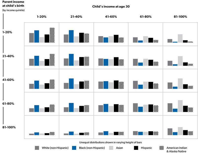
What economic mobility looks like for children in poverty
Poor kids who start out in the bottom 20% have a certain likelihood to “move up” to higher income levels as adults depending on many factors including race and ethnicity.
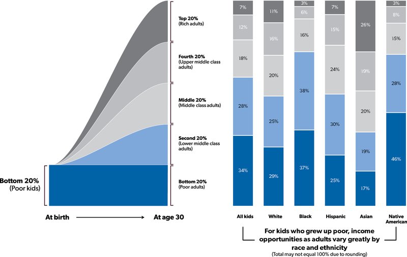
Civil rights
Our Government seeks to ensure that minorities are protected and to reduce the number of civil rights crimes in the US.
|
|
2018 |
|
2017 |
|
2013 |
|
2008 |
|
Change 2018 vs. 2017 |
|
Change 2018 vs. 2013 |
|
|
Change 2018 vs. 2008 |
||||||||||||||
|
Hate crime incidents |
|
|
7,120 |
|
|
|
7,175 |
|
|
|
5,928 |
|
|
|
7,783 |
|
|
|
(1)% |
|
|
|
20% |
|
|
|
(9)% |
|
|
Hate crime incidents (per 1 million people) |
|
|
22 |
|
|
|
22 |
|
|
|
19 |
|
|
|
26 |
|
|
|
—% |
|
|
|
16% |
|
|
|
(15)% |
|
|
Equal employment charges (fiscal year) |
|
|
76,418 |
|
|
|
84,254 |
|
|
|
93,727 |
|
|
|
95,402 |
|
|
|
(9)% |
|
|
|
(18)% |
|
|
|
(20)% |
|
|
Equal employment charges (per 1 million employees) |
|
|
491 |
|
|
|
549 |
|
|
|
651 |
|
|
|
656 |
|
|
|
(11)% |
|
|
|
(25)% |
|
|
|
(25)% |
|
|
Equal employment charges (per 1 million job openings) |
|
|
2,357 |
|
|
|
2,617 |
|
|
|
3,081 |
|
|
|
3,150 |
|
|
|
(10)% |
|
|
|
(23)% |
|
|
|
(25)% |
|
|
Housing discrimination complaints (fiscal year) |
|
|
7,788 |
|
|
|
8,186 |
|
|
|
8,368 |
|
|
|
10,552 |
|
|
|
(5)% |
|
|
|
(7)% |
|
|
|
(26)% |
|
|
Housing discrimination complaints per housing unit |
|
|
56 |
|
|
|
60 |
|
|
|
63 |
|
|
|
81 |
|
|
|
(7)% |
|
|
|
(11)% |
|
|
|
(31)% |
|
|
Health discrimination investigations |
|
|
899 |
|
|
|
921 |
|
|
|
4,465 |
|
|
|
3,401 |
|
|
|
(2)% |
|
|
|
(80)% |
|
|
|
(74)% |
|
|
Health discrimination investigations per 1,000,000 people |
|
|
3 |
|
|
|
3 |
|
|
|
14 |
|
|
|
11 |
|
|
|
—% |
|
|
|
(79)% |
|
|
|
(73)% |
|
† We limited the key metrics data in this table to the years presented to be consistent with the previous sections of this MD&A. The most recent data in those sections is 2018, as that is the latest date for which comprehensive Government-wide financial data is available. Additional years of key metrics data may be found on our website. Click “More detail” to access it.
Civil rights outcomes have been mixed over the past decade. Overall, reports of hate crime incidents decreased over the past decade, with the largest decrease (17%) reported for race/ethnicity/ancestry, partially offset by increases in gender and gender identity (our source began reporting in 2013), disability (104%), and multiple-bias (2,700%) reports. Overall reported hate crimes had been declining but reversed trend in 2013, and increased through 2018, up 20% from 2013. Reported hate crimes increased, when comparing 2018 to 2013, across every category except sexual orientation, which decreased by 3%, while race, ethnicity, and ancestry hate crimes reported increased the most (up 15%).
Compared to a decade ago, equal employment charges increased overall, and results were mixed across categories. Charges increased for retaliation, disability, color, and equal pay, while they decreased for race, sex, national origin, religion, and age.
Housing discrimination complaints and health discrimination investigations can fluctuate significantly but decreased over the periods included in this report.
Democratic participation
Our Government seeks to encourage civic participation, including voting. The voting-age population was 246 million in 2016 (the latest presidential election included within this MD&A), an increase of 4% over 2012. Among people of voting age, 64% were registered to vote in 2016; among citizens of voting age, the registered proportion was 70%. That level has changed little since 1996 but is down from a peak of 75% in 1992.
|
Calendar year |
2016 |
|
2012 |
|
2008 |
|
2004 |
|
Change 2016 vs. 2012 |
|
Change 2016 vs. 2008 |
|
|
Change 2016 vs. 2004 |
||||||||||||||
|
Rate of citizen voting in presidential elections |
|
|
61% |
|
|
|
62% |
|
|
|
64% |
|
|
|
64% |
|
|
|
(1)ppt |
|
|
|
(3)ppt |
|
|
|
(3)ppt |
|
|
Rate of voting per registered voter |
|
|
87% |
|
|
|
87% |
|
|
|
90% |
|
|
|
88% |
|
|
|
—ppt |
|
|
|
(3)ppt |
|
|
|
(1)ppt |
|
† We limited the key metrics data in this table to the years presented to be consistent with the previous sections of this MD&A. The most recent data in those sections is 2018, as that is the latest date for which comprehensive Government-wide financial data is available. Additional years of key metrics data may be found on our website. Click “More detail” to access it.
The proportion of US citizens of voting age who voted in presidential elections has decreased. Voting rates have varied by demographic:
- the voting rate for women has been higher than for men since 1980;
- by age, the lowest voting rate in 2016, 39%, was among 18 to 24-year-olds, while the highest, 68%, was among voters 65 and older;
- among people with less than a ninth-grade education, the voting rate in 2016 was 18%, while among those with a bachelor’s degree or more, it was 71%; and
- regionally, the voting rate in 2016 was highest in the Midwest (61%) and lowest in the West (53%).
By race and ethnicity, the voting rate for citizens in 2016 was highest among non-Hispanic white people, at 64%, followed by Black people, at 56%. Participation in 2016 was lowest among Asian (34%) and Hispanic (33%) people. The voting rate among Black people jumped from 56% in 2004 to 61% in 2008, the year Barack Obama was elected the nation’s first Black president, and was 62% in 2012 for his second term, before dropping again to 56% in 2016 when Obama left office.
|
Calendar year |
2018 |
|
2014 |
|
2010 |
|
2006 |
|
Change 2018 vs. 2014 |
|
Change 2018 vs. 2010 |
|
|
Change 2018 vs. 2006 |
||||||||||||||
|
Rate of citizen voting in midterm elections |
|
|
53% |
|
|
|
42% |
|
|
|
46% |
|
|
|
48% |
|
|
|
11ppt |
|
|
|
7ppt |
|
|
|
5ppt |
|
|
Rate of voting per registered voter |
|
|
49% |
|
|
|
39% |
|
|
|
42% |
|
|
|
44% |
|
|
|
10ppt |
|
|
|
7ppt |
|
|
|
5ppt |
|
† We limited the key metrics data in this table to the years presented to be consistent with the previous sections of this MD&A. The most recent data in those sections is 2018, as that is the latest date for which comprehensive Government-wide financial data is available. Additional years of key metrics data may be found on our website. Click “More detail” to access it.
Voting rates are even lower in nationwide midterm elections when citizens choose all members of the US House of Representatives and a third of the Senate but not the president. The midterm-voting rate had been falling but reversed trend and grew in 2018, resulting in overall growth for the decade.
The voting-age population was 250 million in the 2018 midterm elections, an increase of 4% over 2014. Among people of voting age, 61% were registered to vote in 2018.
Since 1986, women have been more likely to vote in midterm elections than men. As in presidential elections, voting frequency in midterms increases with age and educational attainment. The age group 65 years and older had the highest rate amongst all age groups reported in 2018 at 64%. The group with bachelor’s degrees or higher had the highest rate of voting frequency at 64% in 2018. By race and ethnicity, white, non-Hispanic people had their highest midterm voting rate in 2018, when it reached 57%, the highest rate among all races and ethnicities for any of the periods reported. Hispanic people of any race consistently had the lowest mid-term voting rates, but they too experienced their highest rate in 2018, when it reached 29%. The Midwest region had the highest midterm voting rate throughout the periods shown above, ranging from a low of 42% in 2014 to a high of 54% in 2018. The region with the lowest voting rate was the South for all midterm periods presented, ranging from a low of 39% in 2010 to 47% in 2018, except for 2014 when the voting rate was lowest in the Northeast at 36%.
Community participation
Our Government seeks to encourage the building of strong communities throughout the US.
|
Fiscal year, except as otherwise noted |
2018 |
|
2017 |
|
2013 |
|
2008 |
|
Change 2018 vs. 2017 |
|
Change 2018 vs. 2013 |
|
|
Change 2018 vs. 2008 |
||||||||||||||
|
Volunteering rate |
|
|
na |
|
|
|
26% |
|
|
|
25% |
|
|
|
26% |
|
|
|
na |
|
|
|
na |
|
|
|
na |
|
|
Median volunteer hours per year |
|
|
na |
|
|
|
na |
|
|
|
50 |
|
|
|
52 |
|
|
|
na |
|
|
|
na |
|
|
|
na |
|
|
Total giving (in millions, tax year) |
|
$ |
196,956 |
|
|
$ |
256,065 |
|
|
$ |
194,664 |
|
|
$ |
172,936 |
|
|
|
(23)% |
|
|
|
1% |
|
|
|
14% |
|
|
Total giving adjusted for inflation (2018 base) |
|
$ |
196,956 |
|
|
$ |
262,320 |
|
|
$ |
209,830 |
|
|
$ |
201,695 |
|
|
|
(25)% |
|
|
|
(6)% |
|
|
|
(2)% |
|
|
Total giving per $100,000 of Adjusted Gross Income |
|
$ |
169 |
|
|
$ |
233 |
|
|
$ |
214 |
|
|
$ |
209 |
|
|
|
(27)% |
|
|
|
(21)% |
|
|
|
(19)% |
|
† We limited the key metrics data in this table to the years presented to be consistent with the previous sections of this MD&A. The most recent data in those sections is 2018, as that is the latest date for which comprehensive Government-wide financial data is available. Additional years of key metrics data may be found on our website. Click “More detail” to access it.
na An “na” reference in the table means the data is not available.
Volunteering
The proportion of Americans taking part in volunteer activities remained relatively consistent over the past decade, among males and females and across all age groups and education levels. Data by level of education, by age group, and by gender for 2016 and 2018 were not available at the time of this report’s release. Volunteering in 2017 was most prevalent among people ages 65 and older and least prevalent in the youngest age group tracked, ages 15 to 24. People with higher levels of education (a bachelor’s degree or higher) and women were more likely to volunteer than people with less education and men. In 2015, the latest year which the detailed data was available, men who volunteered were most likely to engage in general labor (12%); coach, referee, or supervise sports teams (9%); or collect, prepare, distribute, or serve food (9%). Female volunteers were most likely to collect, prepare, distribute, or serve food (13%); tutor or teach (11%); or fundraise (10%).
With respect to median volunteer hours, the number of hours per year remained consistent between 2008 and 2015. The most hours were worked by those ages 65 and older, while the least hours were worked by those ages 16 to 24.
Philanthropy
Americans claimed $197 billion in charitable deductions in tax year 2018, for an average of $13,267 per tax return with claims. This is compared with $173 billion in charitable deductions, or an average of $4,406 per tax return, in 2008. Though charitable deductions increased over the past decade, they dropped 23% from 2017, likely due to changes in tax law from the TCJA, which made claiming the standard deduction more attractive than itemizing deductions (including charitable deductions), for many tax filers.
Charitable deductions generally increase as income increases. By income cohort:
- the group with the greatest aggregate dollars claimed and number of associated tax returns in both 2018 and 2008 were those with AGI between $100,001 and $200,000, who claimed an aggregate of $35 billion in charitable deductions in 2018, or an average of $7,063 per tax return, and an aggregate of $41 billion in 2008, or an average of $3,780 per tax return;
- the group with the greatest dollars claimed per tax return were those with AGI of $10 million or more, who claimed an aggregate of $48 billion in charitable deductions in 2018, or an average of $2.4 million per tax return. This is compared to an aggregate of $20 billion in 2008, or an average of $1.6 million per tax return.