Ask an Analyst: Creating a data-driven State of the Union
Go behind the scenes with our team as we find and make sense of the numbers.
Every year, the president of the United States stands before Congress to deliver the State of the Union — an address that’s so important it’s written into the Constitution. Presidents have used this moment to reflect on where the country is and where they want it to go next.
On February 24th, President Trump will deliver his next State of the Union address. If you’ve watched one before, you know what to expect: big policy ideas, select accomplishments, and a distinct point of view. What you won’t get from the speech is a neutral, comprehensive snapshot of how the country is actually doing. That’s not a criticism (it happens every year); it’s just not the norm for a political address, regardless of party.
At USAFacts, that is our job. Our mission is to give you the facts, nonpartisan with no spin, so you can decide for yourself what the state of the nation really looks like. That’s why we’ve been publishing the State of the Union: In Numbers report since 2020. It’s a data-driven companion to the speech that focuses on context, not commentary. Internally, we call it SOTU (pronounced: so-two).
Our SOTU provides a high-level overview of the state of the country across topics such as the economy, immigration, and standard of living. Our goal was, and still is, to add context on a certain topic, not fact-check the president. Over the last seven years of SOTUs (five of which I’ve had the privilege to work on), we have pulled together data from a wide range of government agencies and more datasets than I can reasonably count (before getting this published). One year, I analyzed data from nearly 100 different datasets, which nearly killed me.
Want more Ask an Analyst?
Subscribe to get the latest from our team.
What makes the cut
One of our first decisions to make was simple: What belongs in every State of the Union, no matter who is president or what’s happening in the world? Our team analyzed 40 past State of the Union addresses (thankfully, this was before my time) and created an outline of recurring themes. We still use this framework for our report. For example, metrics such as government revenue and spending, gross domestic product, the unemployment rate, and poverty levels are always relevant. These are the “we-check-this-every-year” metrics.
Both federal revenue and spending increased from FY 2024 to FY 2025.
Federal government finances, adjusted for inflation (FY 2025 dollars)
What changes year to year
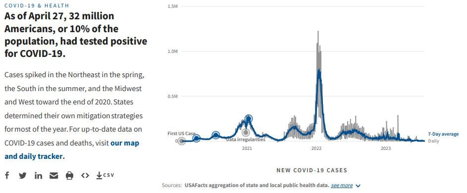
But then there are unexpected events, like global pandemics, that change the way we see our priorities. Our 2021 SOTU edition focused on COVID-19 cases and deaths, unemployment claims, educational outcomes, and more.

In 2025, the average monthly effective tariff rate was 7.7%.
Monthly average effective tariff rate (customs duty revenue as a share of good imports)
What doesn’t make it in (and why)
There is one drawback to such a high-level overview of the country: depth. Not everything makes it into the report. For example, our immigration expert wanted to add much more this year, from detailed data on ICE arrests (read his recent Ask an Analyst column here) to breaking down the differences between affirmative and defensive asylum. But at what cost? You could have missed out on this interesting chart!
The number of refugees admitted to the US dropped sharply in 2025.
Refugee admissions by month
These tradeoffs happen all the time in our work. The fact of the matter is that we have limited space and limited attention. When was the last time you scrolled a single page for more than a couple of minutes? (Be honest.) Every chart you see represents a judgment call, a debate, and a decision to prioritize breadth over depth.
Our goal with the State of the Union: In Numbers isn’t to tell you what to think or what policies to support. It’s to give you a shared factual baseline of historical data, interactive visuals, and clear context for the issues the president is likely to discuss.
The president delivers the speech. We deliver the numbers. You decide what they mean.

