Health
What health conditions make people more vulnerable to COVID-19?
From state governments to the grocery store, coronavirus is changing America. The wheres and hows of these changes, however, are still surfacing. For example, with high unemployment, it’s clear that jobs are disappearing from nearly all sectors, though some industries in some states are losing more than half their jobs. Budget shortfalls are complicating relationships between states and the federal government. These are the stories told by the data so far: five interesting pandemic findings not always seen in the headlines.
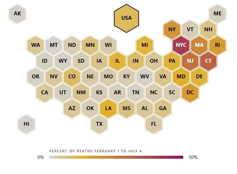
#1: Coronavirus spread inconsistently across the nation, dealing widely different health and economic blows to states
Coronavirus spread inconsistently, with some places seeing higher numbers of cases per capita than others. By the end of May, New York state had 1,901 cases per 100,000 people — the highest in the nation — while Hawaii only had 46 per 100,000 people.
The health crisis varied greatly even among America’s most populous counties. Los Angeles County, California is home to 3.1% of the nation’s population. As of the end of May, it had 3.1% of the nation’s cases. Cook County, Illinois, home to Chicago, has 1.6% of the country’s population but a disproportionate 4.4% of all cases. Meanwhile, Harris County, Texas, home of Houston, covers 1.4% of the population and only 0.7% of total cases.
As the global economy slowed, all states lost jobs across nearly every industry. However, job losses, like the health crisis, did not impact states evenly. Recently released April jobs numbers show that states with the highest number of cases of COVID-19 per capita did not necessarily lose the most jobs. Between March 15 and April 15, New York lost 8.6 jobs per confirmed case while Hawaii lost 232.4 jobs per case.
The economic crisis had more to do with job loss sweeping through particular industries, rather than through certain states. For example, states with high numbers of leisure and hospitality jobs had more losses in this industry, regardless of whether their coronavirus case count was high.
#2: Some states lost nearly two-thirds of leisure and hospitality jobs
The nation lost 20.5 million jobs in April and the unemployment rate rose to 14.7%. Job losses varied greatly from state to state: Michigan lost 23% of jobs in one month, the most of any state. Oklahoma lost the least, with 7.8% of jobs disappearing.
The leisure and hospitality industry was hit the hardest, with states shedding an average of 47% of these jobs. Some states, like New York, lost up to 64% of jobs in this sector.
The construction industry was the next hardest hit: states lost an average of 12% of jobs. Some states, like Michigan, New York, and Vermont lost more than 40% of construction jobs during this time.
Government and financial services were the two areas with the fewest job losses, averaging 4% and 3% job losses, respectively. Places with a high concentration of government employment, such as the Washington, DC and Virginia, had some of the fewest job losses.
#3: Paycheck Protection Program loans were largely given to industries with many small businesses — but not always
As of April 16, the Small Business Administration had approved 1.66 million in loans through the Paycheck Protection Program (PPP) created by the CARES Act. Intended for businesses to cover payroll costs without paying the government back for a large portion, the first round of loans was worth $342 billion. By industry loan data is not available for the more recent round of PPP loans.
In the first round of PPP loans, industries with more small business employment generally received more money. Healthcare has the largest number of employees working at small businesses, nearly 9 million, and that industry received the fourth-largest loan amount at $39.9 billion.
However, having more small business employees did not directly mean more PPP dollars. The accommodation and food services industry has the second-largest number of employees at small businesses: 8.5 million people. The sector, however, received nearly $15 billion less in PPP loans than the construction sector (which has 5.4 million employees). The other services industry, which includes personal care services like nail salons and barber shops, has only roughly 500,000 fewer employees in small businesses than professional services, but received $25.6 billion less in PPP dollars, or less than half the amount.
#4: State and local governments may need bailouts, but what is fair?
Decreased economic activity reduces revenue from income and sales taxes and spells budget problems for state and local governments. These governments cannot take on additional debt as easily as the federal government and will have to find other ways to close budget shortfalls. Options include raising taxes, cutting spending, or requesting additional assistance from the federal government — what many refer to as a “bailout.” Which states need assistance, how much they need and for what will all be debated in coming months, but the answers are complicated.
State and local governments spend different amounts providing services to their residents, on average spending $8,549 per person (including funds the federal government transfers to states to spend). Nineteen states spend more, with Alaska spending the highest at $15,469 per person, followed by New York, at spends $14,867 per person. Thirty-one states spend less than average, with Idaho spending the least at $5,546 per person.
Which programs are driving the differences in spending? The 19 higher-spending states on average spend 41% more per capita on transportation, 20% more on education, 18% more on medical assistance to the poor, and 17% more on pension payments. These four programs make up 72% of total state and local government spending.
The federal government already subsidizes some states more than others, which could complicate additional assistance. On average, federal grants sent to states account for 25% of state and local spending, and lower spending states are more likely to receive a greater share of their budget from federal grants. For 23 of the lowest-spending states, more than 25% of their budget comes from federal grants. For 8 of the 19 states spending more than average, grants account for a greater share of their budget. Montana, Wyoming, and Mississippi are the most highly subsidized states, with 40% of their spending coming from federal grants. Illinois and Virginia receive the smallest share of their budgets from federal grants at 19% each. Some states also receive more from the federal government than they send in tax dollars. On average, states receive $0.22 per federal tax dollar paid by residents. Eleven states in the top 19 spenders receive more than this; 18 states in the bottom 31 spenders receive more than this. New Mexico receives the most in federal grants per federal tax dollar collected from its residents ($0.53) while Virginia receives the least ($0.13).
#5: Grocery prices had the largest monthly increase since 1974
In April, the average price of goods (the Bureau of Labor Statistics’ Consumer Price Index for Urban Consumers) declined 0.8% from March to April. This was the fourth greatest decline in average prices since 1952, with the two greatest decreases occurring in November and October of 2008, at -1.8% and -0.9%. Much of the decline in overall prices was driven by the decline in energy prices, which fell 10.1% from March to April. Prices for apparel and transportation services each fell 4.7%
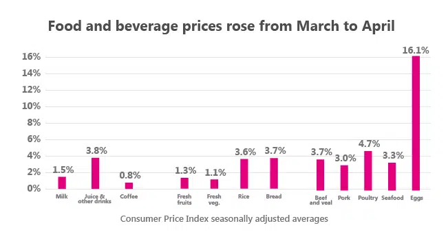
However, at the same time, prices for food at home increased 2.6%, the fourth largest one month increase for prices in this category since 1952, with the three greatest increases occurring during the period of high inflation in 1973-1974.
Take the breakfast table, for example. Eggs had the biggest jump, with an increase of 16.1% in just one month. Cereal prices went up 2.9% from March to April. Milk went up 1.5%, juice went up 3.8%. For anyone wanting a side of toast, the cost of white bread rose 3.5%. The average cost of flour was up 1.3% over March, though butter was one of the few food items that dropped in price (down 1.3%).
In some areas prices for food at home jumped much higher than others. For example, prices for groceries jumped 6.5% in the Miami-Fort Lauderdale-West Palm Beach region, and 7.2% in the Tampa-St. Petersburg-Clearwater region, also in Florida.
Health
Health
Health
Health
Newsletter
Keep up with the latest data and most popular content.